


![]()
Bivaxfabriken, a Swedish company known for its eco-friendly beeswax products, recently rebranded to modernize its visual identity while maintaining ties to its artisanal roots. The brand, founded on sustainability and handcrafted quality, now has a new logo that balances tradition with contemporary design.
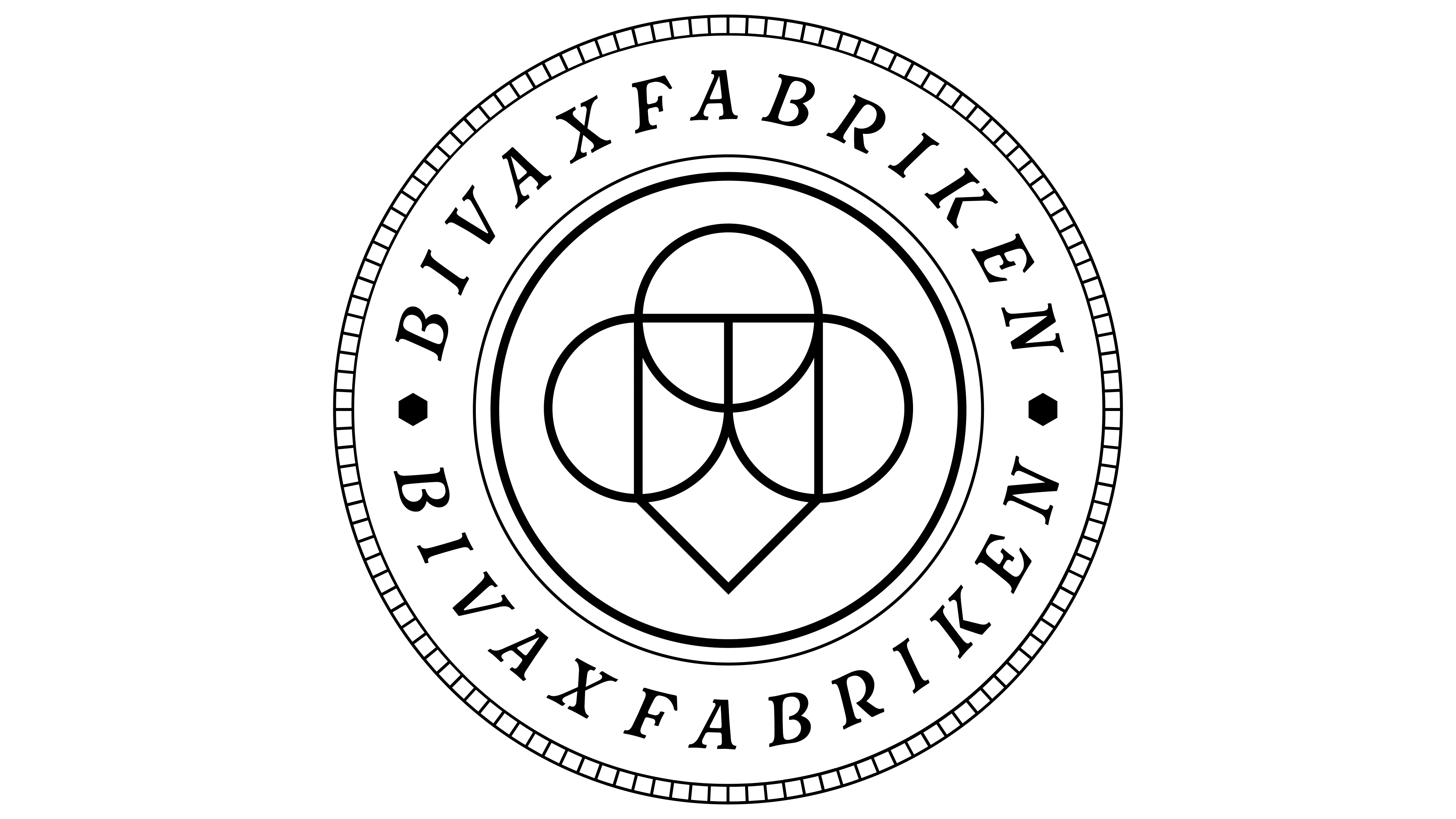
The original logo, with its intricate emblem and serif typeface, emphasized the company’s craftsmanship and history. While beautiful, the complexity of the design no longer aligns with modern branding trends.
![]()
The new logo simplifies the emblem, making it more compact and understated while shifting the focus to the brand name. The text remains connected to the company’s roots but feels lighter and more accessible in modern contexts thanks to its streamlined font with subtle decorative strokes. The updated font enhances readability, ensuring the logo adapts well to various branding environments while conveying sophistication.
The black-and-white color scheme remains, reflecting the company’s focus on purity, simplicity, and elegance. This monochromatic palette reinforces a refined look and aligns with the brand’s commitment to natural, high-quality products and sustainability.
![]()
The refreshed identity represents progress while honoring Bivaxfabriken’s heritage. It positions the brand to engage with contemporary audiences while staying true to its core values of quality, natural ingredients, and sustainability, ensuring the company’s continued evolution.