


![]()
“Funfields” updated its identity with Melbourne studio “Self-titled” to align the style with the scale of the park. The family theme park in “Whittlesea,” 25 miles north of “Melbourne,” opened in 1985 under the name “Alpine Toboggan Park.” Over the years, the site has grown into a major park in Victoria, with water slides, dry rides, and a seasonal audience of more than 200,000 guests.
The old style no longer matched the park’s level. The logo combined different typefaces, effective use of color, and hints of water slides, making the brand look fragmented. “Self-titled” needed to consolidate the rides, wayfinding, website, and all touchpoints into a single system. That led to the “One-Day Holiday” idea, with “Funfields” presented as a short vacation near Melbourne, without flights, long drives, or major expenses.
![]()
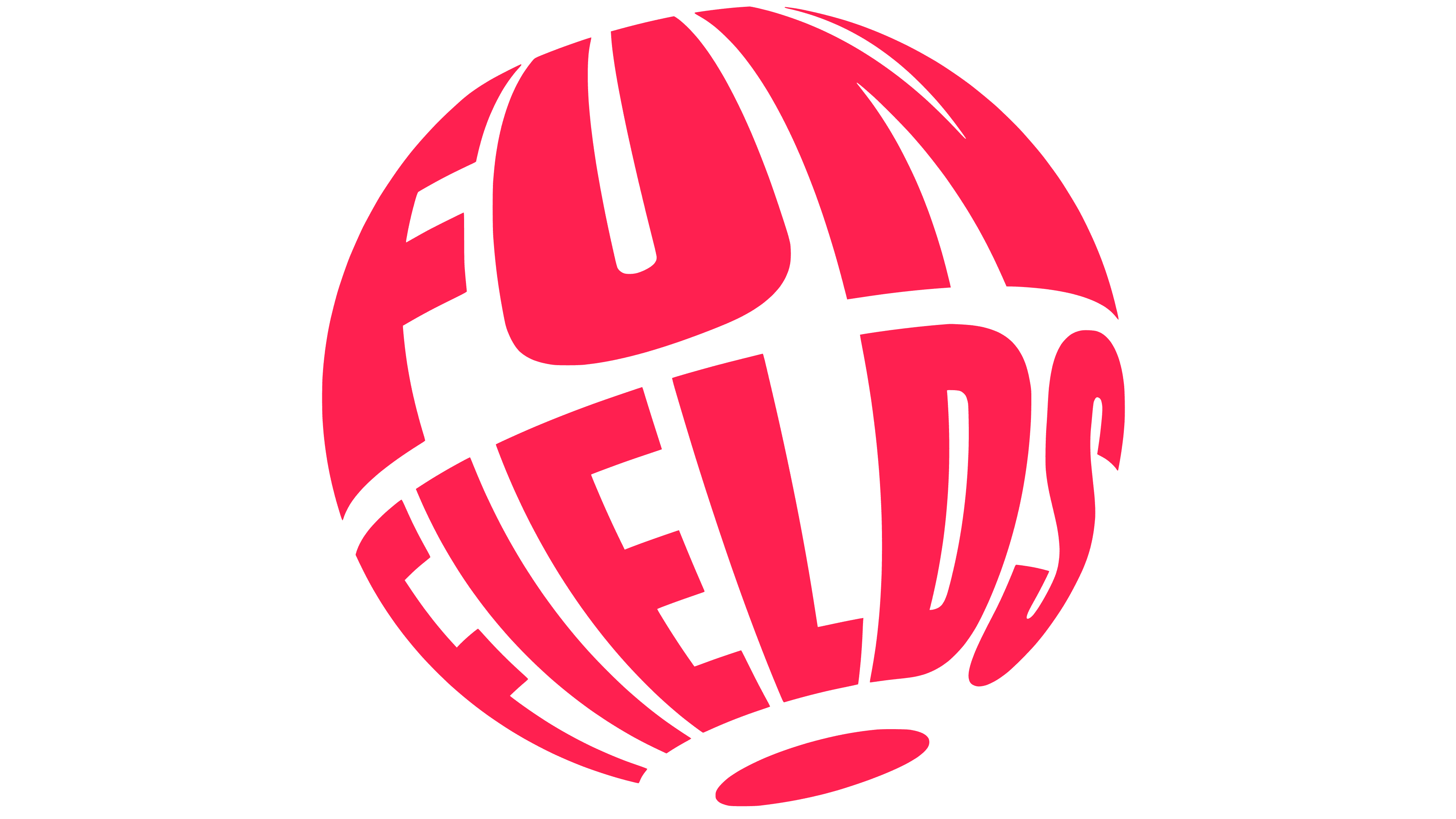
The new logo is built around a sphere. The park is shown as a separate world where a family or group of friends comes for the day. The name runs in a circle, creating volume without “3D” effects. In animation, the mark rotates, supporting the image of a place for relaxation, water, rides, and a summer day outside the usual schedule.
The wordmark uses “Gravity” by “ABC Dinamo.” The typeface works in large headlines and condensed versions, including the anniversary system for the park’s 40th year. The rest of the typography uses “Roobert” by “Display Type.” Together, they give the brand a more disciplined foundation than the previous set of random typefaces while preserving an entertainment tone.
The identity organized the park map. “Funfields” was divided into 7 zones, grouping rides by location, audience, and experience type. Each zone received a name, theme, and color. The old ride logos were converted to one-color versions to avoid competing with one another and to better integrate into the overall wayfinding system.
Stickers became part of the “Funfields” style. They refer to travel stamps, suitcase stickers, and souvenirs from trips. They are used on social media, on merchandise, in the park, and in photos and videos. The device supports the short-vacation idea. Guests get the feeling of a small trip, even when the visit lasts one day.
![]()
The new spherical “Funfields” logo, zone system, typefaces, and stickers position the brand as a place with a clear structure and a vacation mood.