


Simplehuman carried out a smooth logo update. The brand began with home products and gradually grew into a premium name for the kitchen, bathroom, and personal care. Abbreviated worked on the name, the scale of the mark, and how the brand is perceived on the product.
The company was founded in 2000 as Canworks. Later, after expanding beyond trash cans, the Simplehuman name appeared. The product range became broader. It came to include products for the kitchen, bathroom, and everyday care.
Simplehuman describes its products as tools for efficient living. The idea is about home objects where everyday function is combined with engineering precision. A trash can, dispenser, mirror, or organizer looks calm, lasts a long time, and helps maintain order in everyday routines.
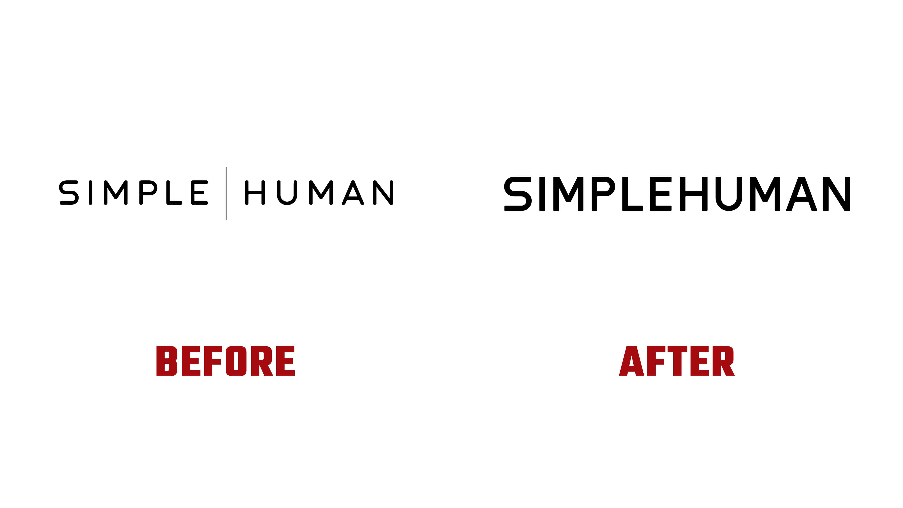
The main adjustment concerns the way the name is written. In the old logo, SIMPLE and HUMAN were separated by a vertical line. Because of it, the name read as two words. In the new version, the line disappeared, and Simplehuman was unified into a single wordmark. The brand now sounds softer and more human, with less distance.
The form remained minimal and became tighter. The spacing between letters was reduced, the contours were refined, and the mark works better at small sizes. For Simplehuman, the practical reason is clear. The logo has to work well in an online store, on packaging, in retail, and on the products’ steel bodies.
The wordmark shows the brand’s love of precision. Curves, counters inside the letters, radii, and spacing between characters are designed for different materials and screens. The logo decorates the product with restraint. It works almost like technical labeling while keeping a warm everyday tone.
After updating the logo, Abbreviated created a separate type family for Simplehuman based on DIN. It kept the connection to industrial typography, while the overall tone became softer. The family received two optical sizes, four styles, and 3,296 glyphs, including stylistic alternates for different work needs.
The new identity continues Simplehuman’s focus on precise objects for everyday life. The logo became calmer, tighter, and more closely aligned with the brand’s products. Careful detailing, convenience, and a high level of execution moved to the foreground instead of a loud effect.