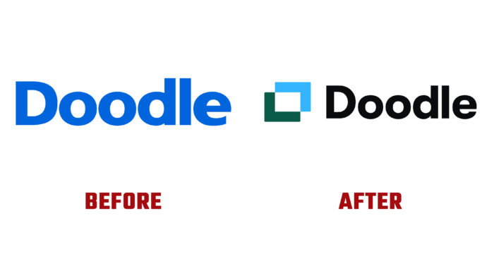
Launched in 2007, the electronic meeting and event planner Doodle, headquartered in Zurich, has changed its identity. His new visualization accurately reflects the changes that have taken place in the strategy and functionality of the brand, which has acquired an attractive modern look. At the heart of its functionality is creating a questionnaire from a detailed list of parameters, including the desired date and time, allowing everyone to communicate their preferences. Within a few minutes, based on the received data, the application will plan a convenient intersection point for everyone. And all this with just a few clicks. The process is facilitated by automating the schedule, leaving more time for users to do more important things. Today the company has offices in Atlanta, Berlin, and Belgrade.
Visualization is based on a graphical representation of time in the form of a geometric figure resembling a frame. This element is dynamic, forming a semblance of a scene that is perceived as a context for future events. It immediately delivers the user at the right time; it remains only to fill this time with your parameters, dreams, aspirations, and desires. Considering that the majority of the world’s population is constantly online in one form or another, the use of calendars and tables offered by the platform allows you to streamline any schedule in a chaotic information space. The grid used for construction, which has flexibility and variability, along with calendars and tables, is conveniently placed in images of visual identity.
The new logo uses the GT Walsheim sans-serif wordmark, which greatly improves the image’s readability. It gives this element a polished look, highlighting the nice repetition of round counters in the “ood” letter compound. They are interspersed with a surprisingly beautifully executed letter “e” with a corresponding counter. The use of recognizable colors in the user interface – green and blue – reflects the availability or blocking of a particular feature when filling out surveys. The convenient use of the traditional “row-column-cell” motif allows you to create a simple icon that conveys the idea of finding the perfect intersection when the graphs coincide.
An attractive visualization was the use of narrative demos, sound background music, and perfectly synchronized sound effects with the dynamics of moving elements. The whole construction of the new identity effectively holds the viewer’s attention, performing its task qualitatively, both in the product itself and in marketing.


