Sporza updated its logo ahead of the 2026 FIFA World Cup. VRT’s Flemish sports platform introduced the fresh style in June 2026. Saffron worked on the identity.
The brand needed an image for broadcast, news, live coverage, the website, social media, and fan communication. Sporza has long held an important place in the sports life of Flanders, while the previous mark looked fairly functional.
The old logo relied almost entirely on the word Sporza and a small green dot. It worked for news labeling and looked too calm for a major sports platform.
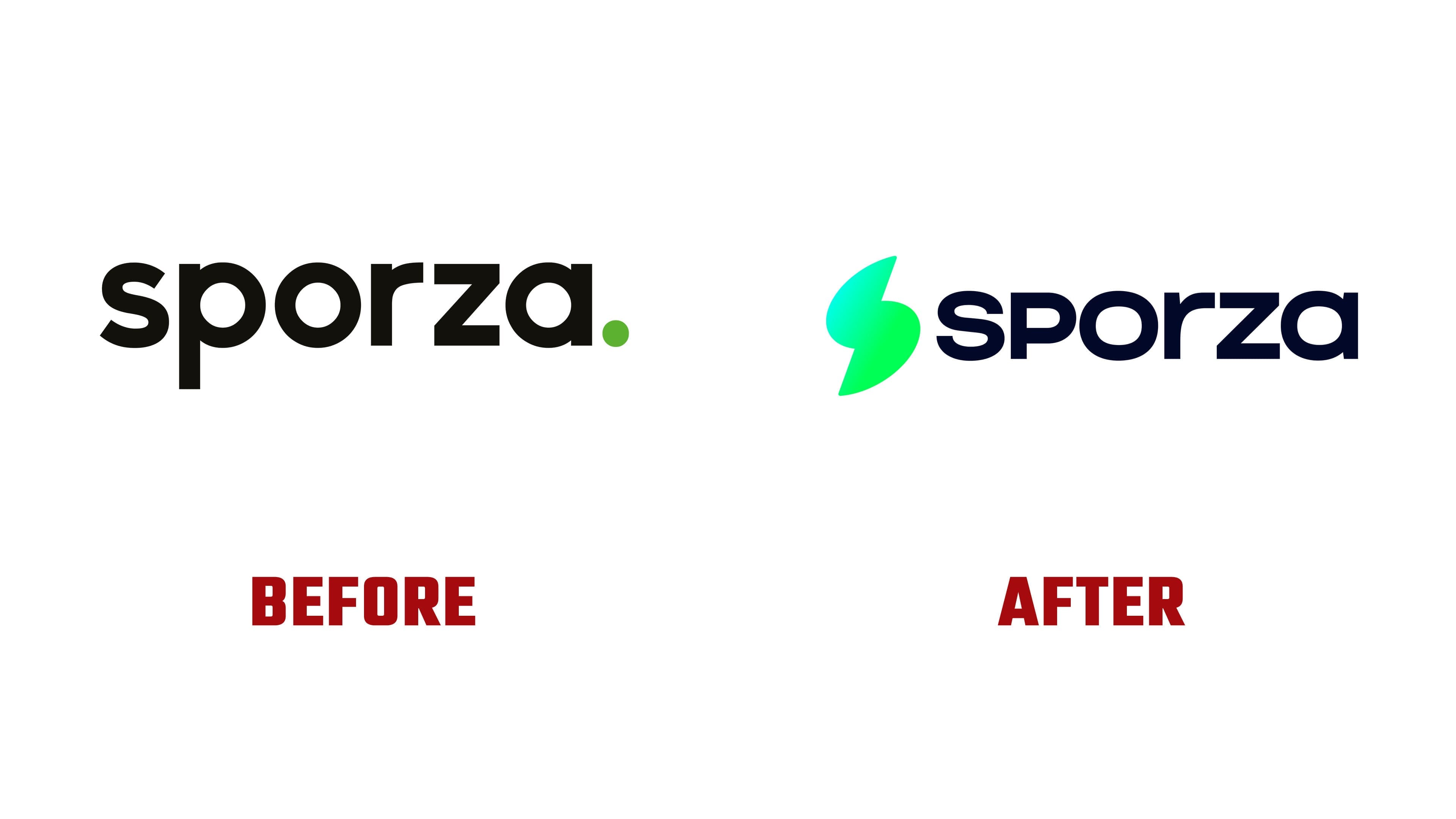
In the fresh version, the name was kept, while a full green symbol appeared beside it. It recalls a lightning bolt, the letter “S,” the path of a ball, a sharp turn during a game, or a burst of emotion in the stands. Saffron used an associative mark instead of images of a ball, stadium, or athlete. The image works through its connections to a match, reaction speed, and the tension of a live broadcast.
The word sporza became denser. The letters received angular endings, so the wordmark pairs better with the active symbol. Earlier, the green dot was a small accent. Now the green mark has become a distinct part of the identity and can function independently of the name.

For VRT, the Sporza update is part of broader work with media brands. Before Sporza, Studio Brussel, MNM, Radio 1, Radio 2, Ketnet, and Ketnet Junior had been updated. Sporza received its own tone. It has less neutral TV labeling and a stronger sense of the match, victories, losses, anticipation, and fan reaction.
The fresh logo helps Sporza look closer to live sports. Ahead of the World Cup, the brand received a mark for screens, broadcasts, and digital channels. One green symbol connects the event, the platform, and the fan through a shared sports impulse.