You will be very surprised when you see the changes that have been in development for four years.
During the spring presentation, Xiaomi presented not only new products but also a visual identity. The company shared a video in which designer Kenya Hara explained the new logo’s meaning and the idea behind the new image.
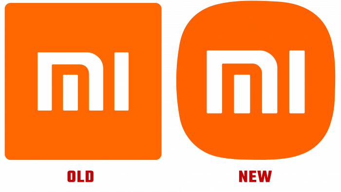
The logo just changed its shape. The orange square has turned into the same shape, only with rounded corners. The brand also tried hard to explain that the new ideal shape can be calculated using a mathematical formula.
The designer also emphasized that since 2017 he has been studying the spirit of Xiaomi to convey the essence of the brand as accurately as possible in a new image. The style of the company is called Alive. It also presented all the options that were developed for the new identity before choosing the final version.
Kenya Hara decided to diversify the color palette and added gray and black shades. With orange, an ambiguous play of colors turns out, which at first glance does not match each other. Thus, the designer decided to demonstrate a constant search for something new, a desire for development, and maintaining a balance.
The rounded version of the logo looks more modern and refreshes Xiaomi a little. The brand will use visual identity on an ongoing basis, and soon we will be able to evaluate the success of the solution more than once.


