


![]() Xiaomi Logo PNG
Xiaomi Logo PNG
The Xiaomi logo is simple and concise, mirroring the design of the company’s electronic devices. Minimalism is currently in fashion, and the Chinese corporation’s logo perfectly fits its requirements. Yet, it is striking enough to catch the eye.
Xiaomi was founded on April 6, 2010, in Beijing by Lei Jun and a team from Kingsoft, Google China, and Motorola. Initial funding reached 30 million yuan, with a model focused on high-spec devices sold at minimal margin.
The first product was MIUI, released on August 16, 2010. Built on Android, it introduced weekly updates shaped by user feedback, creating an early community before hardware launches.
In August 2011, Xiaomi introduced the Mi 1, matching devices like Samsung Galaxy S II at roughly half the price. Sales used online flash events to generate demand through limited batches. By 2012, sales reached 7 million units, and in 2013, the Redmi line expanded into the budget segment.
By 2014, Xiaomi led the Chinese smartphone market ahead of Samsung Electronics and Huawei, while raising $1.1 billion at a $45 billion valuation. Revenue exceeded $10 billion within four years.
International growth began in 2013 across Hong Kong, Taiwan, and Singapore, followed by India in 2014 via Flipkart. By 2017, Xiaomi ranked first in India.
In 2016, shipments dropped from 70 to 40 million units as rivals expanded their offline retail operations. The company responded by launching Mi Home stores and adjusting distribution.
In 2018, Xiaomi went public in Hong Kong, raising $4.7 billion, while limiting hardware margins to 5%. By 2019, it entered the Fortune Global 500.
In 2020, overseas revenue accounted for 55% of total revenue, and the company surpassed Apple in smartphone shipments. In 2021, Xiaomi announced a $10 billion EV project, launching the SU7 in 2024 and expanding further in 2025.
Meaning and History
![]()
The brand’s global career began with widespread popularity in the domestic market. It was then that the company’s management decided to expand its customer base. First, it revised the name and branding because only Asians can easily pronounce “Xiaomi,” whereas residents of other countries find it difficult to pronounce. Ultimately, the administration chose the shortened version of MI. This version was included in the emblem.
What is Xiaomi?
It is a Chinese corporation that produces household appliances, electronic devices, and related software. Founded in 2010, it quickly became the world’s second-largest smartphone manufacturer. The company was founded by a group led by billionaire Lei Jun and is headquartered in Beijing.
April – August 2010
![]()
In mid-2010, eight partners united to start producing software for mobile devices. They named their company Xiaomi and designed a logo featuring inscriptions in two languages: Chinese and English. The word “Xiaomi” is aligned at the bottom right and rendered in bold, lowercase, sans-serif type. It translates to “little rice grain,” a reference to a Buddhist aphorism about how such a grain can stop a river. Two large ideograms occupy the top line. All symbols are in white. The base is a rectangular dialogue bubble with rounded corners painted in dark orange.
2010 – 2014
![]()
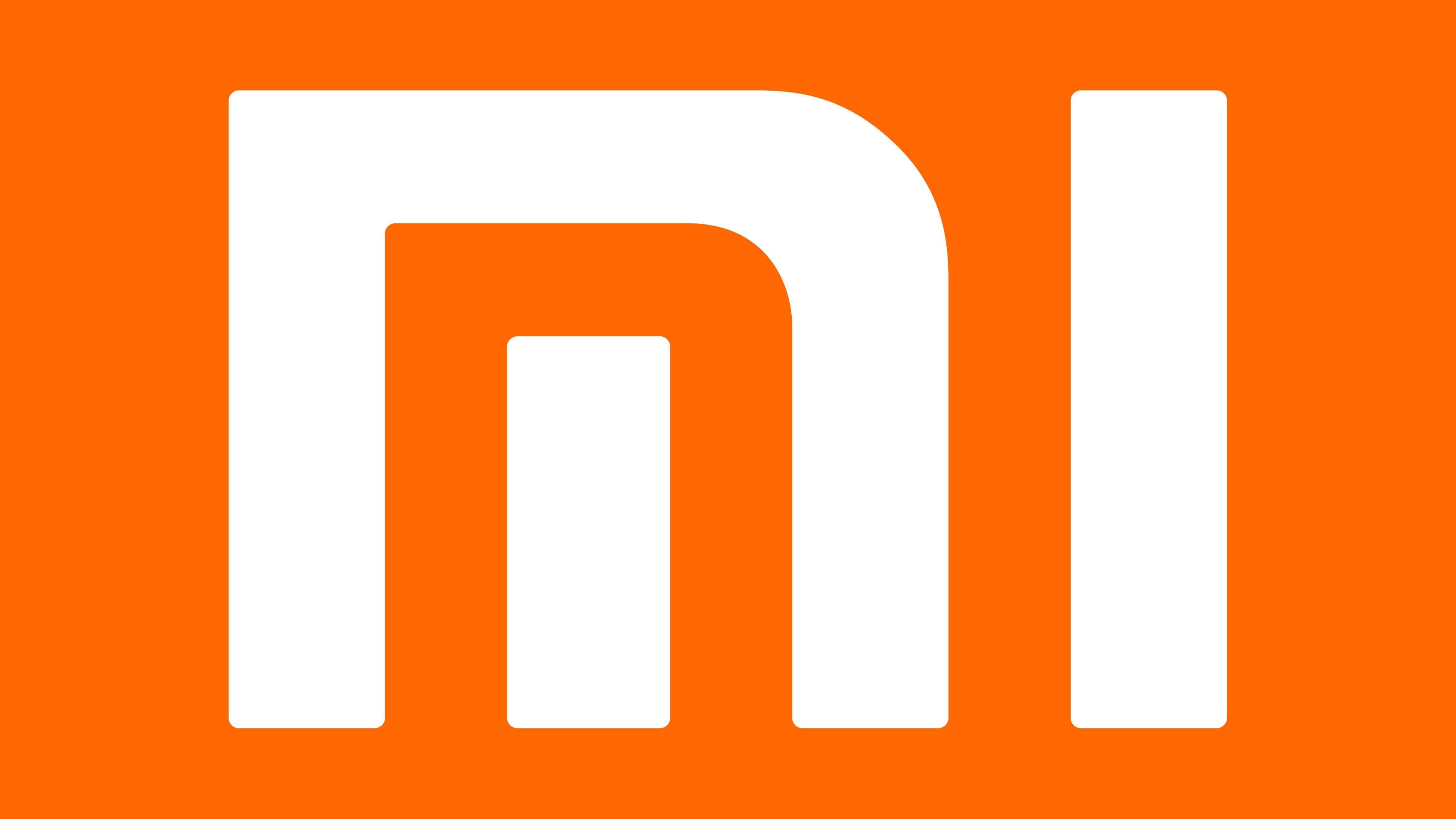
In addition to the graphic sign, the debut logo includes the name in Chinese and the website URL. The white letters “MI” are stylized and placed in an orange square. Outwardly, they resemble ideograms. The middle line of “M” is separated from the rest, which are depicted as gates. “I” is missing.
2014 – 2021
![]()
Following its international market entry, the company undertook a minor redesign to enhance the visibility of its corporate style. To this end, developers enlarged the square, added graphic signs, and rounded the corners. All other elements were removed.
2019 – 2021
![]()
Users did not always recognize the 2014 emblem as a Xiaomi brand sign. For many gadget users, it was like another brand. Therefore, in 2019, the company decided to add the word “Xiaomi” to the logo’s visual identity.
2021 – today
![]()
In 2021, Xiaomi held its New Product Launch Part 2. On March 30, the public first saw the new logo of the consumer and mobile electronics manufacturer. It differs little from the previous version, but Japanese designer Kenya Hara made some adjustments to align with the corporate style concept called “Alive.” As a result, the square icon became rounder, taking the shape of a square with very rounded corners. The shade of orange was also slightly changed. The stylized letters “m” and “i” remained unchanged in the main version. However, the company’s owners decided to use the Mi emblem only as a parent logo and to place the word “Xiaomi” in gray on all devices.
Font and Colors

According to the brand owners’ official explanation, “MI” stands for “Mobile Internet.” At the same time, the company’s management noted that it is also a comical version of “Mission Impossible,” as they faced many problems in the early years of operations when leaving the country. One of them was the forced purchase of a domain with the same name to legalize their trademark.
The logo uses a life-affirming combination of orange and white colors. This same combination is included in the corporate color palette.