The pursuit of simplicity became the foundation of Samsung’s identity, with a logo symbolizing the stability of development and commitment to set goals. The visualization demonstrates the brand’s philosophy – ensuring universal access to high-quality products.
Samsung: Brand overview
| Founded: | 1 March 1938 |
| Founder: | Lee Byung-chul |
| Headquarters: | Seoul, South Kore |
| Website: | samsung.com |
Meaning and History
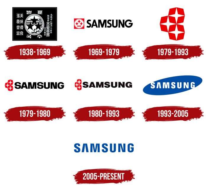
Samsung changed its business focus several times, and with it, the company’s logo. The current symbol is considered an example of successful rebranding, largely thanks to well-developed marketing and large-scale advertising campaigns. It looks completely different from previous versions – in color palette and font.
What is Samsung?
Samsung is a South Korean manufacturer of home appliances, electronics, medical equipment, clothing, chemical products, and building materials. Additionally, the company develops its own hotel business and provides insurance and financial services. This giant conglomerate consists of dozens of different companies. Its history began in 1938 with the sale of noodles and dried fish.
1938 – 1969
The first Samsung logo appeared on noodle packages. Then, it was used for marking rice, dried fish, vodka, wine, and other products in the assortment. It was a detailed trademark in the form of a rectangle. It contained Korean characters and a white circle located inside two rings. In the center were three five-pointed stars. They are associated with the brand’s name because “sam” means “three,” and “seong” – “star.”
There are several theories about the origin of this concept. According to one version, the company owner referred to his sons, who were supposed to inherit the family business. Another hypothesis suggests that he invested special symbolism in this word: he wanted the company to shine like stars in the sky. Moreover, the character “sam” signifies strength and grandeur, and “seong” is associated with eternity.
In addition to stars, inside the circle were three horizontal lines symbolizing the company’s main product – rice noodles. Just below was an image of a wheat ear – a nod to Samsung’s agricultural roots.
1969 – 1979
In the 1960s, the brand began dealing with insurance and real estate sales, reflected in its logo. Designers removed all elements associated with the food industry. They left only three four-pointed stars located inside a white circle on a square background. At that time, the palette was black and white.
The name “Samsung” appeared on the logo for the first time. Developers used the English version of the name to emphasize the company’s global nature and enter the international market. Strict, bold sans serif letters emphasized a restrained style.
1979 – 1993
In the late 1970s, the company’s founder considered the logo outdated, so he changed its graphic. Designers removed the white circle and separated the three stars, placing each inside a hexagon. Geometric shapes became red because this was the time Samsung released color televisions. The manufacturer permanently abandoned unexpressive black-and-white symbols then. It was assumed that the bright palette emphasizes the high image quality on TV screens. In addition, the brand name appeared and disappeared. The font almost did not change.
1993 – 2005
In 1993, the company began actively entering the international level. It aligned with modern innovations and the technological boom, so it abandoned everything outdated, including the previous logo, which hindered the development of its image. As a result of global rebranding, a completely new brand name appeared: the white inscription Samsung on a blue oval. The elongated geometric figure symbolizes the Universe. The hidden connection with stars is evident.
2005 – today
Designers simplified the logo by removing the oval. Only the word “Samsung,” colored blue, remained. It’s written in a custom font, vaguely reminiscent of DDT Cond SemiBold and Helvetica Black. For the printed characters, straight angles and absence of serifs are characteristic – the letter “A” is without a horizontal stroke.
But the logo with the ellipse didn’t disappear – it became proprietary. Now, it’s used by Samsung Group and its subsidiaries. In turn, the brand name, consisting of a single inscription, is found in advertising campaigns.
Samsung: Interesting Facts
Samsung is a big company in South Korea that makes all sorts of electronic things, such as phones and TVs. It started way back in 1938, not with electronics, but with selling groceries and making noodles.
- Starting Small: Samsung began as a small company dealing with groceries and noodles. It didn’t start making electronics until the 1960s.
- What’s in a Name: “Samsung” means “three stars” in Korean, which was supposed to show the company was big, strong, and would last forever.
- Tech Innovator: Samsung is good at inventing new tech. In 2010, it made one of the first tablets that worked with Android, and its Galaxy phones are super popular.
- Top Phone Maker: In 2012, Samsung sold more phones than any other company, beating out Nokia.
- Memory Chips: Samsung is also a leader in producing memory chips for computers and phones.
- TV Leader: Samsung has made many advances in TVs, such as creating the first digital TV in 1998 and making super-clear QLED and 8K TVs.
- Eco-Friendly: Samsung wants to be good for the environment. It’s working to use only renewable energy in its big US, Europe, and China offices.
- Research and Development: Samsung spends a lot of money on research to keep coming up with new ideas in tech, from phones to appliances for your home.
- Supporting Art and Education: Samsung isn’t just about electronics; it also helps with art museums and education programs to improve communities.
- Olympics Support: Since the Winter Olympics in 1998, Samsung has been a big supporter, helping with technology and promoting sports.
From its humble beginnings, Samsung has grown into a giant that makes all kinds of tech products. It works to be better for the planet while also supporting the arts and education.
Font and Colors
The South Korean company’s emblem has nothing superfluous – only the inscription “SAMSUNG” in uppercase. After the 2005 redesign, the word is placed on an empty background. Before that, it was inside a relief oval, remembered by many Samsung electronics and home appliance owners.
However, developers simplified the design by removing the geometric shape and leaving only the brand name. This concept greatly differs from the original because, from 1969 to 1993, the logo contained three four-pointed stars.
The word “SAMSUNG” is similar to the fonts DDT Cond SemiBold and Helvetica Black. Clean lines, numerous angles, and the absence of serifs characterize it. The letter “A,” consisting of only two diagonal strokes, deserves special attention.
Another notable feature of the emblem is the dark blue color (#034EA2). It’s used for the inscription, while the surrounding background is white.
Samsung color codes
| Imperial Blue | Hex color: | #1528a0 |
|---|---|---|
| RGB: | 21 40 160 | |
| CMYK: | 87 75 0 37 | |
| Pantone: | PMS 2736 C |

