The emblem symbolizes the application of achievements in modern electronics and multimedia technologies and impeccable Japanese quality – the logo of Sony, founded in 1946. The name and graphics reflect innovative views and features of the national culture.
Sony: Brand overview
| Founded: | 7 May 1946 |
| Founder: | Masaru Ibuka, Akio Morita |
| Headquarters: | Sony City, Minato, Tokyo, Japan |
| Website: | sony.com |
Meaning and History
The Sony logo is one of the most recognizable. It features the company name, derived from the Latin “Sonus” (“sound”). There’s also a connection with the word “son,” which in Japanese culture is used to denote young people with an innovative outlook on things.
What is Sony?
Sony is a Japanese corporation, the richest company in the country, covering a wide range of industries. It is involved in the manufacturing of electronic devices and household appliances, the release of video games and consoles, the creation of movies, and the recording of musical compositions. It is a multifaceted conglomerate: a record label, film studio, and electrical engineering company. The company was founded in 1946, and its headquarters are located in Japan’s capital.
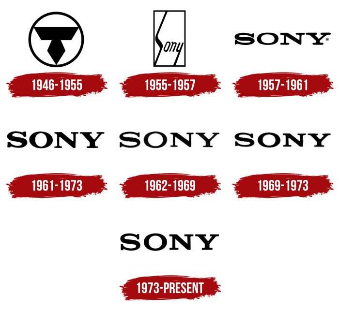
1946 – 1955
The company wasn’t always called Sony. In 1946, it was known as Tokyo Tsushin Kogyo, so the letter “T” took a central place in its emblem. The symbol consisted of an inverted isosceles trapezoid and a rhombus located inside a black ring.
1955 – 1957
In 1955, the Sony brand appeared. Its name was different from the main logo. It was an italic inscription “Sony” placed in a rectangular frame. The elongated letters “S” and “y” gave it a special shade.
1957 – 1961
In 1958, the Tokyo Tsushin Kogyo group of companies was renamed Sony Corporation. Part of the rebranding was changing the logo. Yasuo Kuroki, a full-time company designer, invented the new version. He removed the quadrangle and left only the inscription “Sony.” To emphasize its importance, he chose a bold font with large serifs.
1961 – 1973
Norio Ohga, a former company president, criticized the existing logo and suggested improving it. Chief designer Akio Morita agreed and appointed Ohga to his position. Under his leadership, Yasuo Kuroki revised the trademark and made the letters “S” slightly larger than “O,” “N,” and “Y” so that they would not appear small due to the visual effect. Subsequently, the logo changed several more times until the final version appeared. All versions differed only in bold letters and slightly altered font.
1962 – 1969
The 1962 logo differs from the previous version by having thinner letters: if the font was bold in 1961-1962, the designers now reduced the line width.
1969 – 1973
In 1969, changes to the emblem were minor. The developers thickened the sides of the letter “O” and the right diagonal stroke of “Y.”
1973 – today
In 1973, the designer created an emblem that satisfied the discerning Norio Ohga. The head felt that it perfectly reflected the company’s corporate image. The use of black on a white background symbolizes integrity and elegance. The font resembles Clarendon with minor modifications.
The company tried several times to change the trademark, even holding a contest for its 35th anniversary. It received about 30,000 applications, but none of the works were honored to become the Sony logo.
Sony: Interesting Facts
Sony is a big company in Tokyo, Japan, which was started in 1946 by Masaru Ibuka and Akio Morita. They make all sorts of electronics and are also into movies, music, and video games.
- How Sony Got Its Name: “Sony” comes from a Latin word for sound, which is why they started with sound stuff like radios. It also means young and smart, just like the founders wanted their company to be.
- First Radio in Japan: In 1955, Sony made the first transistor radio in Japan. It was a big deal because you could take your music anywhere.
- The Walkman: In 1979, Sony made the Walkman, the first time people could listen to music on the go with headphones. It was a huge hit.
- CDs Came Next: In 1982, Sony and another company called Philips made the first CD and CD player. This changed how we listen to music because it was all digital.
- Hello, PlayStation: In 1994, Sony released the PlayStation, a video game console that became super popular. It was Sony’s big step into video games.
- Movies and TV Shows: Sony bought Columbia Pictures in 1989, so they started making movies and TV shows, too. This made them even bigger in entertainment.
- Cameras and More: Sony is a leader in this area and is good at making cameras and other devices for taking pictures and videos.
- Music Everywhere: Sony Music is one of the top music companies in the world. It works with many famous singers and bands.
- Caring for the Planet: Sony wants to help the environment. They’re working on improving their products for the Earth and hope not to harm it by 2050.
- Robot Dog: Sony made a robot dog named Aibo. It can recognize people and even act like it has its personality.
Sony has come a long way from just making radios. Now, it’s involved in many different things, like video games, movies, and music, and it’s always trying to develop new ideas.
Font and Colors
Historically, the Sony trademark contains only its name. Adhering to a minimalist concept, the designers were able to focus on the brand and not use bright decorative elements. The simple inscription has served as the emblem since 1957 but has undergone several changes to improve the manufacturer’s corporate style of electronics and multimedia. The final version was adopted in 1973.
The font used in the logo resembles Clarendon, a font created by typographer Robert Besley. It is a bold font with long rectangular serifs. From 1961 to 1973, the font was developed by the company’s in-house designer, Yasuo Kuroki, under the supervision of the corporation’s former President, Norio Ohga. The emblem’s palette is concise and represented by just two colors: black (for the inscription) and white (for the background).
Sony color codes
| Black | Hex color: | #000000 |
|---|---|---|
| RGB: | 0 0 0 | |
| CMYK: | 0 0 0 100 | |
| Pantone: | PMS Process Black C |


