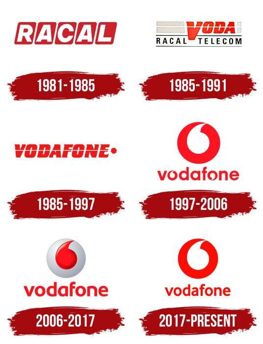
“Communication here is always trendy,” states the Vodafone logo. The emblem reflects the love for customers. Active support of their connections and contacts. Represents the company through which a huge amount of information passes.
Vodafone: Brand overview
| Founded: | 16 September 1991 |
| Founder: | Ernest Harrison, Gerry Whent |
| Headquarters: | Newbury, Berkshire, England, UK |
| Website: | vodafone.com |
Meaning and History
On September 16, 1991, Racal-Vodafone separated from its parent company and became Vodafone Group. It was led by one of its founders, Gerry Whent. This time marks the first logo with the real name of the new structure. It uses the word “Vodafone”, formed from fragments of the phrase “vo ice” + “da ta” + “fone.” Throughout its history, the service has had six logos.
What is Vodafone?
Vodafone is a British telecommunications operator that provides mobile and fixed communication services, internet television, and digital television. The brand appeared in 1991 as a result of the merger of two companies. Its founders are Ernest Harrison and Gerry Whent. The company primarily operates in Europe, Africa, Asia, and Oceania.
1981 – 1985
The debut emblem is the word “Racal,” written in capital white letters in separate red squares.
1985 – 1991
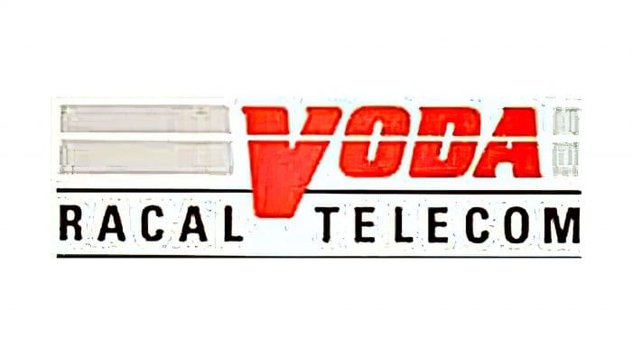
During this period, the emblem played on the company’s second name, Racal-Vodafone, where “Racal Telecom” is written at the bottom and a large “Voda” is at the top.
1985 – 1997
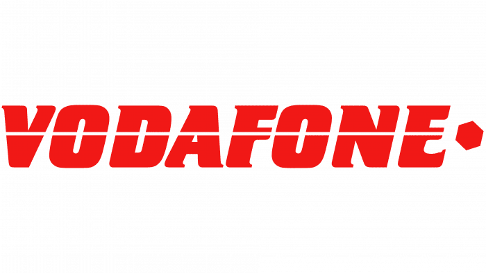
From 1985, another version of the logo was used in parallel, based on the company’s new name – “Vodafone.” The symbol consisted of thin serifs in red capital letters and a straight white line crossing the word horizontally.
1997 – 2006
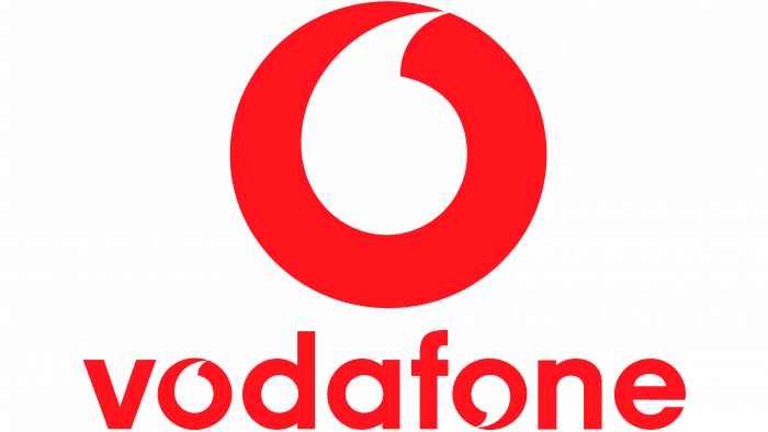
In 1997, the telecommunications service emblem received a new design. It looks like a red circle with a white quotation mark in the center.
2006 – 2017
During this period, developers proposed another version of the logo, changing the colors of the previous version. They then appeared a combination of gray and red with volumetric reflections-shadow.
2017 – today
In 2017, the management decided to return to the 1997 logo – two-dimensional, flat, white and red.
Vodafone: Interesting Facts
Vodafone is a big company from the UK that lets people use their phones to talk and use the internet worldwide.
- How It Started: Vodafone began in 1984, first called Racal Telecom Limited. The name “Vodafone” comes from making voice calls and sending data over phones.
- First Mobile Call in the UK: On January 1, 1985, Michael Harrison made the very first mobile phone call in the UK using Vodafone. He called his dad, marking the start of using mobile phones in the UK.
- Growing Big: Vodafone didn’t just stay in the UK; it grew to serve customers in over 65 countries, becoming one of the top phone companies in the world.
- ZooZoo Ads: In 2009, Vodafone made funny ads with characters called ZooZoos that became very popular in India. The ads talked about Vodafone’s offerings.
- Tech Innovations: Vodafone has led to new phone technology, introducing ideas like “roaming” and helping start services like 3G, 4G, and 5G.
- M-Pesa Mobile Banking: In 2007, Vodafone started M-Pesa in Kenya to send money and get small loans using phones. It’s helped many people who don’t have banks.
- First Text Message: The first text message was sent over Vodafone on December 3, 1992. It just said, “Merry Christmas.”
- Sponsorships: Vodafone has sponsored big sports teams and events, including Formula 1 and Manchester United Football Club.
- Helping Out: The Vodafone Foundation, started in 1991, uses phone technology to address big problems such as disaster relief, health care, education, and more.
- Growing Through Deals: Vodafone has grown by buying other companies and making deals, like buying a big German company and working with Liberty Global in Europe.
From starting as a small company in the UK to becoming a global leader in mobile communications, Vodafone has played a key role in how we use our phones today, bringing new technology and helping people connect worldwide.
Font and Colors
The author of the new logo was the London studio Brand Union. It emphasized the quotation mark (in quotes) and offered various branding packages. It features the main visual identification sign and icons, buttons, short symbols, and inscriptions.
If the previous version of the word was simple and smooth, the current one is complex. For example, the thin sans serif font plays with the letter “O,” which repeats the graphic symbol. But the color palette has always been the same – a combination of red and white. At one point, gray was added to them.
Vodafone color codes
| Electric Red | Hex color: | #e60000 |
|---|---|---|
| RGB: | 230 0 0 | |
| CMYK: | 0 100 100 10 | |
| Pantone: | PMS Bright Red C |

