


![]() Turkcell Logo PNG
Turkcell Logo PNG
The conceptual logo of Turkcell reflects the company’s historical legacy, which has always featured a mascot that distinguishes it from other mobile operators. Despite moving away from the original design, the emblem, as it did years ago, continues to symbolize wireless signal transmission.
The history of Turkcell began with the launch of Turkey’s first GSM network in February 1994. The company was formally established on October 5, 1993, as a joint venture between Çukurova Group and Finland’s Sonera Holding. Sonera provided technical expertise, while the Turkish side handled rollout and local infrastructure.
On April 27, 1998, Turkcell secured a 25-year GSM license from the Ministry of Transport. The same year, it introduced prepaid services, expanding access to mobile communication. In 1999, the company entered Northern Cyprus through KKTCell.
On July 11, 2000, Turkcell listed its shares on both the Istanbul Stock Exchange and the New York Stock Exchange, becoming the first Turkish company to be traded on the NYSE. The IPO opened access to international capital during a phase of rapid growth.
Domestically, Turkcell maintained leadership over rivals such as Vodafone and Türk Telekom. By Q3 2012, it held 52.4% of the market, compared to 27.9% for Vodafone and 19.7% for Avea.
Expansion continued through Fintur into Azerbaijan, Kazakhstan, Georgia, and Moldova. In 2005, the company launched life:) In 2008, Ukraine acquired an 80% stake in the Belarusian operator BeST.
In 2003, Turkcell won a tender to build Iran’s first private GSM network, but in 2005, the license was reassigned to MTN Group. A $4.2 billion lawsuit filed in 2012 was later withdrawn in 2013 after a U.S. Supreme Court ruling.
Internal shareholder disputes among Çukurova, TeliaSonera, and Altimo disrupted governance from 2009 to 2013.
Operationally, Turkcell launched 3G in 2009 and LTE in 2016 across 81 cities. In 2015, it acquired its Ukrainian unit, which was later renamed Lifecell. In October 2020, the Turkish Wealth Fund acquired a 26.2% stake, becoming the largest shareholder.
Meaning and History
![]()
The operator was the first to launch a GSM network on a global scale, covering most of the country’s territory and competing with more well-known mobile communication providers. By 2007, it had established several subsidiaries abroad, through which it began to attract subscribers internationally. Today, its coverage operates in Kazakhstan, Georgia, Azerbaijan, Moldova, Ukraine, and several other countries.
The gradual yet confident work strategy is reflected in the mobile service’s emblem. Almost from the very beginning, it depicted a horned snail as a personified symbol. In total, the telecommunications company has had five logos over the years.
What is Turkcell?
Turkcell is the largest telecommunications company in Turkey, providing a wide range of services to more than 50 million subscribers. It was founded in 1994 and became Turkey’s first mobile communications operator. The holding is now actively investing in 5G technology, developing applications for it, and expanding its store network.
1994 – 2001
![]()
The emblem depicted a crawling snail with high horns, which are associated with antennas. The mollusk folded its hands and smiled warmly. From its head, wavy signals emanate, two semicircles of different sizes. To the left is the inscription: the name of the mobile network, executed in blue uppercase letters.
2001 – 2005
![]()
In this version, the snail is drawn next to the word “Turkcell.” It looks friendly and points with its hands at the inscription, where the designers changed the font. Wave signals emanate from the horns of the mollusk, depicted in a two-to-two ratio (on each side).
2005 – 2011
![]()
Developers again moved the snail to the beginning of the operator’s name but completely removed its body. Only the bow tie, which had been on it since the first logo, was left. The font was made bold and lightened by several tones.
2011 – 2017
![]()
The era of the stylized snail began in 2011. The animal was completely “camouflaged,” with the horns serving as transmitters of the mobile signal. They were placed in a yellow circle. The letters were stretched and narrowed.
2017 – 2018
![]()
The difference between the modern version and the previous one lies in the light tones and the absence of glare on the yellow background.
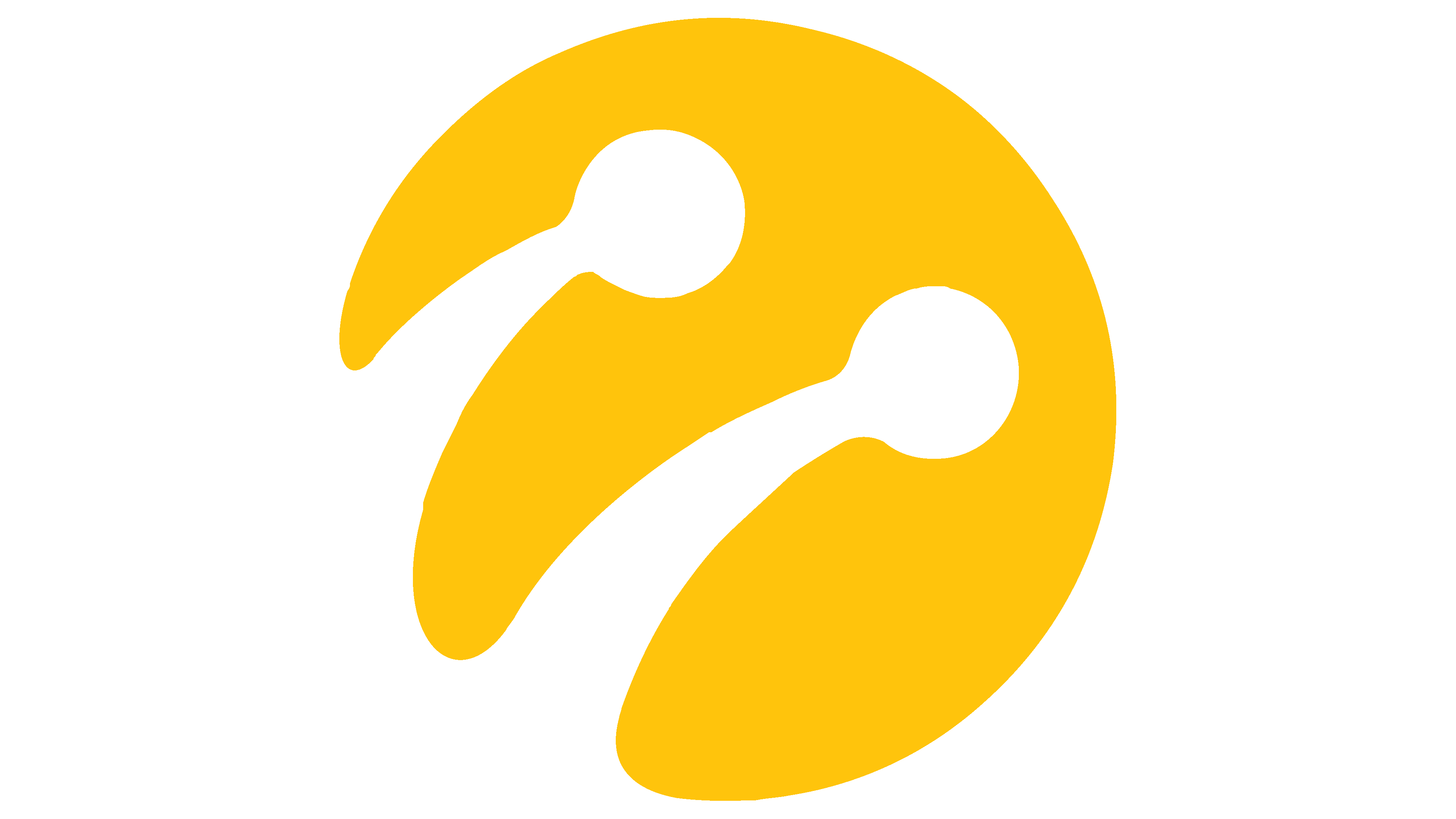
2018 – today
![]()
After the update, the current logo looks like the 2011-2017 version, but in 2D. Designers removed the overflows, shadows, gradients, and reflections, leaving only a warm yellow color. The horns of the snail stand out against its background. They also adjusted the inscription, adding boldness to the letters. The light blue color was replaced with the same dark shade.
Font and Colors
The snail is present in all versions of the logo: until 2005, it was drawn in full; since 2011, only the head. The mollusk symbolizes confident coverage of the entire territory, even inaccessible areas where no operator can reach, only the “snail.” In Turkey, due to the high mountains, there are many blind spots, so the telephone company bet on solving this problem, which attracted many subscribers.
When the logo was last updated, the Turkcell inscription was set in a new font. Since 2011, Satura Text has been used, and for branded products, a combination of Regular and Bold fonts has been used.

Despite the stability of the color palette, it has undergone several transformations. For example, the text color constantly changed from dark (on the debut logo) to light (in the current version). Blue and yellow were chosen as the main combination. They are saturated, dark, and striking. The yellow color remained from the snail, and the blue symbolizes the sky and the surrounding area.
In the new Turkcell logo, because the letters are bolder than before, the inscription appears wider and more grounded. However, the developers did not change the font. The color palette shifted from the light spectrum to the dark, turning blue into a rich sky blue. Designers made the yellow color slightly warmer, shifting it by one or two tones.