


 Dolby Digital Logo PNG
The Dolby Digital logo conveys technological sophistication and sonic precision. Its monochrome design creates clarity and modernity, while the graphics, reminiscent of perforated film, emphasize its connection to cinema and audio technology.
Dolby Digital is rooted in Dolby Laboratories, founded in 1965 in London by engineer Ray Dolby. He introduced Dolby Noise Reduction to reduce tape hiss; Decca Records adopted it first, followed by the BBC, CBS Studios, RCA, and Granada. In 1976, the company moved to San Francisco.
During the 1970s and 1980s, Dolby expanded into cinema with analog surround formats. Dolby Stereo, introduced in 1975, reshaped film sound and was used in Star Wars (1977) and Apocalypse Now (1979). By the late 1980s, digital compression enabled multi-channel audio on 35mm film.
The technical basis came from MDCT, developed in 1987 at the University of Surrey. Dolby engineers adapted it with psychoacoustic coding to create AC-3. In February 1991, it launched as Dolby Digital.
In December 1991, Star Trek VI had early digital screenings, and in 1992, Batman Returns became the first wide release in the format. Audio data was stored optically on film and read by a projector scanner at 320 kbit/s.
By 1997, over 500 films used Dolby Digital, rising to 3,700 by 2002. In 1994, CES introduced home products with AC-3, and ATSC adopted it as a US TV standard. With the DVD in 1997, it became a required audio format.
DTS was the main competitor, introduced with Jurassic Park in 1993. In 1999, Dolby Digital Surround EX expanded to 6.1 channels. With Blu-ray in 2006, Dolby added Digital Plus and TrueHD. Ray Dolby died in 2013.
Meaning and History
The Dolby Digital trademark is well-known worldwide and often appears at the beginning of feature films, video games, and television programs. The owning company registered it alongside the trademark to emphasize its corporate identity.
The emblem features the name of the audio technology, which is named after its creator, inventor, and engineer, Ray Milton Dolby. He founded Dolby Labs in 1965. Around the same time (in 1967), its original logo appeared. But it looks nothing like the modern version of “Double D,” which designers essentially invented from scratch.
What is Dolby Digital?
It is an audio compression format that reduces file size while maintaining high sound quality. The American company Dolby Labоratories, Inc., developed it, and it is often used for recording and playback in cinema, television broadcasts, and video games. This audio encoding standard achieves cinematic sound.
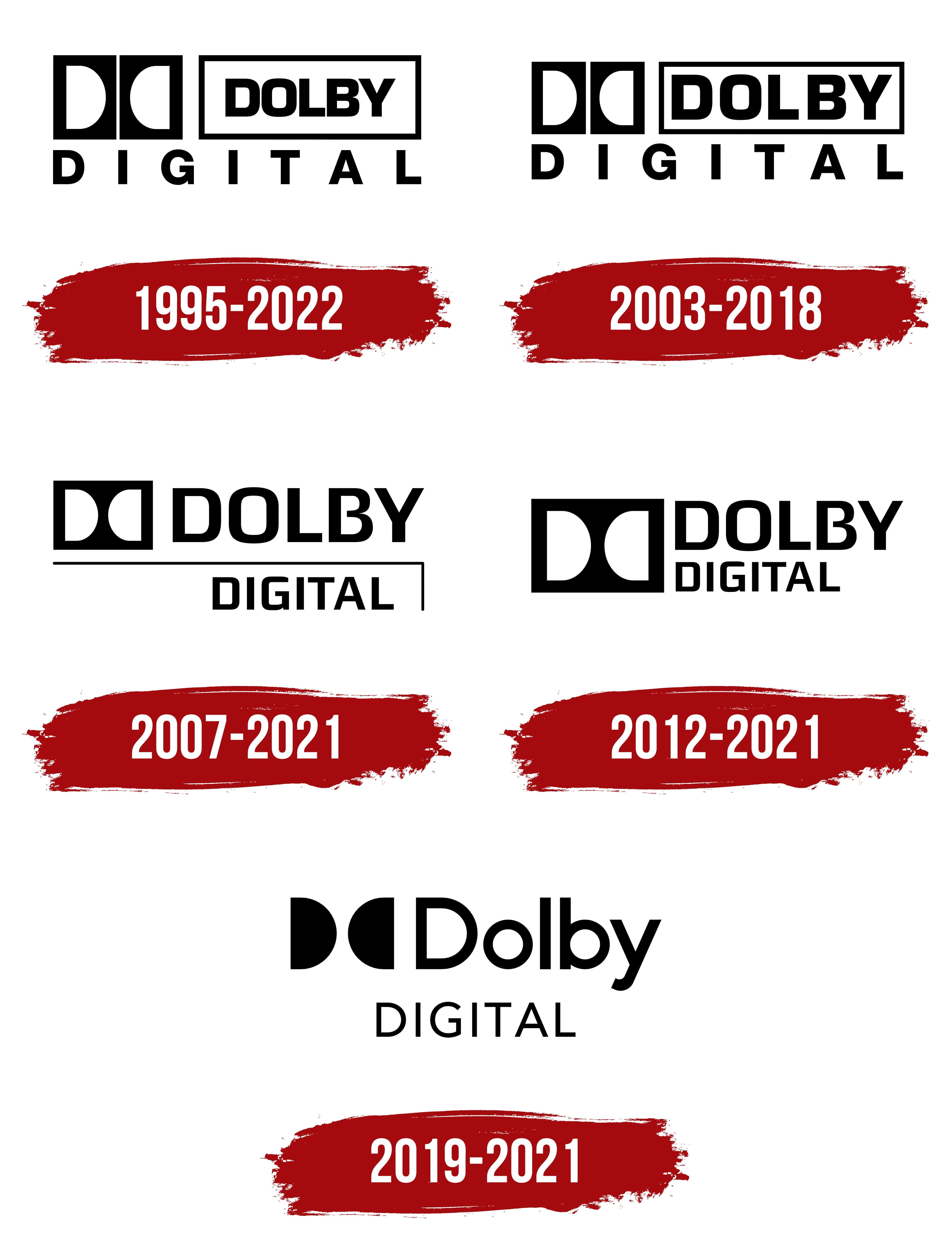
1995 – 2022

From the beginning, the brand’s logo was multi-structured and ambiguous. Each element evokes a surname, a technology, or a historical fact. In the upper-left corner is a double icon: two mirrored “D” letters. They are set against a dark background and appear as vertical cuts. To their right is another horizontal white rectangle with a wide black edge and the inscription “Dolby” centered in black. Below them is the word “Digital,” stretched across the upper elements to balance the logo. It has no frame.
2003 – 2018

While retaining the previous logo’s structure and style, designers made minimal changes. They enlarged the letters in the Dolby inscription so it fills the entire rectangle.
2007 – 2021

In the updated version, developers combined the vertical rectangles containing the two “D” letters into a single large figure with white cuts. They removed the border from the word “Dolby” and, conversely, added it to the “Digital” inscription. But it’s not a standard border, but two thin lines joined at an angle.
2012 – 2021

In 2012, another current version was released. The letters “Dolby” are tightly packed, and the word “Digital” is shifted entirely to the left, closer to the black rectangle. It has been enlarged to two lines. Borders and lines disappeared.
2019 – 2021
Font and Colors

The trademark features a horizontal rectangle with two semicircles. These are the letters “D,” facing each other with the semi-oval side. They have several meanings.
- Firstly, it’s the stylized abbreviation of the technology’s full name, Dolby Digital.
- Secondly, it’s the initials of the Dolby brothers, demonstrating the brand’s origin.
Moreover, the drawing resembles the arrangement of the optical soundtrack on film prints. Dolby Digital is printed on the perforations in the film, i.e., between the holes in its flexible substrate. The two “D” letters represent these very holes, and the rectangle acts as a fragment of photographic material.
Next to the image is the inscription: “Dolby Stereo Digital” (from 1992 to 1995) or “Dolby Digital” (from 1995 to the present). Until 2007, the first word was in a rectangular frame. In 2007, it disappeared and was replaced by a long horizontal bar. In 2012, the bar was removed, leaving only the brand name.
The letters are set in a strict sans-serif font that closely resembles Lux Typographic Studio’s Gustan Medium. The monochromatic palette emphasizes the printed-text style. The emblem also has two officially approved color combinations: black on white and white on black.