The current Huawei logo reflects solidity, rigor, and compliance with the requirements of modern display methods. It is characterized by clarity, evenness, and conciseness in the execution of telecommunication products, distinguished by style and accessibility.
Huawei: Brand overview
| Founded: | 15 September 1987 |
| Founder: | Ren Zhengfei |
| Headquarters: | Shenzhen, China |
| Website: | huawei.com |
Meaning and History
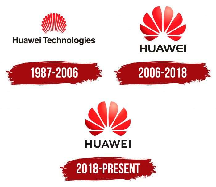
The debut logo arose simultaneously with the company. Over time, it changed several times, but it undoubtedly remained within the framework of the original idea and had approximately the same visual form. It always had narrow or wide lines, an invisible white semicircle in the center, and the name below, executed in a strict font.
What is Huawei?
Huawei is a technology company from China. Since its foundation in 1987, it has been involved in the production of telephone switches. Later, its business expanded to the construction of telecommunication networks and the supply of equipment for cellular operators. Now, the corporation manufactures laptops, smartphones, and other devices.
1987 – 2006
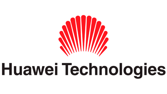
This year’s emblem represents the rising sun’s elongated rays, which seem to peek out from behind the horizon. Below them is the inscription “Huawei Technologies,” executed in a classic font. The first letters are uppercase; the rest are lowercase. The legs of “l” and “h,” as well as the dot over “i,” match the height of the capital “H” and “T.”
2006 – 2018
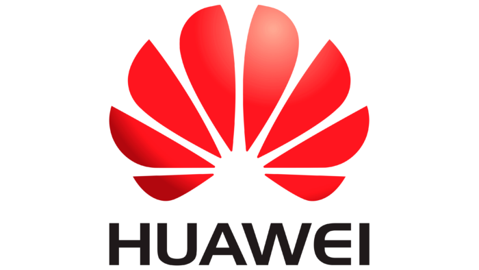
This period is legendary in the history of the logo, as the company underwent a redesign. Thin rays have now turned into wide petals. Also, out of 15 elements, the artists left 8, evenly distributing them around the word “Huawei.” The proportionality of the segments remained the same, so the lower side parts look shorter than the central upper ones. Some details were supplemented with highlights to create a three-dimensional effect. The inscription is in uppercase. The letters “U” and “E” were rounded.
2018 – today
In 2018, changes mainly affected the upper part of the logo. The color became more saturated and darker. The 3D effect disappeared, so the company logo now looks more solid and strict. This is related to the need to print the logo so that it looks equally good as a label and as an official sign. Guided by this principle, the developers revised the text part and returned “U” and “E” to the previous style – clear, even, and concise.
Huawei: Interesting Facts
Huawei is a big technology company from Shenzhen, China, known for making things like phones and helping with internet services.
- Starting Out: Ren Zhengfei started Huawei in 1987. At first, they made equipment for phone calls but grew into a huge company that works on internet stuff.
- Research and Development: Huawei spends a lot of money developing new and better technology. Many countries have special places just for this purpose.
- Worldwide Work: Huawei has offices in more than 170 countries. It helps set up internet networks and sells phones and other gadgets.
- Leading in 5G: Huawei is important in making 5G, the newest way phones connect to the internet, available everywhere.
- Big in Smartphones: Huawei has sold more than any other company. Their phones are known for being good, especially their cameras.
- Some Problems: Some countries are worried about Huawei, thinking it might help the Chinese government spy on people. This has made it hard for Huawei to sell its products in places like the USA.
- Their Own Operating System: Because of these problems, Huawei made its system for phones and gadgets, HarmonyOS, after they couldn’t use Google’s Android anymore.
- Caring for the Planet: Huawei is trying to do things that are good for the environment, like using less energy and supporting clean energy projects.
- Helping Others: They also spend money on scholarships, training, and helping out when disasters happen, showing they want to be a good part of the community.
- Other Cool Tech: In addition to phones and the internet, Huawei is working on cloud computing, artificial intelligence, and smart city technology, which could change how we live and work.
Huawei has grown from a small company to a technology leader. Despite challenges, it is still trying to bring new and exciting tech.
Font and Colors
“Huawei” in Chinese translation means “flower.” Therefore, the company placed an emphasis precisely on this meaning. Moreover, one of the characters that make up the word resembled the debut version of the logo. Initially, designers tried to link the picture of a blooming semi-bud with many thin petals with an image of the sun. Such a technique indicates an association with upward movement.
But then the image of the flower got a more recognizable picture. As a result, the company’s idea means that something new has begun. The logo’s brand colors have always been the same: black, white, and red, with varying shades.
The 2006-2018 logo uses the Handel Gothic Bold font. It’s a sans-serif font with a characteristic semicircular letter “E,” resembling an inverted “U.” After the 2018 redesign, the font changed: the strokes became thinner, and the rounded letter “E” acquired two straight angles.
The color palette of the logo has always been unchanged. Since the graphic element symbolizes the dawn sun, the rays are painted in several shades of red. The word “HUAWEI” is black, and the overall background is white.
Huawei color codes
| Fire Engine Red | Hex color: | #cf0a2c |
|---|---|---|
| RGB: | 207 10 44 | |
| CMYK: | 0 95 79 19 | |
| Pantone: | PMS 186 C |
| Black | Hex color: | #000000 |
|---|---|---|
| RGB: | 0 0 0 | |
| CMYK: | 0 0 0 100 | |
| Pantone: | PMS Process Black C |
