Going beyond the known, expanding horizons, and being ahead of its time – all this is the HP logo. The shape of the emblem is pleasing to the eye. The color scheme is a symbol of a business approach and innovation. The sign shows the desire for the future to create maximum comfort for users.
HP: Brand overview
| Founded: | January 1, 1939 |
| Founder: | Bill Hewlett, David Packard |
| Headquarters: | Palo Alto, California, United States |
| Website: | hp.com |
Meaning and History
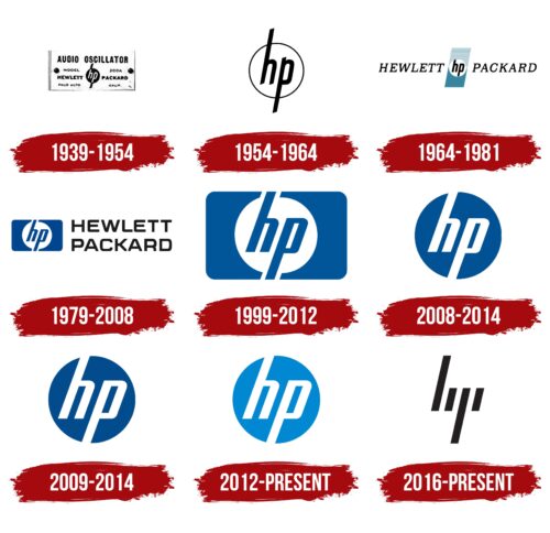
The evolution of the HP logo reflects all of its transformations – from the moment the company was founded in a garage to its division into two parallel structures. The direct successor of the parent corporation was HP Inc. Her visual identification mark appeared in 1939 and did not change dramatically. The original version is black and white. The color of the logo was added only in the late 1970s. An innovative version is currently in use.
What is HP?
HP is a company that succeeded Hewlett-Packard. It was founded in 2015, while its predecessor was established in 1939. It is an American corporation that manufactures PCs, scanners, printers, and software and provides IT services. It is best known for its computers and has competed with market leaders such as Apple, Lenovo, and Dell.
1939 – 1954
The debut emblem directly reflects the company’s name, made up of the names of the founders – Hewlett and Packard. The logo also had a lot of related information that was of a marketing nature. In the middle of the rectangular background were the lowercase letters “hp” enclosed in a circle. Their ends protruded outward.
1954 – 1964
In 1954, the company decided to reduce the branding to a single “hp” in a circle. Leg “h” is directed up, “p” – down. They extend beyond the borders of the edging by the same distance. The letters and the thin line surrounding them are in black, the background circle in white.
1964 – 1981
This period is very significant for the HP emblem, as it appeared in blue. The hp monogram is now positioned between two narrow multidirectional rectangles that form around white space at the junction. It is in it that the abbreviation is located. The lower part is solid black, the upper part is blue, composed of separate wide stripes. There is complete decoding of the corporation’s name to the right and left of the graphic sign – the names of its founders (the first is Hewlett, the second is Packard). They are in thin capital letters. The logo has a slight slope to the right.
1979 – 2008
The developers took the circle with the lowercase abbreviation into a vertical rectangle to highlight it because they placed the full version of the company name next to it. The letters “hp” have the same design as the previous logo but without vertical elements. They are painted blue, occupy a diagonal position inside a white circle, and are provided with an elongated background in the places where the legs are located. On the right side, there is two-level “Hewlett Packard” lettering in bold and smooth sans-serif glyphs.
1999 – 2012
In 1999, Siegel + Gale design bureau improved the logo, offering a terse version. As a result, the logo became completely blue. It consists of a horizontal rounded rectangle with “hp” in the center on a white background. Its width corresponds to the length of the protruding legs.
2008 – 2014
The emblem of those years became round again. A blue or black circle on the background of which the abbreviation “hp” was executed in white.
2009 – 2014
At first glance, it may seem that this version is identical to the 2008-2014 version, but it is not. There are differences between them. Here are larger signs with increased intra-letter space and a slightly lighter color, literally changed by one tone.
2012 – today
In 2012, the round logo began to be used in a softened palette. But at the end of the period came a turning point in the IT corporation’s work: it was divided into two independent companies. The legal successor was HP Inc., which took over the production of computers and other digital equipment.
Initially, the company reverted to the 1981 emblem, which features a blue rounded rectangle and a “hp” monogram on a white background.
A round version is used in soft colors with white letters on a light blue substrate in parallel.
2016 – today
In 2016, the company finally decided to adopt a new trademark developed for it by Moving Brands studio in 2008-2011. It has four oblique black strokes and is found on premium products.
HP: Interesting Facts
HP, Inc. is a big name in the tech world, tracing its roots back to Hewlett-Packard, a company known for breaking new ground in computing, printing, and IT infrastructure.
- Early Days in a Garage: HP started in a tiny garage in Palo Alto, California, in 1939, founded by Bill Hewlett and Dave Packard. This spot is where Silicon Valley began and is marked as a historical site.
- The Name Game: The company’s name came from a coin toss. It could have been “Packard-Hewlett” if the coin had landed differently.
- First Big Product: HP’s initial offering was an audio oscillator, the HP200A. Disney bought several of these for the sound system in “Fantasia.”
- Leading the Way in PCs: Before “personal computer” became a household term, HP introduced the HP 9100A in 1968, a big step forward in computing.
- Calculator Revolution: The HP-35, launched in 1972, was the first handheld scientific calculator, changing the game for many professionals and students.
- A Company Divided: In 2015, Hewlett-Packard split into HP Inc., focusing on PCs and printers, and Hewlett Packard Enterprise, for business products and services. This move was about sharpening their competitive edges.
- Eco-friendly Practices: HP is praised for its sustainability. It works hard to lessen its environmental impact, recycle more, and make its products more energy-efficient.
- Advancing 3D Printing: HP is also pushing boundaries in 3D printing, aiming to make manufacturing quicker, cheaper, and greener.
- Worldwide Influence: With operations around the globe, HP’s products reach millions, showing its lasting mark on the tech industry.
- Innovation Continues: Despite the tech world’s rapid changes, HP focuses on innovation, investing in research to bring new tech solutions to life.
From its modest beginnings to becoming a tech giant, HP’s story is about innovation, vision, and entrepreneurship. Its ongoing journey reflects its role in shaping the tech future, staying true to its pioneering spirit.
Font and Colors
The logo consists of four lines at a 13-degree angle. Each line has a different length and represents a specific part of the corporation name. The emblem is sleek, elegant, innovative, but hard to read. Therefore, it is difficult for consumers to understand the first time what it means.
The abbreviated company name is in lowercase letters and is part of the brand’s graphic identity. It was always in uppercase and written in thin characters, which added a slight slope depending on the version. The typeface is simple, sans serif.
The color of the logo appeared in 1974. The designers chose blue – the embodiment of reliability and professionalism. It also symbolizes protection and the latest technology, which the corporation sought to emphasize. The emblem is black and white.
HP color codes
| Black | Hex color: | #000000 |
|---|---|---|
| RGB: | 0 0 0 | |
| CMYK: | 0 0 0 100 | |
| Pantone: | PMS Process Black C |

