The PlayStation logo is a race track that the console user enters, and the gaming world is full of adventures and speed. The emblem features a three-dimensional image, making characters and objects look lifelike.
PlayStation: Brand overview
| Founded: | December 3, 1994 |
| Founder: | Sony Interactive Entertainment |
| Headquarters: | Minami-Aoyama, Minato, Tokyo, Japan |
| Website: | playstation.com |
Meaning and History
Today, the brand falls into the globally recognized category, as its consoles and video games have attracted worldwide attention. The unique logo can be seen anywhere in the world. Despite its youth, the emblem has been updated several times and has several versions.
The start of the logo’s planetary march dates back to 1988, when Sony, in collaboration with Nintendo, attempted to create a console. However, disagreements over project plans led to the dissolution of their agreement. After that, it took the Japanese corporation five years to develop a gaming console independently, which was released a year later than planned. It also introduced an original logo.
What is PlayStation?
PlayStation is a Japanese video game brand owned by Sony Interactive Entertainment. It includes seven consoles (5 home and two portable), several magazines, a website, a smartphone, and a media center. The first gaming console under this name was released in 1994.
1994 – 2009
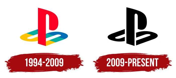
The debut emblem appeared in 1994. It is based on an artistic combination of the letters “PS” – short for PlayStation. About 20 variants were presented to the management, among which this one won. Its creator is Japanese artist-designer Manabu Sakamoto, who created other equally famous Sony signs (VIAO).
He proposed a three-dimensional logo, with “P” depicted standing and “S” lying, as if it were the shadow of the first letter. The semi-ovals are interestingly played out, leaving the top part of the “P” open. Overall, it is a unique combination of text, graphics, and color, as the round elements are painted in different colors – blue, red, and yellow.
There is another variation used for PlayStation 3. It features a blue “S” almost horizontally with yellow and red dots above and below. In another version, the company returned to the debut color scheme but made the logo in an entirely different form.
Manabu Sakamoto also developed a full set of characters, including some other signs: the brand can use them for any generation of consoles. In these versions, the letter “P” is also played with a white “S” inside.
2009 – today
The current modification of the PlayStation label is the most minimalist in terms of color. It consists of a classic combination of black and white, maintaining an elegant contrasting look. In terms of presentation, it is an exact copy of the previous version, with an accurate ratio of geometric shapes and graphics.
Individual designations for each series of gaming consoles are still used. In them, the contour lines are curved in the form of the letters “P” and “S,” with the serial number of the console or video game on the right. The symbols have a serpentine shape and are written continuously.
PS4
The emblem of the fourth version of the console, released in November 2013, follows the overall brand concept. On the left is an icon in the form of capital letters “PS,” one of which stands vertically, and the other appears to be its flat projection or shadow. On the right is the abbreviation PlayStation. It is made using contour symbols. Due to their unusual shape, the curved stripes resemble ribbons or kabbalistic symbols. The series number of the gaming console is indicated next to it. The number “4” is made large – even massive, with thin lines. This impression is created not only because of the large gap but also because of the shortened leg.
PS5
Although the logo of the new generation Sony PlayStation PS5 console appeared in November 2020, it still has old roots. The emblem’s design is the same as the previous version. The only change is in the numbering. The gaming console is complemented by an original number “5”, which denotes its next number. Externally, it resembles the first and second letters of the abbreviation “PS.” It has the same large format and similar bends. However, there is a slight difference: in the top left corner of the five, there is a right angle of 90 degrees.
PlayStation: Interesting Facts
PlayStation is a famous video game brand that has changed how we play games.
- How It Started: Sony made PlayStation, and it first came out in Japan in 1994. A year later, it was sold in North America and Europe. This was Sony’s first video game console.
- Before PlayStation: Sony wanted to make a CD-ROM for Nintendo’s SNES console. But things didn’t work out, so Sony decided to make its game console.
- Big Success: PlayStation became popular because it had better graphics, many cool games, and used CDs, which could hold more game data. It was the first console sold to more than 100 million people worldwide.
- The Controller: PlayStation’s controller was new and different. It had thumbsticks and could shake (vibration feedback), making games feel more real. The DualShock controller, which came out in 1997, set the standard for all future PlayStation controllers.
- Playing Online: In 2006, PlayStation launched PSN (PlayStation Network) with the PlayStation 3. This network lets players play games together online, stream movies and music, and buy games digitally.
- Portable Gaming: In 2004, Sony made the PSP (PlayStation Portable), its first handheld game device. It had good graphics for a small device and used special discs for games.
- PlayStation 2: This came out in 2000 and is the best-selling game console ever, with over 155 million sold. It was loved for its great games, strong hardware, and the ability to play original PlayStation games.
- Virtual Reality: In 2016, PlayStation released PS VR for the PlayStation 4, making VR (virtual reality) games more common for everyone. This shows Sony’s love for trying new things in gaming.
- Making Games: Sony has a group called PlayStation Studios that makes some of the best video games, like Uncharted, The Last of Us, and God of War.
- Community and eSports: PlayStation has a big group of fans who play games online together. It also supports eSports, which are video game competitions.
From its early days as a project with Nintendo to leading the game world, PlayStation keeps bringing new ways to have fun, connect with others, and enjoy games.
Font and Colors
The logo uses a custom font developed as part of the overall visualization. Its author is designer Sakamoto, who created it specifically for the PlayStation project. The letters are characterized by strict and straight lines with smooth bends at the “a,” “o,” and partially “n,” making them look simple. The main emphasis is on the capital “S” and “P,” as well as on the “t,” which has half of its top stroke cut off.
Regarding color, for most of its history, the emblem focused on three shades: yellow, red, and blue. The current version of the emblem is monochrome due to the laconic combination of black and white.
PlayStation color codes
| Black | Hex color: | #000000 |
|---|---|---|
| RGB: | 0 0 0 | |
| CMYK: | 0 0 0 100 | |
| Pantone: | PMS Process Black C |


