


![]() LG Logo PNG
LG Logo PNG
The LG logo is a monogram of the first letters of the merged companies, which became the largest Korean conglomerate. The emblem, which formed the basis for the slogan “Life’s Good,” reflected the brand’s success, credo, and position.
LG’s history began on January 5, 1947, when Koo In-hwoi founded Lak Hui Chemical in Seoul. The company first became known for Lucky Cream, Korea’s first locally produced face cream, and later for toothpaste and plastic goods. In 1952, Lak Hui launched the country’s first plastic production.
In 1958, GoldStar Co. was created to develop domestic electronics. The first Korean-made radio appeared in 1959, followed by a refrigerator in 1965 and a black-and-white TV in 1966. Cooperation with Hitachi accelerated technology development, and by 1976, the company was producing one million televisions per year.
In 1977, GoldStar introduced the first color TV in South Korea and opened production in the United States. In 1983, Lucky and GoldStar merged to form Lucky Goldstar, combining their chemical and electronics divisions into a single structure.
A rebranding occurred in 1995, when the company adopted the name LG, a new logo, and the slogan “Life’s Good.” LG Electronics became the main global brand for consumer products.
In 1999, LG acquired Zenith, gaining access to US patents and distribution. A joint venture with Philips helped launch LCD panel production, and by 2009, LG Display became a leading manufacturer. Competition with Samsung Electronics intensified across key categories.
In 2013, LG released its first commercial OLED TV. In 2021, the company exited the smartphone business after years of losses, shifting focus to B2B technologies, automotive components, and display innovation.
Meaning and History
![]()
The financial-industrial group’s modern logo looks futuristic, although its prototype dates back to 1995. Since then, it has barely changed: designers worked with the color palette and additional details, keeping the main symbol in its original form.
What is LG?
LG is a global diversified corporation specializing in telecommunications products, household appliances, electronic equipment, and chemicals. It was founded in 1947 by businessman Koo In-Hwoi and is privately owned by his family. Today, it is the fourth-largest organization in South Korea, owning numerous subsidiaries and brands. The conglomerate’s name is an abbreviation of the phrase “Lucky-Goldstar.”
Lucky company
1947 – 1963
![]()
LG’s predecessor had a simple, understandable logo aimed at Asian consumers, featuring hieroglyphs. They wrote the company’s full name, which occupied two lines. The upper inscription was in a red oval, and the lower was on a white background.
1964 – 1978
![]()
After the redesign, the emblem looks more modern. Developers replaced the oval with a rounded-corner rectangle and placed the English letter “L” with a wavy horizontal line. They placed the name that used to be in the red oval on the right. Designers also used a different font for the hieroglyphs, a straight, strict one, whereas the old logo was italic.
1978 – 1983
![]()
A blue square appeared to the left of the full company name. It had outwardly bent edges and non-sharp corners. Inside was a flower with four ornate petals. It was made of a solid white line. Each side had a heart shape.
1983 – 1995
![]()
Before the merger, “Lucky” used the 1964-1978 emblem. But there was a difference. In the updated version, the wavy letter “L” received a two-tone crown with five rays and white dots at the ends. The rectangle’s corners became straight at 90 degrees. Instead of red, a subdued pink hue was used. However, the designers used the same Chinese-character inscription as on the 1978-1983 logo.
GoldStar company
1958 – 1964
![]()
In 1958, the main company acquired a subsidiary, GoldStar. Under the GoldStar brand, owned by the parent company, household appliances and electronic equipment were produced. Its logo consisted of half a star, with its rays forming a crown. At the top of each was a miniature circle. Two central rays were black, and the other three were white. The company name was placed below the emblem, written in connected script text with straight letters. The inscription resembled Arabic calligraphy.
1964 – 1983
![]()
Designers added a black square on which they placed a white circle with a clockwork star and the abbreviation “GS.” This abbreviation represented a shortened version of the company name.
1983 – 1995
![]()
During this period, the GoldStar logo consisted of the previous emblem, painted in pastel pink. The expanded brand name on the right was the same color. The letters had a strict geometric shape, minimal rounding, and straight corners. The signs “d” and “a” were very similar in appearance; the “t” lacked the left fragment of the horizontal bar, and the “r” resembled a bracket.
LG Corporation
1995 – 2014
![]()
In 1995, the company’s head merged the brands and gave them a new name, LG. The emblem’s authors presented these letters as a concise monogram. A lowercase “L” is depicted inside a capital “G.” Together, they are at the center of a red circle.
![]()
In 2005, the logo underwent a minor redesign. Developers added a separate gray abbreviation, “LG. ” Another change occurred in 2011 when a three-dimensional version of the symbol with shadows and highlights appeared.
2014 – today
![]()
The current emblem exists in two versions: 2D and 3D. They are equal, although the first is often used as an identification and corporate sign. The second is used as a trademark, i.e., for advertising, and appears on product packaging. According to the authors’ idea, the 3D image should attract attention by providing a visual impact for consumers. It preserves the legacy of the two-dimensional logo and positions LG in a new perspective.
2023 – today
![]()
LG electronics logo
The electronics giant introduced a new square-shaped logo, moving away from the previous round design. The company decided to simplify its emblem, which already included a round element in the capital letter “G.” This letter is stylized as a squint-eyed human face with a nose and mouth shaped like an “L.”
The new design allowed the removal of borders from abbreviations used as graphic symbols, creating a cleaner, sleeker look. Changes affected not only the shape but also the color. Designers lightened the red shade by several tones, turning it from deep burgundy to a brighter scarlet.
This logo change represents more than just a visual update. It reflects the company’s changing identity and its desire to present itself in a more modern, accessible manner. The new square design, devoid of unnecessary ornamentation, aligns with the modern aesthetic that prioritizes simplicity and clarity. The company retained its recognizable features by subtly changing the color and removing the round frame, giving it a fresh and updated look. The new logo symbolizes the brand’s continuous innovation and adaptability, showing that even well-established icons benefit from thoughtful redesign.
Font and Colors
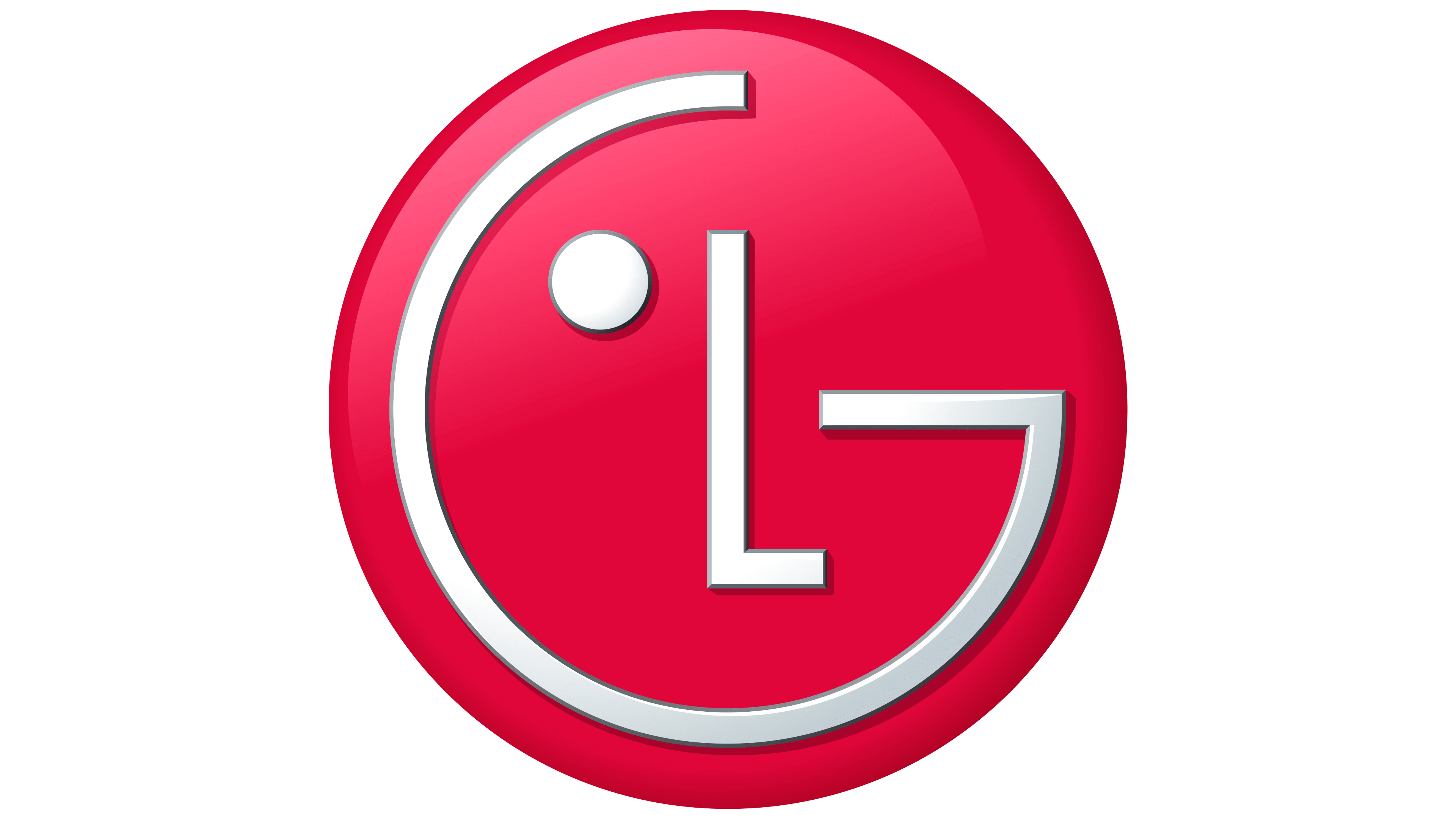
The large red circle represents the globe, reflecting the brand’s global presence and technology. The other elements are also symbolic: “G” is a smile, and “L” is a dot with a nose and an eye. The friendly face emphasizes accessibility and friendliness, conveying the company’s desire to establish long-term relationships with customers and delight them with quality products. The fact that there is only one eye also has meaning. It speaks of determination and fidelity to its ideals.
The emblem’s authors used the Helvetica Black font. In 2014, the letter “G” lost its customary notch and became stricter. In addition, the letters became thinner, and the “LG” inscription slightly increased in size, now matching the famous round emblem.
The logo’s color palette consists of LG Red and LG Gray. The main one is a dark shade of red, symbolizing the company’s goodwill. Dark gray is used as an additional color so the abbreviation does not stand out against the circle and balances its brightness.