Deutsches Historisches Museum updated its mark, bringing the short name dhm to the fore. For the museum in central Berlin, the move to an abbreviation is connected with the desire to sound closer to the city’s audience. History remains the main subject, while the presentation becomes lighter and more open.
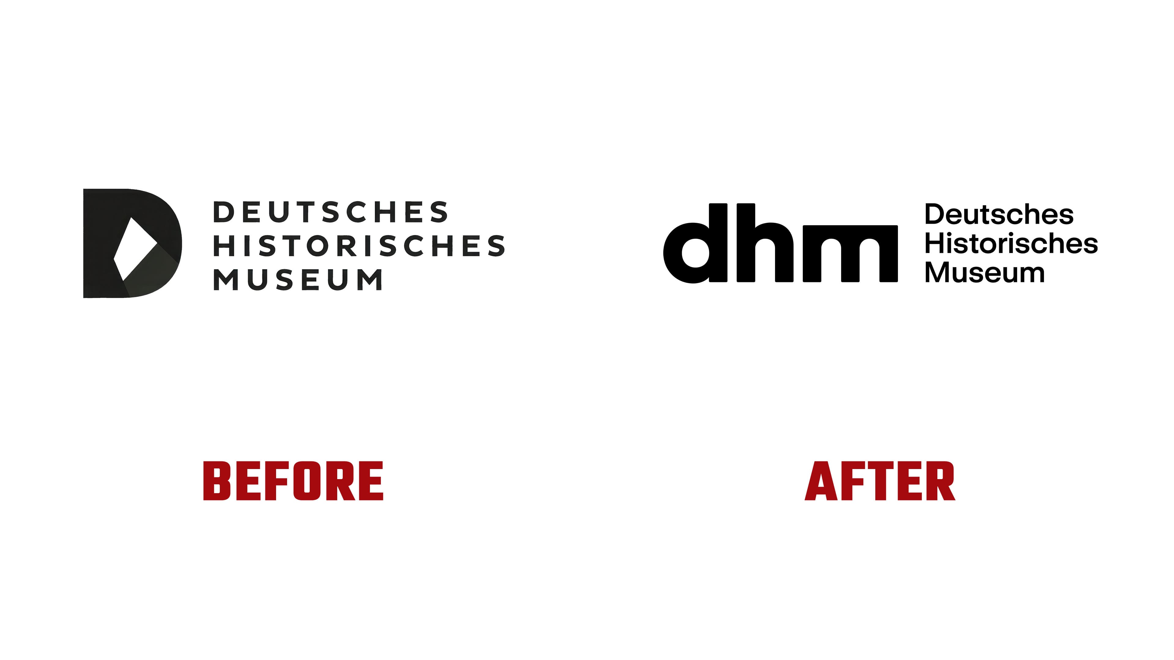
The new corporate design was introduced in May 2026. The system was created by “s t a t e”. The previous logo was built around a large letter “D” with an abstract form inside. It looked official and recalled museum identities from the late twentieth century. In the new version, the distance is reduced. The full name and separate symbol give way to the short dhm, already familiar in everyday communication.
The idea rests on three letters. They are dense, rounded, and restrained in form. The letter “m” received an arched silhouette. It refers to the Zeughaus, the museum’s historic building in Berlin. The architectural detail connects the mark with a real place and moves the image away from an abstract cultural institution.
The shift from the old “D” to dhm changes the brand’s tone. The previous symbol looked closed and strict. The new acronym sounds shorter and lighter, and it works well for posters, the website, wayfinding, printed materials, and the urban environment. The connection to history remains through the letter’s shape, without relying on direct museum clichés.

The system uses GT Standard. It helps handle text cleanly across different formats. The logo sets the main tone. It brings together the museum’s name, the building’s architecture, and the new public role of dhm.
Now dhm reads as a full name for Deutsches Historisches Museum. The update helps the museum appear closer to people and to contemporary Berlin while maintaining the seriousness of the historical subject.