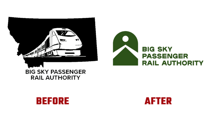
Closed more than 42 years ago, passenger train service through Southern Montana got a second chance to restore public transportation through the area. With the creation of the Regional Passenger Rail Authority, through the enactment of MCA 7-14-16, it will be possible to manage, investigate, analyze and control local urban rail services. The high value of such a corridor is that such a corridor acts as an effective economic engine in the communities covered by the action areas. Through such systems, precedents are set for profits for the communities that serve the transportation system. To draw attention to the idea of rebuilding the movement, the brand has begun to actively work to create an attractive, modern image, the main lines of which have recently been introduced to potential users and investors.
The new identity was not just a way to introduce the prospective offer and its features. The main task, the solution of which was provided by the visualization, was the preservation and improvement of abandoned railroads and their effective use for agriculture, industry, and civil transport in the future. Developing the brand’s logo, the designers proceeded from the need to make it not only informative but also particularly attractive. The ability to correctly and interestingly present the visual information at the moment depended, in fact, on the future of the new program. A special role in achieving the goal was played by the original color solution of the logo.
Its main colors – bright red and classic black created a readable and easy visual picture and the necessary atmosphere of the whole composition. The choice of red was predetermined by the main features of the created structure. Not only is it the most attractive, but it is one of the main colors in human life and psychology. This color symbolizes an important feature – the demand for attention and understanding of the dangers that necessarily accompany a mode of transport such as railroads. It echoes the “red traffic light,” providing an easy-to-remember and brand recognition. This effect is reinforced by the contrasting black element of the logo image in the form of a railway tunnel going into the distance.
Among other things, the text module – the full name of the management of this railroad, made in a clear, easy-to-read font in black – impacts the creation of the desired atmosphere. The architecture of the text construction provides ease of perception. The text, printed with an indentation on the left edge, is arranged in a “staircase,” making it easy to read on any scale when transmitted typographically or digitally.


