![]()
“Blacklane” updated its brand with “Anomaly” and shifted its presentation from ordinary rides to premium service. The company was founded in Berlin in 2011 and operates as a global chauffeur service. It offers city rides, airport transfers, intercity routes, and hourly bookings. In April 2026, the brand introduced a new identity and an updated corporate travel booking platform.
The main idea was named “Flow.” For “Blacklane,” it is not about a route as a set of points, but about the passenger’s condition upon arrival. The brand focuses on calm, concentration, control, and eliminating unnecessary steps along the path from booking to exiting the car. The company moves away from the image of ordinary ground transportation. It presents the ride as part of preparing for a meeting, a flight, or an event.
![]()
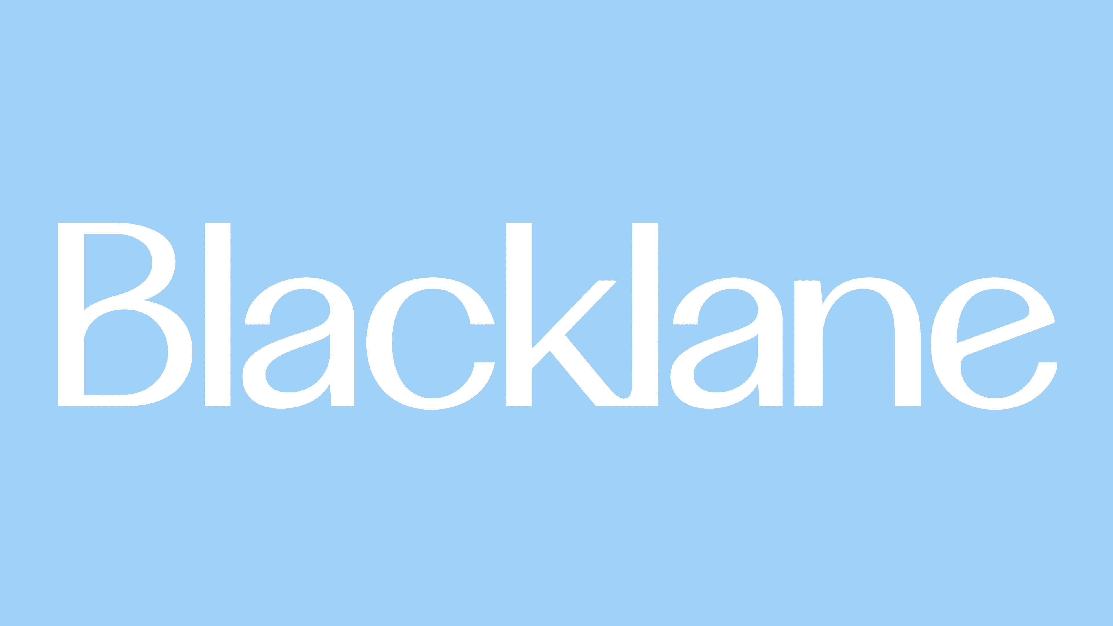
The new logo became softer in tone and more disciplined in execution. The wordmark no longer looks like a heavy corporate mark. It became calmer and more high-end. Sentence case removes unnecessary rigidity while keeping a sense of order. The new icon emerges from the curves of the wordmark and appears as a single geometric line. It conveys a route without breaks, where the ride feels like one continuous experience.
The visual system received the color “Blacklane Blue.” It replaces the functional tones commonly used in ground transportation with a calmer, more premium image. It is supported by gradients tied to different states of “Flow,” from energy to concentration.
![]()
The update affected the brand’s entire ecosystem. The website, app, booking process, communications, chauffeur uniforms, in-car experience, and service touchpoints all changed. For the customer, everything is meant to come together into a single scenario: search, booking, meeting the chauffeur, the ride, and feedback.
Blacklane’s first major update since 2019 is tied to the company’s global growth and its move to a new level in the luxury mobility category. In its new image, the brand presents itself as a personal service for private and corporate clients, with no association with taxis or car rentals. The logo, color, and digital platform work toward one idea: a ride matters when it helps a person arrive composed and ready for business.