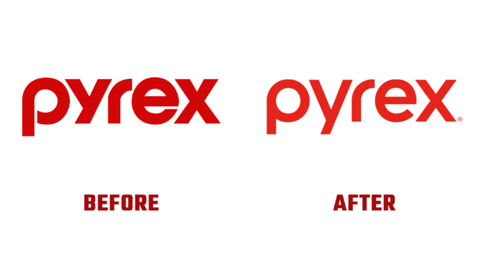
An iconic manufacturer of unique cookware, Pyrex unveiled its new visual identity today. For more than a hundred years, the brand, founded in 1915, has been giving people the opportunity to become owners of warm family memories of joint feasts, occupying a significant place in hearts and homes. During this time, dishes made of durable and highly aesthetic glass have become not just an object for serving dishes but also a way to satisfy one’s passion for food with the help of aesthetic design. It has become valuable memorabilia that is passed down from generation to generation, taking a leading place in kitchen interior design, becoming a symbol of high culture and a valuable family heirloom. The brand’s main goal has always been to bring joy to everyone who loves to cook, share meals with family and friends, and strive to deliver the best and most unforgettable experience to food lovers worldwide. All this is reflected in the brand’s renewal, which is proud of its hundred years of history and always wants to remain relevant and modern.
The new identity is geared towards young families who are the first generation to grow up on social media. The modern trend towards making everything look perfect, especially in cooking, has cast a certain shade on consumer demand and the principles of selection of dishes. With fewer people wanting to cook for themselves, many are missing out on opportunities for creative expression. Thus, they deprive themselves of unforgettable impressions and pleasant memories of loved ones eating food in a single and friendly circle. To break this vicious circle, the brand makes every effort to draw attention to the cooking process with its unforgettable and prestigious products. This became the basis of the deep meaning of the new strategy and identity created. The presented design system inspires a new generation to be confident in the success of their creativity. It reinforces the iconic status of the brand, transforming it from a functional product into a modern lifestyle.
The visualization emphasizes the commitment to historical experience, using a traditional bright red hue as a corporate color. It creates new expressions and illustrations, making it easier to navigate the entire system of the brand and its sub-brands. This effect is enhanced by new Sharpie-style typography, highlighting the uniqueness of handicrafts in their noble imperfection, especially found in culinary arts.
The packaging design and photographs have been updated to reflect the boldness and confidence of the modern lifestyle, refreshing the real relationship between man and food. Identity has become a spectacular reflection of the many different ways of preparing and serving food, through which people get unforgettable pleasure from this amazing process.


