The Hotjar service, located in Malta, allows you to increase conversion on the site and create convenience for Internet marketers when studying user behavior and priorities. Founded in 2014, the instrument has undergone many revisions and improvements over the years of its existence. The service has become more flexible and multifunctional, which has led to a rethinking of strategy and visual identity—the How&How design studio has successfully implemented this project. Hotjar’s effectiveness lies in providing customers with “real-world experience analysis” of various products that have been used directly by users.
The program uses heatmaps to record the points of clicking, moving, and scrolling sites. Thanks to thermal traces, a real-time action map is created. All clicks, mouse movements, turns, and pressing of certain buttons are recorded “live.” The nature of the direction of the response is also determined – disappointment or delight. The Hotjar team consists of 200 people living across Europe, the Americas, and Africa, and the product has been applied to over 900,000 websites in 180 countries.
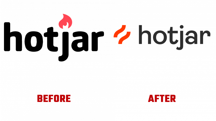
Rebranding matured a long time ago. The image was not very good. The flame was more like a Tinder variant, not very inclusive. Having become an important tool for many users, the service began to be perceived in a completely different way in its new visual identity. Today, a brand of the future has been created, where three main areas are highlighted – audience coverage, vision, goal. Inspiration through compassion was an important point. The basis of the image was made up of two red zigzags, symbolizing short-term flashes. At the same time, they represent an expressive duplicated line of the user’s path. The gentle curve in the logo hints at the warmth of the legendary flame and the letter “H” – the capital letter of the name.
To the right of the sign, the service name – Hotjar is executed in black letters. The Konstanz Semi Bold by W Type Foundry typeface with slightly revised letters “a” and “r” looks very impressive as a name. Visually, the new logo provides a display of flame, taking on abstract heat waves. The transition of parallel red straight lines into an association of something similar to tongues of flame looks original, which is very well received in social networks and digital advertising. The introduction of some visual adjustments made it possible to make the transitions softer and smoother. At the same time, the legibility of the images and the logo are ensured in the smallest sizes.


