The iPhone logo is the lightness of lines, purity, and style. All this characterizes the phones of the brand. Ease of operation and technical excellence make iPhones the leaders of the segment, and thanks to the stylish design, the device has become an indispensable attribute of a wealthy person.
iPhone: Brand overview
| Founded: | 2007 |
| Founder: | Apple Inc. |
| Headquarters: | United States |
| Website: | apple.com |
Meaning and History
Work on a prototype of what eventually became the iPhone began in 2004. Apple recruited a group of highly qualified professionals, especially for this project. One thousand people were invited. The team was headed by three engineers: Tony Fadell, who was responsible for the software; Sir Jonathan Ive, who was responsible for the construction; and Scott Forstall, who was a programmer. They worked together on Project Purple.
At first, the goal was to create an innovative tablet, but then CEO Steve Jobs changed priorities in favor of a multifunctional mobile phone. It eventually emerged in secret collaboration with Cingular Wireless, renamed AT&T Mobility. Since then, the company has launched one device each year that improves over the previous one: the smartphones have an improved configuration with modified stuffing. One of the latest series is the iPhone 12, which includes several models with the A14 Bionic processor and 5G connectivity.
The brand’s name, which is the basis of the brand identity, was invented by Jobs. According to his concept, the word iPhone is derived from such terms as “internet,” “inspire,” “inform,” “individual,” and “instruct” (instruct). They are indicated by the short sign “i,” which is also in the name of other Apple products: iMac, iPod, and iPad. The second part is the “phone.” It is taken from the English word “phone.” Such a mark is on all branded smartphones. There are three versions of the emblems.
2007 – 2013
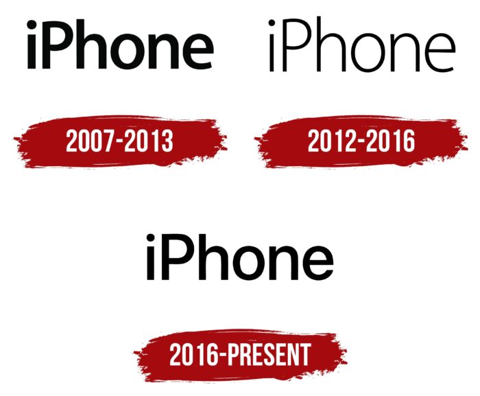
The first models had a marking in bold type. The single “i” was originally lowercase, and the “P” was capitalized to emphasize priority and functionality. The letters are flat, smooth, without serifs. They are characterized by a streamlined shape corresponding to the finger’s smooth movement on the touch screen. Therefore, none of the characters have broken lines and right angles (and even if they are visible, they have a less pronounced degree of slope). The logo is text, but to the left, there is a bitten apple – the individual designation of Apple. In this way, the manufacturer emphasizes that the product belongs to him.
2012 – 2016
The emblem has been upgraded in parallel with the improvement of the functionality and contents of the devices. It acquired lightness, visual simplicity, sophistication, and elegance. All this is despite the brevity of the logo, which reflects the key importance of the internal content rather than external appearance. As a result, in 2012, the lettering was given a slim shape. The font is still lowercase, except for the “P,” which has always remained uppercase. The letters are smooth, with uniform transitions in height, as if it were the trajectory of a finger on the display. Thanks to the narrow characters, the inter-letter space was slightly larger, which added to the readability of the lettering.
2016 – today
The current logo contains the same word but in an accent version: bold letters. They’re not as wide as in the first version but not as narrow as in the second. This font is called SF Pro Semibold. It is moderately subtle but more pronounced. The top of the “h” is now aligned in height with the “P,” whereas its foot was higher. The letter “i,” although lowercase, also reaches them. The round dot moved further away from the vertical bar at the beginning of the logo’s creation.
iPhone: Interesting Facts
The iPhone is a symbol that has changed technology, how we communicate, and even our social habits.
- The Beginning: Steve Jobs unveiled the first iPhone on January 9, 2007, launching it on June 29, 2007. Its touchscreen and combined phone, iPod, and internet abilities were groundbreaking.
- App Store Came Later: The first iPhone didn’t have an App Store. This key feature, which allowed for third-party apps, was added in July 2008.
- The Name: “iPhone” was already used by Cisco for its VoIP phones before Apple’s version. They resolved the issue, and both kept using the name.
- Secret Development: Known as “Project Purple,” the iPhone was developed by a special team at Apple, isolated from the rest of the company.
- Sales: Since its launch, over a billion iPhones have been sold, making it one of the top-selling products and a huge part of Apple’s business.
- Siri: In October 2011, the iPhone 4S introduced Siri, a voice-activated assistant that changed how we interact with devices.
- First Prototype: The initial iPhone prototype was much larger, similar to a small tablet, and it took time to shrink it to something you could easily carry.
- Acclaim: In 2007, TIME magazine called the iPhone the “Invention of the Year” for its design and how it shook up tech.
- Face ID: In 2017, Apple introduced Face ID on the iPhone X, which allows you to unlock and authenticate your face and replaces the fingerprint scanner.
- Camera Upgrades: The iPhone’s camera has greatly improved, from a simple 2-megapixel camera to complex systems that offer professional-grade photos and 4K video.
- Economic Influence: The iPhone’s success has supported a whole ecosystem, from app developers to accessory producers, adding billions to the economy.
Since its debut, the iPhone has been a milestone in mobile tech, constantly setting new standards and driving innovation in the field. Apple’s focus on innovation, quality, and user experience keeps the iPhone evolving and successful.
Font and Colors
The main purpose of the iPhone visual identity sign is to demonstrate the ease of use of the smartphone. Therefore, the font is not decorated in any way—it consists of simple single lines without outlines, frames, or double stripes. This performs a key task, accurately conveying the functionality and purpose of the new generation of mobile devices.
Grotesque typeface family San Francisco Pro For text selected for the emblem. It is a custom development by Apple. The official logo palette is monochrome, combining black (lettering) and any background color. Usually, it is white, but it all depends on the shade of the smartphone model.


