


 Siri Logo PNG
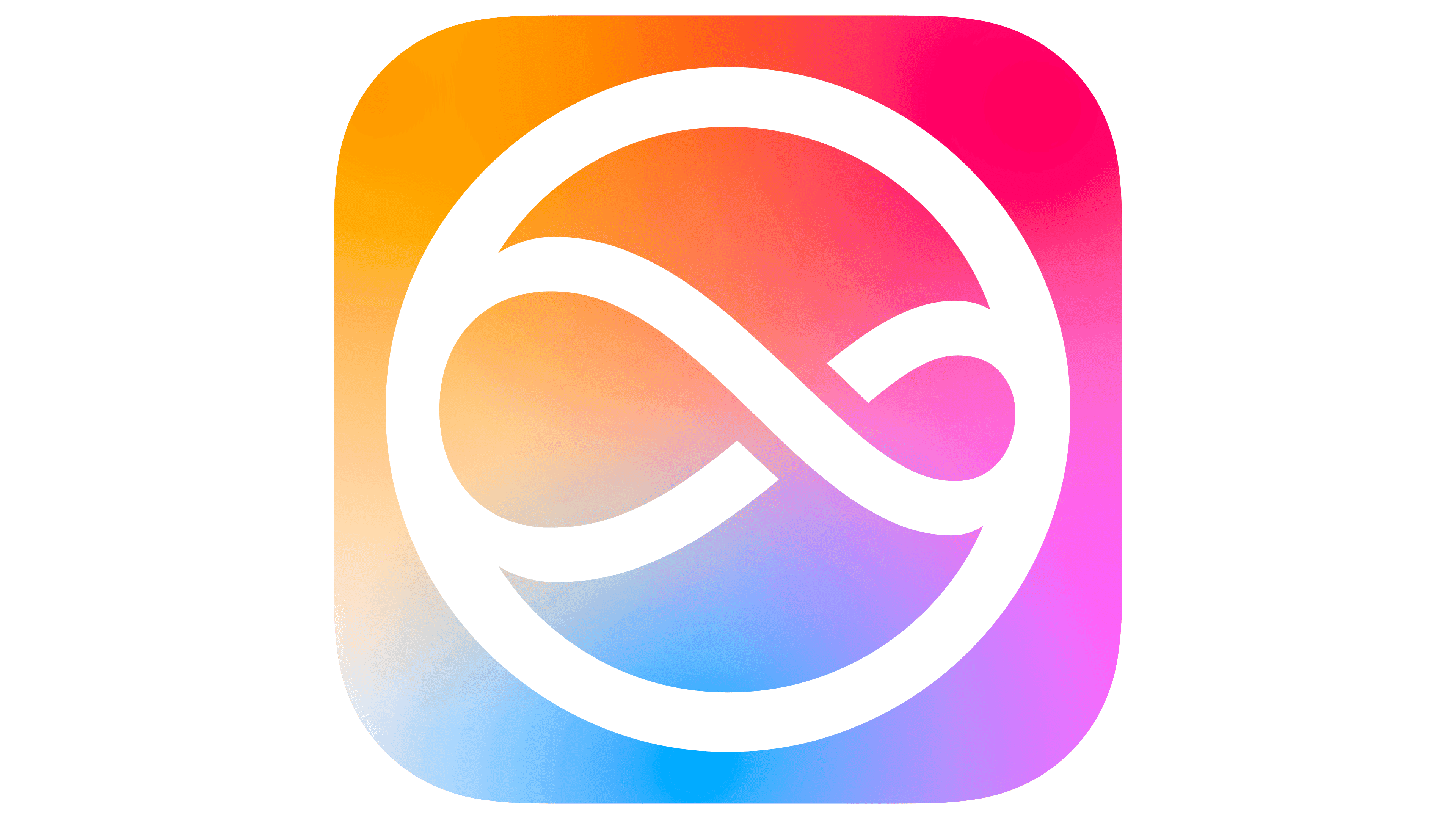
The Siri logo represents the infinite development and improvement of artificial intelligence. The play of colors in the emblem symbolizes the ability to think in different directions and adapt to human needs.
Siri’s story began in 2003 at SRI International, where the DARPA-funded CALO project explored a cognitive assistant capable of learning, organizing information, and responding to user requests. Doug Kittlaus, Adam Cheyer, and Tom Gruber later used that research as the base for Siri, Inc., moving the technology from laboratory development toward a consumer product.
By 2007, SRI International treated the project as a commercial opportunity and spun it into a separate company. In 2009, Menlo Ventures and Morgenthaler Ventures financed further development. In February 2010, Siri launched as an independent iOS application in the App Store, offering natural-language answers, recommendations, and basic task execution at a time when mobile assistants were still a young category.
The product drew attention quickly. In April 2010, Apple acquired Siri, Inc., and on October 4, 2011, the assistant became a built-in feature of the iPhone 4S. In 2012, it expanded to iPad and gained broader language support. In 2013, the service received a redesigned interface and a male voice option, while 2014 brought streaming speech recognition and Shazam music recognition.
From 2015 onward, Siri became more integrated into the company’s ecosystem. It gained proactive suggestions based on habits and context, then opened to third-party apps through SiriKit in 2016. The same year, macOS Sierra brought the assistant to Mac. HomePod followed in 2017; Siri Shortcuts arrived in 2018; privacy-focused on-device processing expanded in 2019; and later updates added a compact interface, audio messages, translation tools, and limited offline commands by 2021.
Meaning and History
What is Siri?
It is a virtual assistant developed by Apple. It allows users to interact with Apple devices using voice commands. This assistant performs various tasks, such as setting reminders, sending messages, making calls, searching the internet, and controlling smart home devices. With Siri, users can manage many device functions without touching them.
2010 – 2011
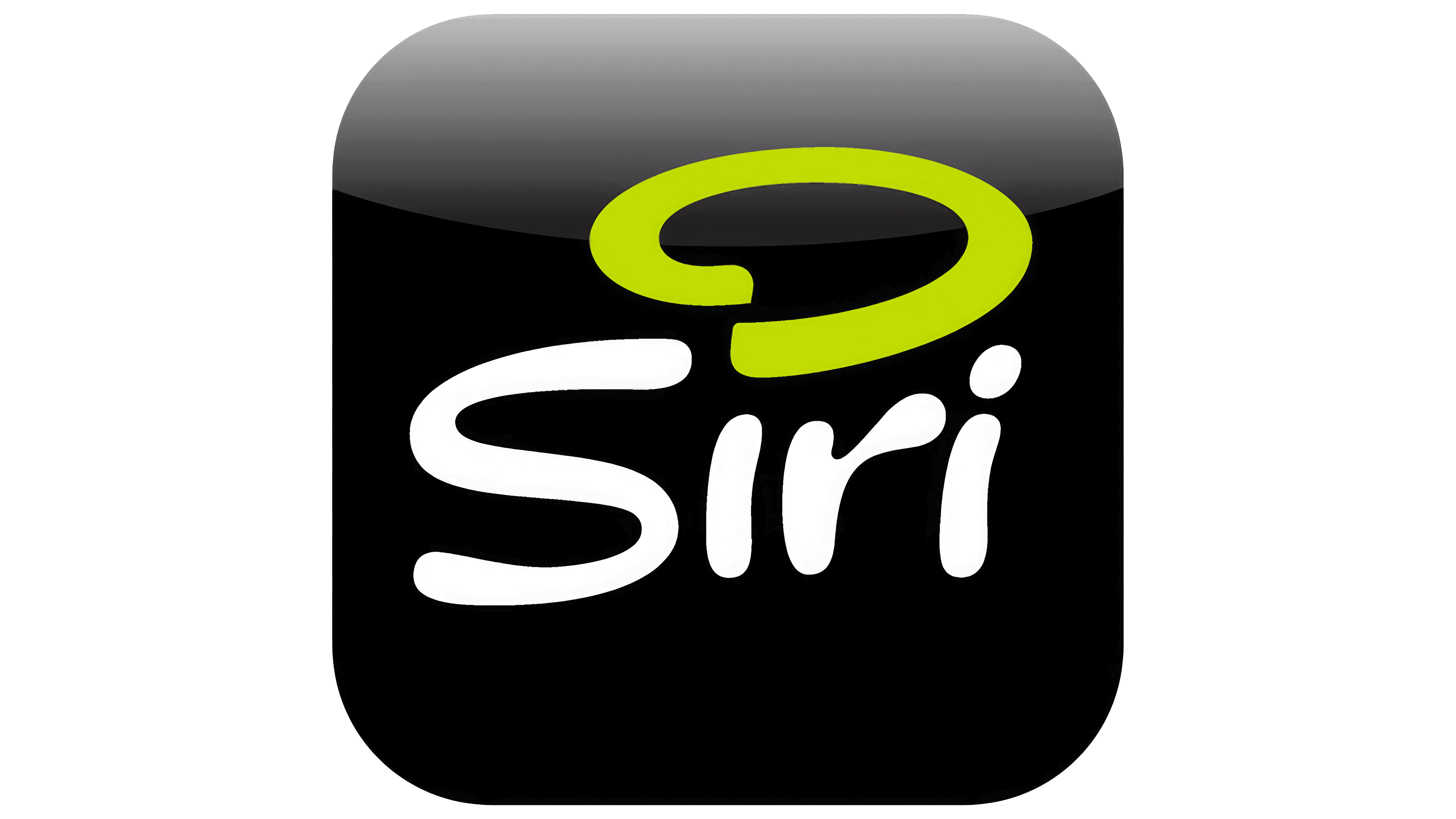
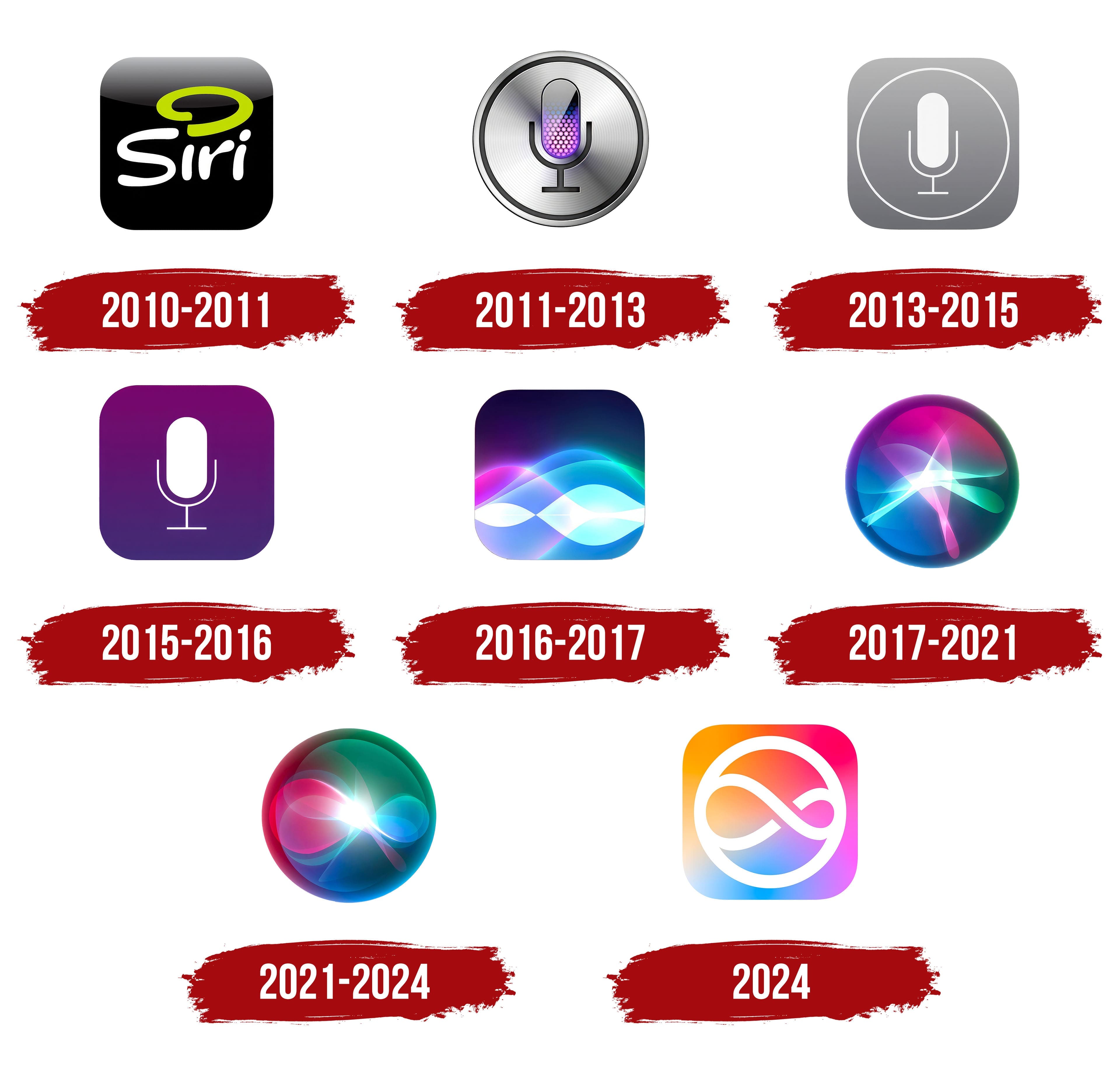
The first emblem is designed as a neat button icon for a computer application. The format immediately indicates a digital product with a set of features.
The black color, symbolizing the infinity of the Universe and the World Wide Web, shows that the program extracts information from a vast array of data.
The font is light and free. The large curve, rather than the dot over the “i”, indicates that the algorithm has found an answer to the user’s query. The loop’s green hue, the color of life, signifies that the algorithm learns, grows, and improves.
2011 – 2013
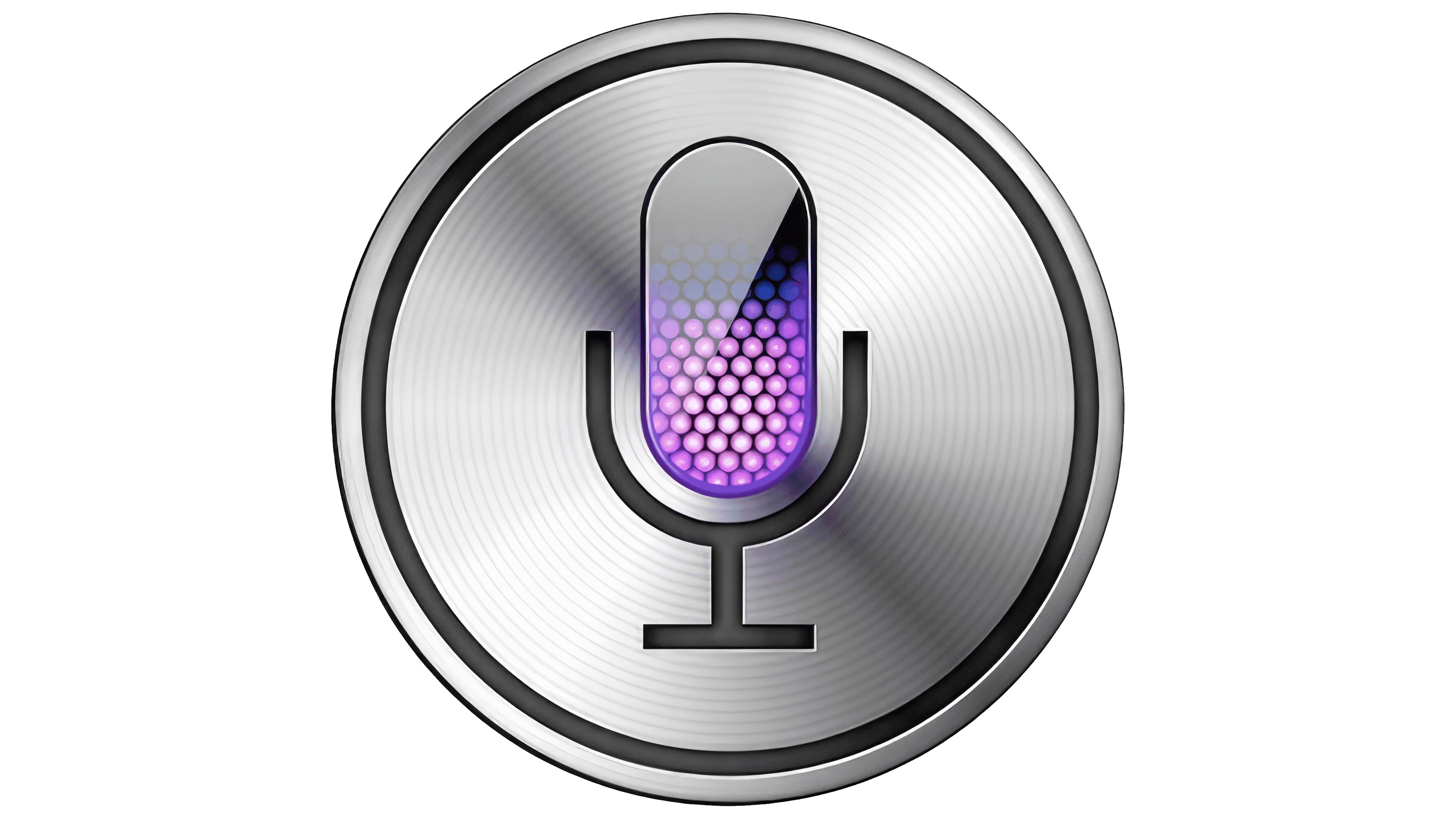
A year after Siri was introduced in the iPhone 4S, the logo was changed to a microphone in a platinum circle. This change, which occurred in 2012, reflected the growing importance of digital assistants in users’ daily lives. The new logo highlighted the uniqueness of Siri’s development and thoughtful coding. The emblem emphasizes the voice assistant’s primary function: recognizing voice commands.
The microphone symbolizes the user’s ability to interact with the device through voice. It underscores the importance of voice input in Siri’s operation. The platinum circle around the microphone conveys premium quality and technological sophistication, underscoring the feature’s high performance and reliability.
The logo reflects Siri’s main purpose to mediate between the user and the device, helping accomplish tasks through voice commands. This demonstrates the company’s aim to make interaction with technology more natural and intuitive.
The logo lacks text, but the microphone itself is designed in a modern, minimalist style that aligns with the overall design of Apple products. The logo uses clean lines and symmetry, making it easily recognizable and associated with technological advancement.
The logo’s primary colors are platinum and purple. Platinum symbolizes reliability and advanced technology, while the purple shade inside the microphone is associated with artificial intelligence and its capability to think logically and understand users.
The microphone includes a pattern of hexagons reminiscent of data storage cells. This indicates the structured and organized nature of the data Siri works with. The logo design reflects the precision and meticulousness with which the program was developed, making it an integral part of the Apple ecosystem.
2013 – 2015
The 2013 emblem emphasizes the assistant’s simplicity and accessibility. Transitioning from an extraordinary computer marvel, AI becomes a constant, stable companion for Apple product users. Siri is present in all new iPhones and has been introduced to the iPad.
The gray color conveys regularity, stability, and everyday routine work. It signifies readiness to assist with tasks and simplify goal achievement. The shade also highlights versatility, as the assistant has existed in female and male forms since 2013.
The square’s rounded corners indicate a precise, highly harmonious algorithm that ensures an error-free, user-friendly Siri experience. The microphone’s white lines represent novelty and the information the assistant finds upon request.
2015 – 2016
The change to a lavender-purple gradient background immerses the viewer in the depths of intelligence as powerful as the vastness of the Universe. The shade signifies the program’s improvement.
Since 2015, AI has been activated via voice commands without the need for touch. It recognizes the owner’s voice and responds only to the device owner’s commands.
The white microphone serves as a reliable guide in digital technology, helping find the right path.
2016 – 2017
The program’s new logo features beautiful shimmering sound waves and chains of digital data. The numerous gradients give the emblem a magical and futuristic feel. Bright flashes resemble thought impulses, representing data transmission through the neurons of artificial intelligence.
Siri partially opens its code for integration and collaboration with other applications. The new logo depicts flows of information. The program has evolved beyond a simple reference service, learning to manage and orchestrate all digital applications: making payments, downloading and installing programs, sending emails, making calls, ordering deliveries, and more.
2017 – 2021
The round, three-dimensional sphere makes the Siri logo resemble a magical predictor of the future, like a disembodied mass of energy casting lightning bolts within its shell. This living force has not yet revealed its full potential. The logo impresses with its power and captivates with its play of flashes and waves. Siri engages in dialogue and can converse coherently, making the AI as close as possible to a real-life interlocutor.
2021 – 2024
The emblem represents a reimagining of Siri’s role in Apple products. Inside the sphere, at the intersection of colorful loops, a bright flash resembles the birth of a new star. The dominance of green shades indicates that AI is the future of the digital world, which grows, evolves, and lives its own life.
2024
This Siri logo was created when artificial intelligence technologies were actively developed and integrated into everyday life. The infinity symbol anticipates Siri’s integration with ChatGPT, which will significantly enhance AI capabilities. Two infinity loops, one large and one small, represent projects in development and improvement, symbolizing their interconnection and collaboration to achieve new heights in artificial intelligence.
The emblem combines an infinity symbol set within a circle and placed in a square. This design highlights the logic and beauty inherent in the assistant, symbolizing the program’s code’s unlimited potential for growth and development. The infinity within the circle reflects continuous improvement and adaptation.
The infinity symbol reflects the drive for constant development and enhancement. The emblem showcases the program’s capabilities and its potential to further expand functionality. The circle symbolizes perfection and completeness, while the square represents stability and reliability.
The logo’s minimalist style emphasizes its core elements and symbolism. The absence of text focuses on the visual aspect, underscoring the assistant’s universality and global reach.
The logo’s palette includes gradient shades of orange, pink, blue, and purple. These colors evoke a sense of dynamism and movement, aligning with infinite development. They symbolize technological progress and innovation.