![]() Mac Logo PNG
Mac Logo PNG
Although heterogeneous, the Mac logo is attractive. In this way, its creators sought to emphasize the technology’s friendliness, and they succeeded. The emblem features two smiling faces. They are geometrically accurately arranged relative to one another and united by a common frame. The symbol exudes confidence and care for the users.
Apple Computer Company was founded on April 1, 1976, by Steve Jobs, Steve Wozniak, and Ronald Wayne. After the success of the Apple II, the company began developing a personal computer with a graphical interface, drawing on ideas its engineers had studied during a visit to Xerox PARC.
On January 24, 1984, Steve Jobs introduced the first Macintosh at Apple’s shareholder meeting in Cupertino. The computer had a 9-inch black-and-white display, a Motorola 68000 processor at 8 MHz, 128 KB of RAM, and a price of $2,495. Its launch was preceded by the “1984” Super Bowl ad directed by Ridley Scott. Unlike IBM PC machines running Microsoft DOS, Macintosh used a graphical interface and a mouse.
Jobs left Apple in 1985 after an internal conflict. During the next decade, Apple released many Macintosh models, while its market share declined. In September 1997, after losses of more than $1.8 billion, Jobs returned as interim CEO. In 1998, Apple introduced the iMac G3 with USB and a translucent colored case. In 1999, the iBook G3 brought a similar concept to consumer laptops.
In 2001, Apple announced the titanium PowerBook G4, followed by aluminum models from 2003 to 2006. At WWDC in June 2005, Jobs announced the transition of the Mac from PowerPC to Intel, which was completed in August 2006 with the Intel Mac Pro. In 2019, Apple released the 16-inch MacBook Pro with a redesigned keyboard. In November 2020, Apple began moving from Intel to Apple Silicon with the M1, launching new MacBook Air, MacBook Pro, and Mac mini models.
Meaning and History
![]()
The creator of the Mac computer was a business magnate, designer, and entrepreneur, Steven Paul Jobs. He introduced it to the public in 1984. The basis for the PC was a graphical user interface developed by the California company Xerox PARC. The developer was inspired by a research center that Apple collaborated on. He proposed an innovative digital product, which the New York Times later recognized as revolutionary.
The debut version of the all-in-one personal computer was initially called Macintosh. Jef Raskin, an Apple representative who developed the project for an affordable and easy-to-use PC, suggested this name. He named it after the McIntosh apple variety, which he loved. The name appeared before the digital device in 1979, simultaneously with the start of work on it. A year before the novelty’s launch, the manufacturer obtained a license to use the word “Macintosh.” In 1986, the American company became the legal owner of the corresponding trademark. It was bought from McIntosh Laboratory, a company that produces audio equipment.
What is Mac?
Mac is a family of Apple-produced computers that includes desktop PCs and laptops. At its launch in 1984, it was named Macintosh and consisted of only one type of computer. The lineup has expanded significantly, and as of 2022, it includes the Mac Pro, MacBook Pro, Mac Studio, MacBook Air, Mac mini, and iMac. Jef Raskin, under the guidance of Steven Jobs, developed the first version.
1984 – 1988
![]()
The earliest logo does not resemble the classic symbol at all. It looks more like an ordinary drawing. It depicts a monitor, keyboard, mouse, and an Apple logo. The lines are outlined, unfinished, and multicolored: gray predominates, complemented by cobalt blue, fiery red, sunny yellow, and green. This friendly emblem was used on the welcome screen until Mac OS 8.
1988 – 1989
![]()
Designers highlighted the apple, making it the logo’s main element. It became large and black, with a bitten edge on the right side. Below, it is complemented by the inscription “Macintosh,” set in a tall, narrow font with sharp serifs.
1995 – 2002
![]()
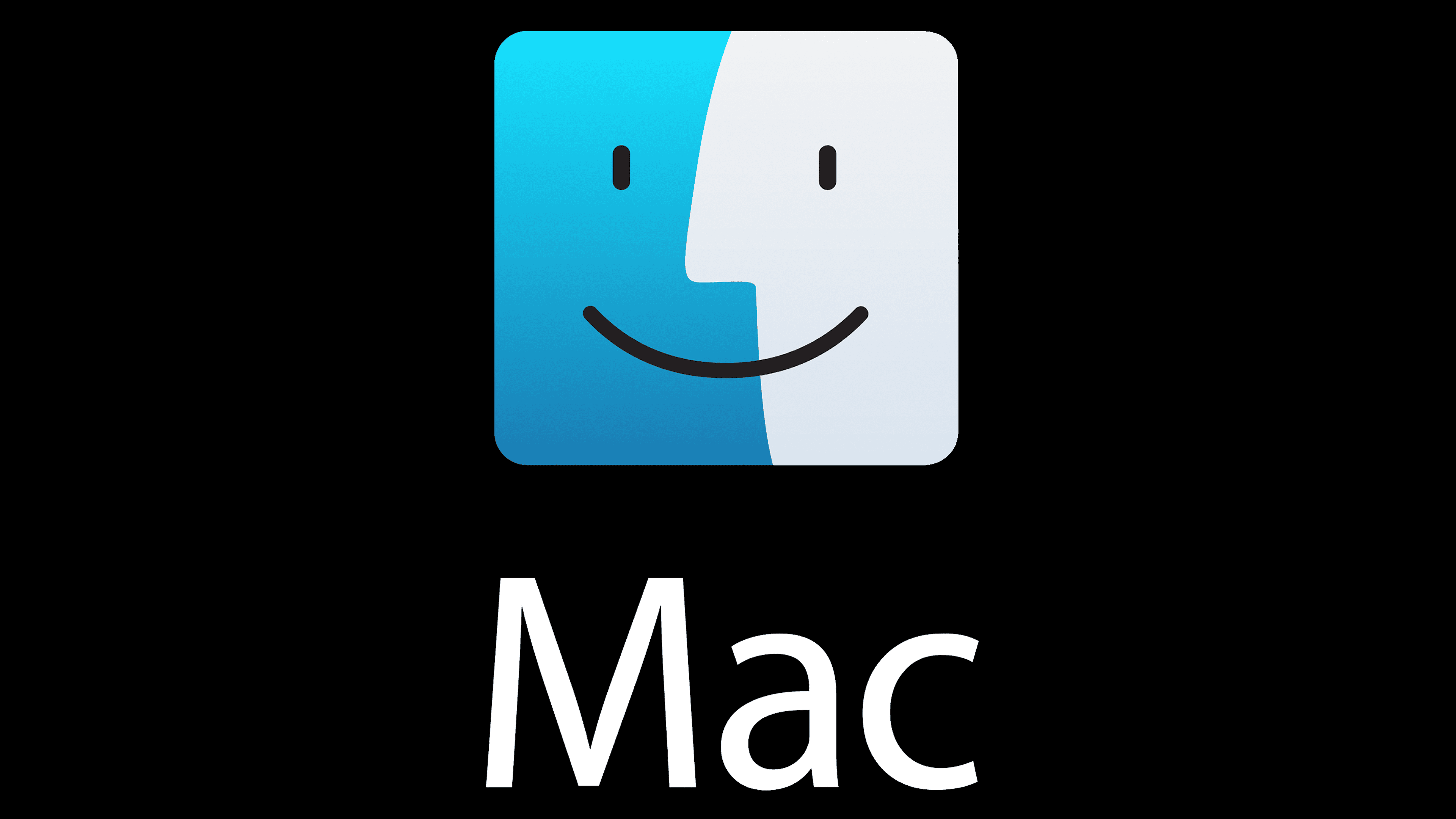
In 1995, the Finder icon era began, a symbol that appears after the system loads. It accompanies the first application that opens on the PC. The emblem is friendly because it consists of two smiling faces drawn in a common rectangle. One represents the user (positioned in profile and turned to the left), and the second represents the computer monitor or laptop (located directly). A thick black line separates them. At the bottom, the word “Mac” is written in large letters, as the brand underwent a rebranding and the name was shortened.
2002 – 2014
![]()
The logo became more uniform as designers replaced the dark blue lines with black ones, visually uniting the rectangle’s left and right sides. As a result, the emblem gained brightness and expressiveness. In addition, developers used a sans-serif typeface, removing the serifs.
2014 – today
![]()
In the modern logo, a square replaced the rectangle, making the faces more proportional, though they are elongated due to the smaller area. The dividing line in the center disappeared, leaving only the inverted arc representing a smile. The colors took on new shades: gray and azure with a gradient. The lower inscription and graphic image are combined within a thin, rounded-cornered vertical frame.
The Mac logo evolved from a simple drawing into a classic icon. It became strict, professional, and symbolic with a broad hidden meaning. Such an emblem conveys the computer’s friendliness towards the user and the simplicity of operation.
Font and Colors
The first textual versions of the emblem used the Garamond typeface. Then, after the 2002 redesign, it was replaced by Myriad Pro, a smooth, semi-bold, sans-serif font. This happened after the launch of the eMac. The company’s color palette also transformed, moving from multicolored to a more restrained palette. The visual identity is now built on a combination of gray, black, and azure blue with a gradient.