The App Store logo is a unity of disparate parts and elements. The symbol is like a structure where you can get the necessary parts anytime. The emblem shows that the client will receive everything he needs, enough to use the catalog correctly.
App Store: Brand overview
| Founded: | 2008 |
| Founder: | Apple Inc. |
| Website: | appstore.com |
Meaning and History
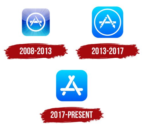
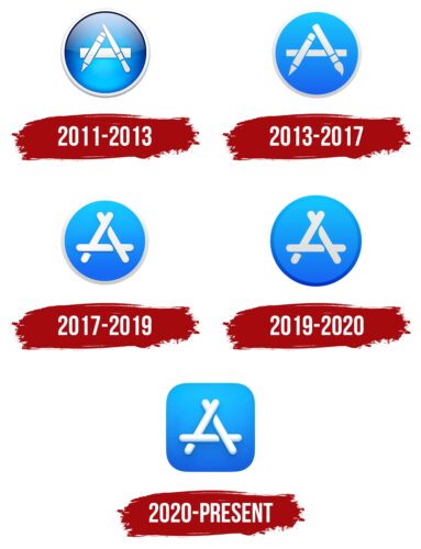
The online store icons have changed several times, although these changes cannot be called global. Rather, it was a small tweak to improve the existing design. The style was simplified to minimalistic: first, the bright reflections disappeared, then the white circle disappeared, and the main elements became abstract.
What is App Store?
App Store is a virtual store of mobile applications for gadgets operating on the IOS and iPadOS operating systems. The Internet platform allows users to view, select and download various programs for iPad, iPod Touch, iPhone, Apple Watch, Apple TV. The service appeared in 2008 and is owned by Apple Inc.
iOS
The second most common mobile platform was released in 2017 and was immediately focused on Apple Inc. equipment. It was called iPhone OS for the first years, but then it was renamed iOS as the range of compatible digital devices expanded. To unify the visual identity of the programs, the developer company used approximately the same design. The logo style of this application is also consistent with the overall design and is based on three crossed elements in the shape of the letter “A.” The emblem has changed twice, but none of its variants has a name.
2008 – 2013
The first App Store logo was the most striking. It appeared after the release of iPhone OS 2 and was used until the iOS version 6 platform was developed. The drawing contained a large blue square with rounded corners, containing a pencil, brush, and ruler in a ring. Behind the white stationery, beams radiated in all directions—from the center of the geometric shape to the edges. They enhanced the 3D effect of the gradient.
2013 – 2017
After the redesign, the rays disappeared, and the blue became lighter. The gradient position has also changed, with a darker tint at the bottom and cyan at the top. This logo can be found on devices with iOS 7 and 10 versions.
2017 – today
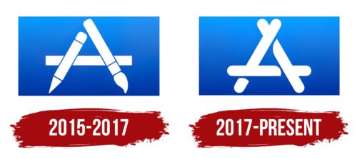
In 2017, the era of abstraction began: the Apple Store logo lost some of its elements and began to look much more minimalistic. Three lines appeared in place of the stationery, forming a disproportionate triangle. They resemble ice cream sticks in shape. The white ring has disappeared, and the intensity of the gradient has decreased.
macOS
Apple Inc. launched the macOS platform in 2001, and it has now become the second most popular operating system for desktops and laptops. Appearing in the spring, it received its first update a few months later, and since then, almost every key version has changed the logo. The operating system has gone through several rebrandings. So, it was initially called Mac OS X; in 2012, the developer company shortened its name to OS X, and in 2016, it changed to macOS. This was done to unify the computer platform with other Apple products – tvOS, watchOS, and iOS. Interestingly, none of the logo options contain the name of the program.
2011 – 2013
The macOS logo was round and looked like a three-dimensional shiny medallion. In the middle, he had a construction formed from three elements: a ruler, a pencil, and a brush. They were drawn in segments – as if they were made up of squares, rectangles, semicircles, triangles, and trapezoids. Moreover, these elements were folded as a hut: a wide strip was horizontal, and the other two parts were vertical. This arrangement indicated the main direction of the OS and revealed its name and tasks to users. The background was light blue. The gradient went from the center to the edges. The frame of the emblem was gray and three-dimensional, with a shadow in the top half.
2013 – 2017
After the upgrade, a two-dimensional logo appeared with elements of an improved configuration. This was due to the refinement of the correct shape of the brush and pencil. As a result, they became more like real ones. The developers made the horizontal ruler thinner and changed the background. It was dominated by aquamarine blue, and the gradient was directed from top to bottom. The gray edging brightened, and the shadows disappeared. The design resembled “A” – the capital letter from the software company’s name.
2017 – 2019
In 2017, the blue color almost completely turned into aquamarine (deep blue), and the gradient became linear – it went from top to bottom with a gradual hue darkening. The top side of the frame was highlighted, making it appear white. The designers replaced the pencil, brush, and ruler with three sticks with rounded ends. They were folded so that they created a semblance of a hut. Shadows passed where they crossed. This design denoted the first letter of the name of the developer company – “A.”
2019 – 2020
The logo update resulted in a complete replacement of the blue color with aquamarine in the center of the medallion. But blue appeared on the ring surrounding the three rod-shaped elements. The gradient is preserved, but now it is less noticeable. Designers muted the white color with a light grayish haze.
2020 – today
Apple removed the circle to unify its digital products and used a square instead. So it happened: this geometric figure is now in the macOS logo. It has rounded corners and changed color to the 2017-2019 version, which is dominated by a linear gradient from light aquamarine (top) to dark blue (bottom). The central element of crossed sticks is made three-dimensional. The designers removed the frame.
tvOS
This is a proprietary development of Apple Inc. It is an operating platform for its digital media players and is designed for TV viewing. The product’s first launch took place in the fall of 2015, and since then, it has undergone many modifications. The last update was adopted in the summer of 2022. At the same time, the visual identity of the corporate application was improved so that it had an original designation. Over time, Apple TV was renamed to tvOS, which unified branded products, along with macOS, watchOS, and iOS. Now, they are all designed in the same style and are under the personal label of Apple Corporation – a unique “A” made up of three iconic elements.
2015 – 2017
Immediately after the program’s launch, she received a logo, like macOS 2013-2017. The developer initially planned to combine their products with a common identity. The unified design gave many advantages: it was easier for users to navigate to the desired application, it was easier to search for it in a specialized store, and it was immediately recognizable among analogs from other manufacturers. As a result, the designers placed a pencil, a ruler, and a brush crossed in a certain way in a horizontal rectangle with a gradient from light blue to cobalt. The tops of the stationery didn’t touch, so they seemed to hang unnaturally in the air. In this version, the soft part of the brush has been tweaked to resemble the actual curve of the bristles.
2017 – today
In 2017, the copyright owner of digital products undertook a major redesign of their visual identity, introducing significant changes. So, on the tvOS logo, a design of three sticks with rounded ends appeared – exactly like the macOS of that time. These pieces have replaced the ruler, pencil, and brush to make it easier to unify the logos. The resulting configuration resembles a hut but stands for the first letter of the name of Apple. The stripes are wide, with darkening in places of overlap. The right side of the central crossbar is wound under the right leg of the letter, and the left side, on the contrary, is located on top of the left diagonal “A.” The logo is flat and two-dimensional, located in a horizontal rectangle. The palette has been changed from a dark spectrum to a lighter one, so the predominant color in the gradient is deep blue-aquamarine.
App Store: Interesting Facts
The App Store, launched by Apple Inc. in 2008, has revolutionized finding and using software.
- Starting: On July 10, 2008, the App Store changed the game with just 500 apps. It made it easier for developers to get their apps to people worldwide.
- Quick Growth: A week after launching, users downloaded over 10 million apps, showing its instant hit and hinting at its huge future impact. Now, it offers millions of apps.
- Pioneering Platform: It was the first major platform for mobile apps, inspiring others to create similar digital stores for various devices and operating systems.
- Economic Influence: The App Store has helped developers and companies big and small make a lot of money, generating billions in revenue and becoming a key space for digital business.
- Strict App Review: Apple’s tough review process ensures apps meet high quality and safety standards, though it has received mixed feedback on how it affects developers.
- In-App Purchases: Introduced in 2009, in-app purchases let developers sell extra content or services within their apps, opening up new ways to make money.
- Apps Galore: “There’s an app for that” became well-known in 2010, showing the App Store’s wide range of apps, from games and entertainment to tools that help us work and stay healthy.
- Cultural Shifts: The App Store has changed how we communicate, work, and play, introducing us to social media, mobile gaming, and more.
- Subscription Model Push: Apple has been encouraging developers to use subscription models, aligning with the trend toward subscription-based services.
- Focus on Privacy: With increasing privacy concerns, the App Store has implemented strict rules and features to keep user data safe, requiring apps to ask before accessing personal info.
The App Store isn’t just a tech milestone; it’s reshaped our economy, culture, and how we interact. It is a pivotal platform for digital innovation and a hub for developers and users to bring new apps and services to life.
Font and Colors
The jagged shape in the center of the square represents the “A”—the first letter of the App Store name. This makes more sense than randomly stacked brushes, rulers, and pencils, although some users only see ice cream sticks in the logo and do not understand what they mean. This is all because of excessive abstraction, which interferes with perception.
The icon does not have sharp or right angles—the sides of each shape are rounded. This is done to inspire trust in the platform and its media content. A friendly look, simple design, and three-dimensionality distinguish the App Store icon from the list of other programs.
The Apple Store logo does not have inscriptions, except that the central figure is associated with the letter “A.” We are not talking about any fonts because it consists of three separate rectangles with rounded corners.
The color scheme is not as simple as the rest of the design. It contains a mix of blue shades arranged sequentially and smoothly, flowing into one another. The gradient is linear; the color transition occurs horizontally—from a light top to a darker bottom. Additional elements are painted white. To highlight them, the designers used the negative space effect.
FAQ
What does the App Store icon mean?
The icon is very important for the user experience. It is the first thing users see when they browse the store, making it key to attracting and getting them to explore an app’s page.
The icon shows the app’s identity and gives a visual idea of its offerings. This helps users understand its purpose and appeal quickly. A well-designed icon catches attention and sparks curiosity, leading more users to click on the app’s page.
A strong and clear icon boosts the user’s perception of the app’s quality and trustworthiness. Users decide to install an app based on their first visual impression, and the icon acts as a visual hook that increases the user’s intent to download.
Can I use the App Store logo?
They can use the logo under certain conditions. Apple gives a limited, non-exclusive, non-transferable, royalty-free, worldwide license to use the brand badge, icon, and some product images. This license is part of the Marketing Agreement with Apple.
This license lets you promote Apple-branded products that run iOS. You must follow Apple’s guidelines and rules to use their branding correctly. If you misuse or ignore these guidelines, you could lose the license. This keeps all promotional materials consistent with the brand’s quality and integrity.
How do I get the App Store icon?
To get the icon back on your device if it’s missing, follow these steps:
- Open Settings on your device.
- Tap on Screen Time.
- Go to Content & Privacy Restrictions.
- Tap on iTunes & App Store Purchases.
- Make sure the Installing Apps option is set to Allow.
If the icon is still missing, try resetting your home screen layout:
- Open Settings again.
- Tap on General.
- Select Reset.
- Tap on Reset Home Screen Layout.
These steps will restore the icon to its original place on your home screen and remove any restrictions that might be hiding it.
What is the logo for the Apple App Store?
The logo is a sleek and modern ‘A’ design. It consists of three simple shapes that look like ice cream sticks. These shapes come together to form a recognizable ‘A.’
Originally, the logo included a pencil, a brush, and a ruler, forming the ‘A.’ This represented creativity and the tools used in app development. The KON company filed a lawsuit against Apple, claiming the emblem was too similar to their logo. To resolve this, Apple redesigned the App Store logo.
The new logo has a cleaner, more abstract look. The three shapes are uniform and simple, fitting Apple’s modern and minimalistic style. This change solved the legal issue and matched Apple’s design philosophy, which values simplicity and elegance.
The updated logo is important in Apple’s branding. It appears on the home screen and in promotional materials. Its clean design creates a strong visual identity that users easily recognize. This consistency helps maintain user trust and familiarity with the brand.
