YouTube’s logo features a video play button, symbolizing the essence of the largest American video hosting service. This graphic reflects the brand’s primary mission, specialization, and direction, making the logo a clear representation of YouTube’s core purpose.
YouTube: Brand overview
YouTube was founded in February 2005 by Jawed Karim, Steve Chen, and Chad Hurley, all former PayPal employees. The idea for the platform came after they experienced difficulty sharing party footage. This inspired them to create a website where anyone could easily upload and watch videos.
On April 23, 2005, Jawed Karim uploaded the first video to the platform. The 18-second clip, “Me at the zoo,” featured Karim discussing elephants at the San Diego Zoo. This video marked the beginning of the era of user-generated video content.
The site gained popularity rapidly in its first year. Its user-friendly interface and simple video-sharing functionality attracted a growing audience. By December 2005, the site received over 8 million views daily. A major event in the platform’s history occurred in 2006 when Google acquired the service for $1.65 billion. With Google’s resources and technology, the platform gained new growth opportunities.
After the Google acquisition, the platform expanded rapidly. In 2007, localized versions of the site were launched in multiple countries, helping the service grow internationally. That same year, a monetization system was introduced, allowing content creators to earn revenue from video ads.
2008, the service introduced HD video quality (720p), significantly improving the viewing experience. That same year, it became the second most popular search engine globally after Google.
By 2009, the site had reached one billion daily views. The platform continued introducing new features, including video automatic captioning, which made the content more accessible to viewers with hearing impairments.
In 2010, the service experimented with new video formats, introducing 4K video uploads and testing live streaming.
In 2011, a new channel-focused interface was launched, making it easier for creators to organize their content and attract viewers. The same year, the platform introduced Analytics, providing creators with detailed insights about their channels and videos.
2012, the service launched the Original Channel Initiative to produce high-quality original content. This marked the platform’s first major effort in content creation.
The platform held its first Music Awards in 2013, highlighting its growing role in the music industry. Offline viewing for mobile devices was also introduced in select regions that year.
In 2014, support for videos at 60 frames per second was introduced, a feature that sports fans and gamers particularly appreciated.
The platform celebrated its 10th anniversary in 2015 when the service received nearly 400 hours of video uploads every minute. The same year, YouTube Red was rebranded as YouTube Premium, offering ad-free viewing and exclusive content.
In 2016, the team introduced YouTube Go, a lightweight app for regions with slow internet connections. The platform also launched Community, allowing creators to engage with their audiences through posts, polls, and images.
In 2017, the service rolled out a new logo and design. That same year, the team launched YouTube TV in the US, offering live TV streaming. Additionally, the platform began systematically removing misinformation and extremist content.
In 2018, monetization opportunities for creators were expanded. New features included selling merchandise and channel memberships. Stories were also introduced for channels with over 10,000 subscribers.
In 2019, the recommendation algorithms were refined to improve the user experience. The platform also introduced Super Stickers, allowing viewers to support creators during live streams. The service grew substantially in 2020, especially in educational content and home entertainment. New analytics and monetization tools were added to benefit creators.
In 2021, the platform focused on creating more tools for creators. Stronger measures were taken to combat misinformation and harmful content, and Shorts, a short-form vertical video format, was launched to compete with TikTok.
Shorts continued to grow in 2022, and the platform ventured further into e-commerce by testing features that allowed viewers to purchase directly from videos.
By 2023, the service had billions of users and an extensive content library, making it one of the most popular video-sharing platforms worldwide. The company continues to invest in AI technologies to improve content recommendations and moderation while developing new tools for creators to enhance engagement and revenue.
Meaning and History
Hurley invented YouTube’s name and logo. He is a well-known entrepreneur from Silicon Valley, the creator of the original PayPal icon, and a graphic designer with a degree in fine arts. He was YouTube’s CEO but was responsible for the brand’s image. At some point, he presented his friends with the fact that this emblem would become the emblem of the new web service. The decision was made unanimously and was not discussed.
The artist who drew the famous icon admitted that Walt Disney is his main inspiration. Perhaps this is why Hurley conveyed the meaning of the YouTube badge interestingly. After all, “Tube” is the slang name for CRT TVs with vacuum tubes. The large red rectangle on which this word is written represents the screen of such a device with an electron-beam backlight.
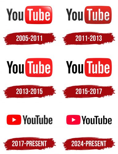
However, the design of the brightest element often changed. In 2005, the emphasis was on a volumetric gradient. 2011, the rounded rectangle became burgundy and simple, although the three-dimensional effect remained. In 2013, the color changed to red. There were no other updates in the brand’s visual style: YouTube retained the classic style as part of its marketing strategy.
What is YouTube?
YouTube is one of the most popular platforms on the internet for uploading and playing video content. The site is visited by over a million unique users every month. Since 2006, the YouTube brand and everything associated with it belongs to Google.
2005 – 2011
The debut emblem of YouTube consists of two parts: graphical and textual. It includes the name of the internet service, divided into two fragments. The first part is the black “You” inscription in elongated grotesque letters. The second part is the word “Tube,” written in white letters and placed inside a large red rectangle with a gradient transition to a darker palette.
The symbol’s significance lies in its ability to convey the primary purpose of the service—video hosting. The red rectangle resembles a TV or monitor screen associated with watching videos. The black-and-white text emphasizes contrast, making the name easily readable and memorable.
The meaning of the YouTube logo is found in its straightforwardness and simplicity. It displays the brand name, making it recognizable and understandable for users. The red symbolizes energy and dynamism, reflecting the video content’s active and lively nature.
The sign’s font is grotesque, giving it a modern and technological appearance. The elongated letters make the inscription expressive and easy to read. The contrast between the black-and-white text and the red background adds visual appeal.
The emblem’s color palette includes black, white, and red. Black symbolizes seriousness and technologicality, white represents purity and simplicity, and red signifies energy and dynamism. The gradient transition in the red rectangle adds depth and dimension.
2011 – 2013
The trademark, which features a red rectangle and white “Tube” inscription, became synonymous with the video revolution. The 2012 update reflected the company’s growth and evolution, marking a more mature and stable transition. At that time, Google owned the company, providing additional resources and development opportunities.
In 2012, the red rectangle was changed to a darker shade. The previous glossy symbol became matte. Highlights in the corner of the rectangle disappeared, but the color gradient from bottom to top remained. These changes gave the logo a modern and strict appearance, symbolizing strength, passion, and progress. The new design also appeared more polished, conveying stability and confidence with its flat design.
Changes also affected the letters of the word “Tube.” Previously, the word seemed embossed into the rectangle; now, a clearer black shadow made it appear visually raised, giving the emblem extra depth and dimension.
2013 – 2015
The emblem’s design was changed in 2013: the rectangular icon on the right became crimson with a slight gradient at the bottom, and the inscription “You” on the left became black.
2015 – 2017
After another logo revision, the palette was changed again. In this version, the shading at the bottom of the rectangle was removed, and it acquired a pure red color without tonal transitions.
2017 – today
2017, the company’s management redesigned a logo, radically changing its image. The phrase “YouTube” is written together in the current version, highlighting the capital letters. Before, it was a red rectangular button with a white triangle in the center—this was the designation for launching a video for viewing. The style of the inscription remained the same: the only change was the deepening of the letter “Y,” which became more elongated.
In 2012, entrepreneurs decided that the CRT on the logo does not convey the essence of the world’s largest video hosting service. Moreover, they wanted to introduce new features and applications into their web service that would not be associated with the last century’s technologies. This evolution affected all areas of YouTube’s activity.
Christopher Bettig, the art director, speculated that people might not even realize the meaning of the word “Tube” and do not understand why it is in a rectangle. Therefore, it was decided to remove the red TV screen and shift the focus from “Tube” to the video playback icon. Thus, the most significant redesign in the company’s history took place.
However, the changes were only “cosmetic.” The owners did not dare to make transformations so that YouTube would not lose its recognizability completely. They focused on a smooth transition from the site to a family of multi-platform applications: YouTube Kids, Music, TV, Red, and Gaming. Thanks to the universal design, the new logo unites all these services.
Initially, Bettig and his team experimented with a single Y icon. But then they realized that it was a losing proposition and decided to go an even simpler way: to keep the old inscription and add a red play button in the center of each video, closely associated with YouTube.
2024 – today
The YouTube logo has undergone many changes but has always stayed true to its essence—it symbolizes the video platform that has become a central part of the internet. There are slight changes in the latest version of the logo, but they are still noticeable. The main change is the saturation of the red icon color. Now, it leans more toward crimson, making it brighter and more attention-grabbing. This change helps the logo stand out among other apps and platforms, especially in the digital space, where user attention is key.
The shape of the visual symbol has remained the same—a red rectangle with rounded corners, inside of which is a white triangle pointing to the right. It has become a symbol of the platform and the internet as a video-sharing space.
As for the font, the letters have become a bit sharper and more defined. The font remains familiar but with slight adjustments. The company aims to maintain its recognizability while improving the visual experience for users. All the logo elements are designed to create a simple and clear association with video content.
The platform has become one of the world’s leading spaces for hosting content, education, and entertainment. While the logo has changed slightly, it reflects the company’s desire to keep up with the times while staying true to its roots.
YouTube: Interesting Facts
Steve Chen, Chad Hurley, and Jawed Karim created the video hosting platform in February 2005. It quickly grew from a small site where people shared videos to a huge place that changed how we watch, make, and share all kinds of videos.
- The First Video: The first video on the platform, “Me at the Zoo,” was about one of the founders, Jawed Karim, hanging out at the San Diego Zoo. It’s just 18 seconds long and started everything.
- Growing Fast: The video hosting platform became big quickly. People posted 65,000 new videos daily and watched over 100 million in a year. Google noticed and bought it for $1.65 billion in 2006.
- Big Impact: The video hosting platform has changed pop culture a lot. It’s where many singers, like Justin Bieber, were discovered. It’s also used for big social movements, fun, and learning.
- Making Money: In 2007, the platform started letting video makers earn money from ads on their videos. Over the years, it has paid billions to these creators.
- All Kinds of Videos: The video hosting platform offers almost anything—music, how-tos, blogs, comedy, and lots more. Whatever you’re into, there’s probably a channel for it.
- Finding What You Like: The platform’s special program suggests videos based on your previous watch. This helps viewers find new content, and creators get their videos seen by more people.
- Worldwide: The platform works in over 100 countries and 80 languages, and it’s set up in 91 countries, so it’s suitable for people worldwide.
- Live Stuff, Too: The video hosting platform isn’t just for recorded videos. You can watch live broadcasts or sign up for the platform’s TV service to watch live shows from over 85 channels.
- Changing the World: The platform is also big in politics and activism. Leaders, groups, and activists use it to talk to people and spread their messages.
- Learning Anything: It’s also a great place to learn, with tons of educational videos on almost any topic.
Black YouTube Logo
In addition to the main red and white logo, YouTube uses a monochrome black version. This logo is an important component of the platform’s visual identity and is commonly used in official documents and scripts that require a darker or more dramatic look.
Black is a color associated with sophistication, professionalism, and focus on the subject. It is ideal for viewing at night as it reduces eye strain in low light.
In addition to its association with grief and mourning, black is associated with strength and self-confidence. The company sometimes uses this emblem to demonstrate its compassion and involvement in global social issues.
Font and Colors
The developers changed the font and color scheme. The font design was based on the stylistics of classic television and the VHS era. They managed to preserve the history of the original typography and give it a more modern look.
The designers wanted to connect the logo with the video, so they settled on the shade of red, # FF0000, presented in RGB. The inverted triangle inside the button is white. As for the color of the inscription, there are two options: white (#FFFFFFFF) or black (# 28282828). The first is used on a dark background, and the second is on a light one.
FAQ
What does the YouTube logo symbolize?
The red rectangle with a white triangle in the center represents the video play button. This element symbolizes the main task that YouTube copes with well – providing users with the ability to upload, search, and view video content.
What was the original YouTube logo?
The original logo contained the two-tone word “YouTube.” The first half of the name was black with a white background, and the second half was white and written inside a red rectangle with rounded corners and a gradient.
