


![]() YouTube Shorts Logo PNG
YouTube Shorts Logo PNG
The YouTube Shorts logo is dynamic and compact, like the content posted on the platform. The emblem indicates the video format and the engaging stories, which are hard to turn away from.
YouTube Shorts, introduced in September 2020, marked YouTube’s entry into short-form video content and directly competed with TikTok. Initially tested in India, Shorts quickly expanded globally, tapping into YouTube’s massive audience of over two billion monthly active users. The feature allows creators to produce engaging videos up to 60 seconds long, enhanced by integrated editing tools, filters, and a comprehensive music library. Shorts quickly achieved significant popularity, surpassing 50 billion daily views worldwide. To further encourage creators, YouTube introduced video remixing features and established a dedicated creator fund, reinforcing its commitment to short-form content and its role in modern digital entertainment.
Meaning and History
![]()
The short video format was officially launched in 2021, though it had been in beta since 2019. Therefore, the series emblem likely appeared two years before the global release. The sign is a transformed version of the main platform’s logo, differing from the YouTube emblem in just a few details.
What are YouTube Shorts?
A video format for posting short 15-second vertical clips. It allows reaching a larger audience and increasing the number of subscribers. It is part of YouTube and belongs to Google through the Alphabet Inc. conglomerate.
2020 – today
![]()
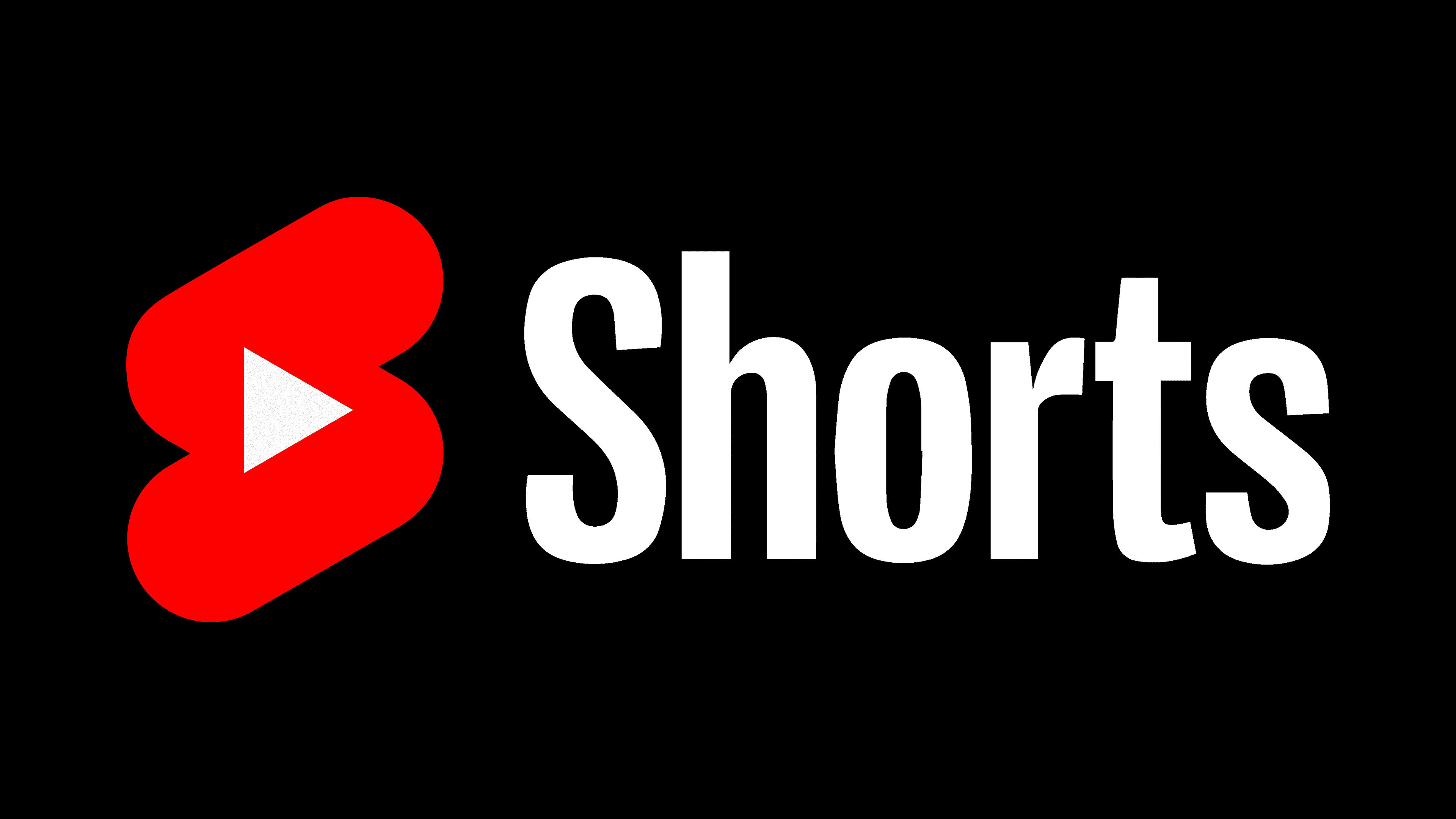
The short film’s logo is quite compact. It consists of a red icon and a name.
The product name was chosen to emphasize the clips’ duration. The format was intended to compete with TikTok. Therefore, it was important to highlight the minimal video length.
The red icon resembles a stylized letter S, the first in the name. The figure consists of two parallel lines and represents a sped-up way of writing the letter.
At the center of the symbol is the Play icon, part of the constant YouTube emblem. The choice demonstrates the format’s affiliation with the main platform. The symbol itself embodied the transmission of information and the shift of power. Before the advent of platforms, the ability to share video content and spread ideas was available only to large firms and corporations. With the emergence of YouTube services, power shifted to the people. It is no longer possible to “silence” facts. On the platform, one can always find an alternative opinion.
Font and Colors
The emblem’s palette is built on the contrast of red and black.
- Red speaks of interesting and captivating stories. YouTube Shorts is an endless feed, and some users get so engrossed in watching that the company has even added a special reminder for teenagers to take a break. The color also emphasizes the short time span in which the author must convey or show the necessary information. It should be noted that, although not intentionally by the creators, red has become a warning sign of danger, as studies show that many young people use short videos to escape reality, which is harmful to personality development.
- Black signifies the stability and weight of the platform. 2.5 billion people view Shorts per month.

Meanwhile, the color of the red icon can change depending on the situation: it can be white when highlighted, black on black-and-white screens, or concentric maroon circles on advertising materials.
The font of the inscription resembles Maleo Medium and Roboto black.