Universal, pleasant, positive – all these precisely characterize Apple’s media player. It works excellently on devices running Windows and macOS and is directly connected to the store for greater convenience, which is an excellent marketing move. To some extent, this reflects its identity: the iTunes logo is business-like and practical, as a multifunctional website should be.
iTunes: Brand overview
| Founded: | January 9, 2001 |
| Founder: | Apple Inc. |
| Website: | apple.com/itunes |
Meaning and History
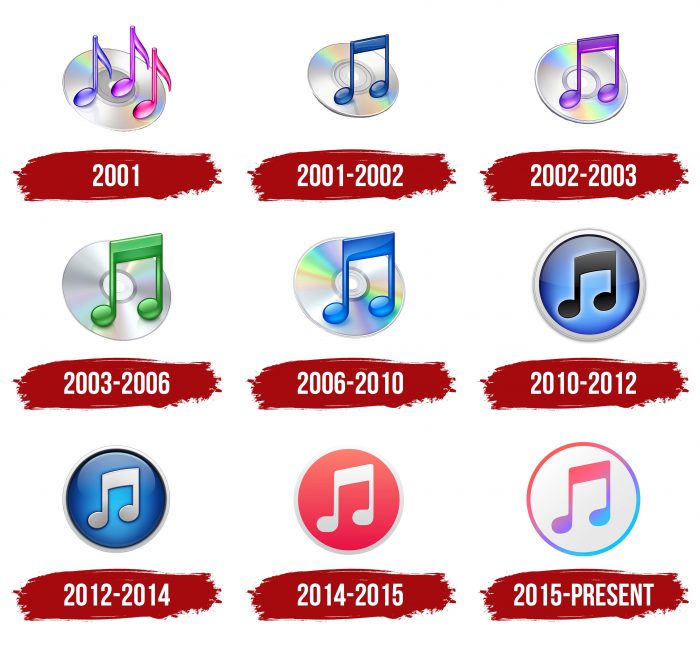
The iTunes logo has always been associated with music, although the service has become more than just a player. Despite its rapid evolution, the icon retained two main elements: a circle depicting a compact disc and musical notation. The primary graphic technique – the gradient transition of shades – has remained even after 20 years.
What is iTunes?
iTunes is a media player, media library, client application, and internet radio all rolled into one. Apple Inc. developed the service to purchase, listen to, download, and organize digital media files on devices running Windows and macOS. The service was launched in 2001.
2001
The debut emblem was very telling: a compact disc and several notes. That was enough to indicate the service’s specialization and do without textual information. The graphics spoke for everything. The logo featured three eighth notes – not only with heads and stems but also with flags. They were placed separately from each other and colored in different colors with gradient transitions: pink, purple, and blue. The background was a sparkling compact disc with a light rainbow spectrum at the top and reflections of notes at the bottom. It was slightly raised, almost standing on the edge. A wide bottom shadow created this impression.
2001 – 2002
Originally, the application was developed as a player for Macintosh computers. It had a simple emblem with a compact disc and three eighth notes, colored in blue, purple, and pink. This choice was conditioned by the fact that compact discs were intended for storing digital audio recordings, and iTunes was meant to replace them.
A few months later, the second logo appeared. This happened after Apple adopted the media player for the iPod. Designers changed the angle of the compact disc and left one large double note in dark blue.
2002 – 2003
A year later, a version of iTunes with smart playlists came out. The note on the icon turns purple.
2003 – 2006
In 2003, the player turned into a full-fledged online service with its store and podcasts. However, this was not reflected in the logo: developers only changed the color scheme, making the note green and removing some shadows.
2006 – 2010
Over the next three years, the iTunes interface was constantly updated. The emblem remained the same: a blue note on a shiny compact disc.
2010 – 2012
In September 2010, the 10th version of the media service with the integrated social network Ping was released. This served as a reason for a global redesign. The CD logo was removed, as it lost relevance. Instead, a blue circle with a white outline was depicted. The double note was recolored in black and moved closer to the center.
2012 – 2014
Developers again started experimenting with the color of the note. Now, it is as white as the outer ring.
2014 – 2015
In 2014, iTunes 12 was launched. The palette of the logo changed drastically: the circle turned red, and the dark shadows disappeared.
2015 – today
In July 2015, Apple Music was launched, along with a new logo. It features a white-gray circle with a bright outline and a double note. The palette includes shades of red, blue, purple, and light blue.
The next emblem was introduced in the same year. After the redesign, the musical sign and the outer border became light, while the background became colorful. Rumors suggest that this iTunes sign was “copied” from the old Apple logo. Designers took the three bottom colors from the rainbow apple, made them paler, and mixed them inside the circle in a random order.
iTunes: Interesting Facts
iTunes, made by Apple, changed how we listen to music and enjoy other media. It started as a simple program for playing music on your computer but became much more.
- The Beginning: iTunes started on January 9, 2001. At first, it was just for organizing and playing music and videos. But in 2003, the iTunes Store opened, making it easy to buy music online.
- Changing Music Sales: The iTunes Store made buying songs for 99 cents each legal and easy. This helped stop illegal music downloading because now there was a cheap and simple way to get music.
- iPod Connection: iTunes and the iPod, which came out in October 2001, worked perfectly together, making Apple a big name in digital music.
- More Than Music: iTunes didn’t stop at music. It grew to include movies, TV shows, podcasts, and audiobooks, becoming a one-stop shop for entertainment.
- iTunes U: In 2007, iTunes U started offering free educational stuff like lectures and lessons. It made learning from top colleges available to everyone for free.
- App Store: When the iPhone came out, iTunes let you download apps, making it even more useful.
- Music Charts: Hits on iTunes started affecting music charts. If a song did well on iTunes, it would also climb the charts elsewhere.
- Cool Features: iTunes added digital booklets and special album features with extra content to make buying digital music as cool as getting a physical album.
- Gifts and Allowances: iTunes Gift Cards became a popular present, and iTunes Allowances let parents give kids money to spend on iTunes, teaching them to buy music legally.
- Moving On: In 2019, Apple decided to close iTunes as we knew it and start using separate apps for music, podcasts, and TV. iTunes became Apple Music, focusing on streaming instead of buying songs individually.
iTunes made a mark by changing how we get and enjoy music, leading to the streaming services we use today. It made buying music easy and helped bring other entertainment into our homes.
Font and Colors
Each redesign brought only color changes to the logo – the shape, appearance, and several elements always remained the same. Eventually, the visual evolution process led to the creation of a simple emblem representing a double note in a white circle with a multicolored border. The musical signs are depicted classically: two heads with cups, connected at the top by a common bar and painted in several colors with gradient transitions. A solid line of the same palette surrounds them.
Neither in the current nor in the previous versions of the iTunes logo is there any text – only graphic elements are present. If the name is used separately and not supplemented with an emblem, it is written in Myriad Bold font. Its authors are designers Robert Slimbach and Carol Twombly.
Color is very important for the service, so it plays a significant role in the identity, as the musical overflows subtly correspond with color transitions. The logo’s palette emphasizes this: it contains shades from blue to red in a pastel spectrum. The brand palette includes pink colors: Medium Orchid (#CC45F2), Steel Pink (#D948DD), and Light Deep Pink (#EA4CC0).
iTunes color codes
| Cinnabar | Hex color: | #de473c |
|---|---|---|
| RGB: | 222 71 60 | |
| CMYK: | 0 68 73 13 | |
| Pantone: | PMS Warm Red C |
| Medium Orchid | Hex color: | #cc45f2 |
|---|---|---|
| RGB: | 204 69 242 | |
| CMYK: | 16 71 0 5 | |
| Pantone: | PMS Purple C |
| Vivid Sky Blue | Hex color: | #1ac4fe |
|---|---|---|
| RGB: | 26 196 254 | |
| CMYK: | 90 23 0 0 | |
| Pantone: | PMS 312 C |
FAQ
What does the iTunes logo mean?
The iTunes media player logo signifies a musical note, directly indicating the content’s theme and the service’s direction. The ring used to represent a compact disc, but with the development of audio attributes for playing music and the expansion of the range of carriers, the company’s management changed the logo, turning the disc into an improvised circle of musical interests.
When did the iTunes logo change?
The iTunes logo underwent several serious changes. The first occurred at the very beginning of the service’s operation (at the end of 2001): out of three separate notes, only one pair remained. The second adjustment is related to replacing the compact disc with a background circle format. This happened in 2010. The third change dates back to 2015, when designers removed the general color and made the notes rainbow-colored with a gradient.
