The Patreon logo is as creative as the content hosted on the online platform. The emblem represents the site’s name, uniting fans and their idols. However, the emblem reflects minimalism, which became fashionable several years ago.
Patreon: Brand overview
| Founded: | May 2, 2013 |
| Founder: | Jack Conte, Sam Yam |
| Headquarters: | San Francisco, California, U.S. |
| Website: | patreon.com |
Meaning and History
The commercial site Patreon was launched in 2013 and is popular among musicians, writers, artists, video bloggers, and other internet content creators. It is also well-known to “patrons” who provide financial support to their idols. Therefore, millions of users have seen the recognizable logo with the inscription “PATREON.” However, many were dissatisfied with the latest redesign: the new logo version seems boring and non-conceptual to them, as it was executed in the spirit of minimalism.
What is Patreon?
Patreon is an online platform for creative individuals. It allows the distribution of personal works based on a paid subscription or providing them to their patrons in exchange for money.
2013 – 2017
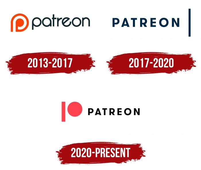
The first logo of the crowdfunding platform looked unconventional. Developers depicted a stylized white letter “p” inside an orange teardrop to represent Patreon in cyberspace. To the right, with a small indent, was the service’s name – “Patreon.” Each letter had something special: “p,” “a,” and “o” were the same shape, “e” “rolled back,” and the left part of the horizontal dash “t” was disproportionately short. Moreover, all symbols were in lowercase.
2017 – 2020
In 2017, the site changed its logo and went beyond a minimal redesign – it completely updated the font and abandoned the familiar teardrop element. This was because the old logo looked outdated, especially the font with strange geometry. In the new version, the word “PATREON” is written in uppercase letters and placed to the left of a thick vertical line.
Patreon uses a red color in the shade Fiery Coral (#FF424D). The same color is used for the circle depicted on the small icon. The main logo is black-blue – both the inscription and the vertical stripe. This is a good choice because neither color is associated with other popular brands.
2020 – today
The current logo represents a shift towards modern trends in icon graphics. There are three main factors: simplicity, absence of volume, and clear clarity of everything depicted in the logo. At the same time, each element is veiled and symbolizes its concept. In this case, the first letter of the name “Patreon” is conveyed. The letter “P” is split. It consists of round and rectangular fragments spaced some distance from each other. It’s an emblem in the style of cubism, with only one vertical rectangle and one circle. Despite the criticism, the management of the crowdfunding platform retained the concise image that meets modern requirements.
Patreon: Interesting Facts
Patreon, started in 2013 by musician Jack Conte and developer Sam Yam, has changed how people who make things like music, videos, or art can profit from their work. Instead of just hoping for ad money, creators can get paid directly by their fans, called “patrons,” through a subscription.
- Why It Started: Jack Conte struggled to make enough money from his YouTube videos, so he helped start Patreon. It lets fans support their favorite creators with some money every month, which helps creators spend more time making cool stuff.
- Who Uses It: Patreon is not just for YouTubers or podcasters. Writers, artists, musicians, teachers, and many other creative people use It to share their work and receive support.
- How It Works: Creators on Patreon can set up different levels of support for fans, each with its perks, like seeing stuff no one else does or chatting with the creator.
- Money Matters: Patreon has given out billions of dollars to creators since it started. This shows that fans are willing to pay for the things they love.
- Worldwide Community: People from over 200 countries use Patreon, meaning creators can reach fans worldwide and find people who love what they do, no matter how unique.
- Growing Fast: More and more people are joining Patreon, especially when things like the COVID-19 pandemic have made it harder for creators to make money in other ways.
- Standing Up for Creators: Patreon fights to keep creators’ stuff theirs, helping with copyright issues and ensuring they control their work.
- Freedom to Create: Unlike places that depend on ads where you might have to change what you make to get more views, Patreon lets creators make what they want, the way they want.
- Building a Community: Patreon gives creators tools to talk with their fans, like live chats and special updates, strengthening the fan-creator connection.
- Always Getting Better: Patreon updates and adds new content based on what creators and fans say they want, making it easier and better to use.
Patreon shows a new way for people to support the things they love and for creators to make a living by doing what they’re passionate about, making a big difference in digital content.
Font and Colors
Abandoning futurism, Patreon opted for minimalism, which did not please many users. The main argument of critics was that the updated design does not correspond to the crowdfunding platform. The combined sign turned out to be too generic: it could equally belong to any company associated with financial services. The icon, consisting of a blue rectangle and a red circle, seems too abstract – it’s impossible to understand what the site specializes in.
The minimalist inscription is made with the GT Walsheim Bold font, characterized by the absence of serifs. Otto Baumberger, a Swiss poster designer of the 1930s, inspired it. Until 2013, the logo featured the modified font Opificio, vaguely reminiscent of SF New Republic.
Although the logo is textual, it does not contain a single word, as the letter “P” has turned into a graphic detail. The brand palette now contains two colors: coral (used for the circle) and black (used for the rectangle).
Patreon color codes
| Fiery Coral | Hex color: | #FF424D |
|---|---|---|
| RGB: | 255 66 77 | |
| CMYK: | 0 74 70 0 | |
| Pantone: | PMS 1787 C |
| Brand Black | Hex color: | #141518 |
|---|---|---|
| RGB: | 20 21 24 | |
| CMYK: | 17 12 0 91 | |
| Pantone: | PMS Black 6 C |
FAQ
Why did Patreon change its logo?
The radical change in the logo occurred in 2017 because the previous version had become outdated and outlived its usefulness. As a result, the service completely abandoned the “teardrop” element and updated the font.
Can you use the Patreon logo?
The crowdfunding platform allows the use of the icon to promote one’s page within the site, for which a license is required. In any other case, the use of the logo without Patreon’s permission is prohibited.
What is a Patreon patron?
Patreon is the support of artists by “patrons” who sponsor them and thus earn on their talent.
What is Patreon for artists?
Patreon for artists is a direct opportunity to receive money for their works. It supports not a single-user project but the artist himself.
