The famous and recognizable Google logo symbolizes the number 10 followed by a hundred zeros, expressing the immense power of the system and emphasizing its connection through the original name. Simple and understandable, with a user-friendly interface, it reflects Google’s modern identity.
Google: Brand overview
| Founded: | September 4, 1998 |
| Founder: | Larry Page, Sergey Brin |
| Headquarters: | Mountain View, California, U.S. |
| Website: | google.com |
Meaning and History
Ruth Kedar, an artist and part-time professor at Leland Stanford Junior University, where Google’s founders Sergey Brin and Larry Page studied, made a significant contribution to logo development. However, it was based on an existing color design concept. It simply gave the colorful inscription a new shape, with its merit being a successful interpretation of the emblem.
What is Google?
It is an American corporation of an international level, a digital giant with many programs and useful tools that help navigate comfortably in the virtual space. She specializes in Internet search engines, cloud computing, innovative programs, advertising technologies. The company was founded in 1998 by software entrepreneurs Edward Page and Sergey Brin.
1995 – 1997
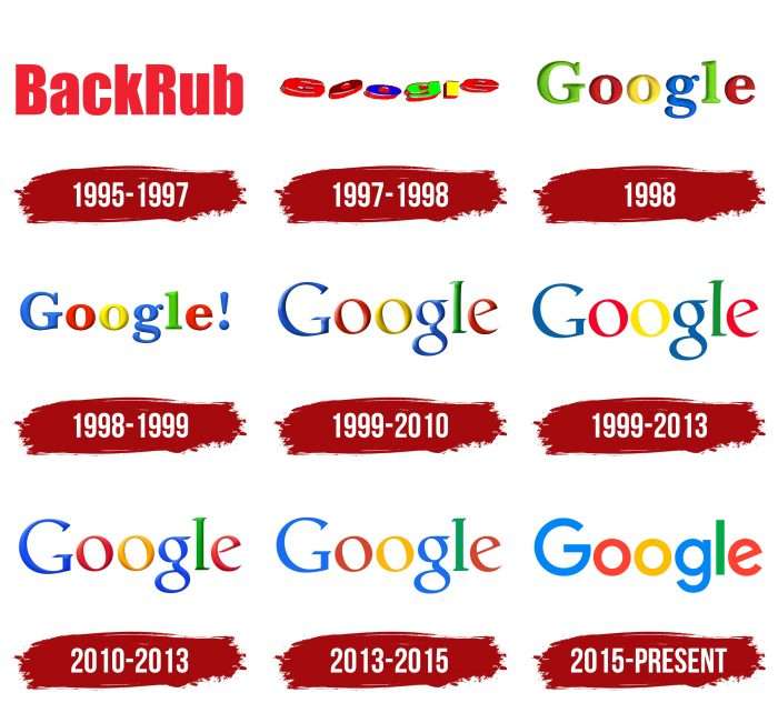
The first logo reflects Google’s old name, BackRub. It was dedicated to the popular practice of obtaining backlinks to increase website traffic. The word was written in bold red letters with serifs, vaguely reminiscent of Impart Family and PF Fusion Sans Pro Black. The background featured a hand touching a flat surface, which in the full version looked like a bare back.
1997 – 1998
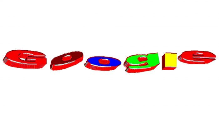
Two years later, BackRub was renamed Google, reflected in its logo. The new name is derived from the mathematical term googol, meaning the number ten followed by a hundred zeros. The rebranding resulted in a logo with multicolored bouncing letters. The inscription was flattened and looked funny, but it could become iconic. It was used in the beta version when Google existed only as a pilot project for Stanford University students.
1998
Google was registered in 1998, and the same year, a new logo was created using Baskerville Bold font. The designers revised the color palette, coloring the letters in green (“G” and “l”), red (first “o” and “e”), yellow (second “o”), and blue (lowercase “g”). Rumors suggest this logo was modeled in GIMP. The question of its creator remains open: some sources claim Sergey Brin, while others attribute it to Larry Page.
1998 – 1999
The first emblem, adopted in September 1998, was short-lived. In October, it was replaced with a modernized version featuring a blue uppercase “G” and an exclamation mark at the end. Gradient transitions and shadows became more pronounced, giving the letters a three-dimensional look. The exclamation mark was likely intended to make Google’s logo resemble Yahoo!’s, as they competed in everything, including corporate style.
1999 – 2013
From May 1999 to September 2013, a simplified emblem with two-dimensional letters and without the punctuation mark “!” was used. Designers chose the new Catull BQ font, created in 1982 by artist Gustav Jaeger for Berthold Type Foundry. The font featured slanted letter elements and fancy serifs stylized to look antique.
1999 – 2010
In May 1999, another logo appeared – this time with a 3D design, used as Google’s official symbol until May 2010. It was developed by Ruth Kedar, whom Sergey Brin and Larry Page met through a mutual friend. She proposed several options with Adobe Garamond and Catull fonts, a magnifying glass, intertwined “o” letters, and an intricate multi-component form. However, the company owners chose a minimalist option, closer to the original.
2010 – 2013
In 2010, the design proposed by Ruth Kedar was revised. The font remained the same; only the details changed. Pronounced shadows disappeared, the gradient’s intensity was reduced, and the yellow “o” acquired an orange hue.
2013 – 2015
The next logo update occurred in October 2013. Developers made the inscription two-dimensional and adjusted the serif shapes to be less sharp than before. The brand name was intended to harmonize with recently introduced Google services and match the Material Design style.
2015 – today
In 2015, the company introduced a simplified logo. Serifs disappeared, and shades became more saturated. This version was developed by a team of graphic artists who collaborated for a week.
Google: Interesting Facts
Google was started in 1998 by two guys, Larry Page and Sergey Brin, and it became one of the biggest tech companies ever.
- The Name: Google’s name comes from “googol,” a huge number (a 1 with 100 zeros after it). This shows that Google wants to help people find information on the Internet.
- Starting in a Garage: Larry and Sergey first worked on Google in a garage they rented from a lady named Susan Wojcicki in California.
- First Google Doodle: In 1998, they made a simple drawing on their homepage to tell people they were out at the Burning Man festival.
- Google’s Big Home: Google’s main office is in California and has a fun name, the Googleplex. It’s a big place where workers get free food, exercise, and even naps.
- Buying Other Companies: Google started growing by buying other companies. Its first big buy was in 2001, and later, it bought YouTube in 2006 and Android Inc. in 2005, adding many new things besides search.
- Google’s Own Code: In 2009, Google created its coding language, “Go.” This language helps create software that works well and is easy to use.
- Caring for the Planet: Since 2007, Google has worked to protect the environment. By 2030, it wants to use energy that doesn’t pollute all its buildings and data centers.
- Maps and Street View: Google Maps started in 2005, letting people see maps online. In 2007, they added Street View, which uses special cameras to show places as if you were walking there.
- Android Phones: Google’s Android is the most used phone system in the world. It was launched in 2007 and is designed to work on many different phones.
- Big Dreams Projects: Google’s bigger company, Alphabet, works on big dream projects like self-driving cars, balloons that give internet access, and health tech stuff through a place called X lab.
Google began small but dreamed big. It’s all about finding info, improving tech, and caring for the planet.
Font and Colors
Google has a mini-emblem in the form of the uppercase letter “G,” consisting of several color segments: blue, green, yellow, and red. The rainbow letter is used as an icon for the voice search service, a favicon for web resources, and an icon for the mobile application.
Before 2015, the logo contained various modifications to the Catull font. After the final redesign, a new font, Product Sans, was introduced. The letter “e” has a slanted line as a symbol of the company’s unconventional nature. The inscription’s color is not uniform, striking: letters are painted in bright shades of red, green, blue, and yellow, contrasting with each other and firmly associated with Google products.
Google color codes
| Brandeis Blue | Hex color: | #4285f4 |
|---|---|---|
| RGB: | 66 133 244 | |
| CMYK: | 73 45 0 4 | |
| Pantone: | PMS 2727 C |
| Cinnabar | Hex color: | #db4437 |
|---|---|---|
| RGB: | 219 68 55 | |
| CMYK: | 0 69 75 14 | |
| Pantone: | PMS Warm Red C |
| Selective Yellow | Hex color: | #f4b400 |
|---|---|---|
| RGB: | 244 180 0 | |
| CMYK: | 0 26 100 4 | |
| Pantone: | PMS 7549 C |
| Shamrock Green | Hex color: | #0f9d58 |
|---|---|---|
| RGB: | 15 157 88 | |
| CMYK: | 90 0 44 38 | |
| Pantone: | PMS 3405 C |
FAQ
What does the Google logo symbolize?
The Google logo symbolizes the mathematical term googol – the number 10 followed by a hundred zeros. This real number was used by the internet company’s founders to express the immense power of their search engine. They emphasized this ratio by placing two “o” letters next to each other, which in shape resemble zeros.
What’s special about the Google logo?
The overall distinction of this company’s logo from other firms’ emblems lies in the combination of several bright colors. These are blue, green, yellow, and red, and they are present in all service marks of the Google family. The geometric nature of the letters also characterizes it: in the modern version, the Product Sans font of its design is used (since 2015).
Why is the Google logo considered the best?
The graphic Google logo is considered the best because the circle of the emblem with the first letter of the American internet giant’s name is perfectly round. Although the empty space in the letter “G” breaks the integrity of the wide ring, it does not make the logo disharmonious, as the center rectangle forms a massive white letter “C” in the negative space.
What is the Google logo called?
It is called Google Doodles due to special changes made at certain intervals. This feature is used on holidays, anniversaries of famous personalities who contributed to global development, on particularly significant dates, and during planetary-scale events. The modified logo appears on the main pages.
