A popular means of visualizing the social network is the combined Facebook logo, whose brand color is conditioned by the founder’s condition (Deuteranopia). Its identity symbolizes a commitment to its history, reflecting the essence and functionality of the global online community.
Facebook: Brand overview
Facebook is a global internet community and a company of the same name. It was founded in February 2004 by Mark Zuckerberg, Eduardo Saverin, Dustin Moskovitz, and Chris Hughes. Its location is Menlo Park, California (USA).
Meaning and History
The Facebook logo has always been and remains its distinctive symbol. It’s the social network’s name written in white letters on a blue rectangular background or black on white. There’s also a graphic representation in the form of a single letter “f.” The emblem has undergone minor changes throughout its existence, remaining recognizable and standing out among others.
What is Facebook?
Now, it’s the only name of the social network. As the owning company, Facebook was renamed Meta Platforms, Inc. in 2021. The world’s largest platform for online communication has existed since 2004. Initially, it was conceived as a student directory with photos of students from Harvard University and other US institutions. Registration on the site became publicly available in 2006.
2003 – 2004
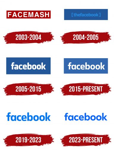
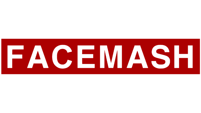
The year preceding the final emergence of the unique platform, which had no analogs, was called FACEMASH. This resource served as the impetus for creating the first logo. The word was written in white uppercase font and placed in an elongated red rectangle.
2004 – 2005
Then radical changes occurred, and the platform named “thefacebook” in one word appeared. It formed the basis of the logo. The phrase was written in blue lowercase letters and enclosed in square brackets on a dark blue rectangular background.
2005 – 2015
2005 became a turning point for the social network, reflected in its visualization. After acquiring the corresponding domain, the owners changed the emblem’s design, making it lighter and better. As a result, they removed the article “the” for easy readability, and the font was enlarged and made white so the word immediately caught the eye. Thus, “Facebook” increased in size, filling almost all the space on the blue field. Since then, the branding has had a classic rectangular shape.
2015 – today
In 2015, the new logo was finally approved. As before, it used only one word – “facebook”. Additionally, minor changes were made, even imperceptible at first glance. But, looking closer, you can see that the letter “a” became completely different: without the top segment and with an enlarged inner letter spacing. The letter “b” changed too. The color palette also changed: alongside the original version, black-and-white colors appeared. However, the size of the protruding elements “f,” “b,” and “k” remained the same.
2019 – 2023
In 2019, Facebook underwent a significant redesign, updating visual elements, particularly the color palette and design. In the previous version, the logo was in dark blue tones; in the new design, it became lighter on a white background, giving it a new, bright look. Not only did the verbal representation of the logo change, but The iconic symbol of the platform transformed from square to round, harmonizing with the light blue tone. There are two variations of this round sign: flat and gradient. This update was aimed at modernizing the brand while maintaining its recognizable elements.
2023 – today
The logo became more friendly. This was manifested primarily in reducing the letters, which became lower than before. Another significant innovation is the appearance of rounded shapes for the letters “a,” “o,” “e,” “c,” and “b.” The central cutout of these letters looks like a perfect circle. The second change concerns the diagonal cut at the top of the vertical strokes of the letters “k” and “b,” as well as on the crossbar of the letter “f.” It became more pronounced and deeper. The font became somewhat thinner but remained bold. The color lost its cobalt shade and became sky blue. This version of the emblem acquired the most important quality for a social network – friendliness.
Facebook: Interesting Facts
Facebook is a big deal on the internet, letting people worldwide talk, share, and discover new things.
- College Project: Mark Zuckerberg and his friends made Facebook at Harvard University on February 4, 2004. At first, only Harvard students could use it, but then it opened up to more schools and, finally, everyone.
- Name Change: It was first called “Thefacebook,” but in 2005, they bought the domain “facebook.com” for $200,000 and just called it “Facebook.”
- Growing Fast: By the end of 2004, a million people were using Facebook. It showed everyone how quickly it could bring people together online.
- News Feed: In 2006, Facebook introduced the News Feed, a new way to see what all your friends were posting in one place. Some people didn’t like it initially, but it became a big part of how we use Facebook.
- Apps on Facebook: In 2007, Facebook let other companies make apps that worked with Facebook. This helped make Facebook a place where you could do all sorts of things online.
- Buying Other Companies: Facebook bought a bunch of other companies, like Instagram in 2012, WhatsApp in 2014, and Oculus VR in 2014, making Facebook even bigger.
- Becoming a Public Company: On May 18, 2012, Facebook started selling its stock to the public. This was a huge deal and made the company worth $104 billion.
- Used Everywhere: Billions of people use Facebook monthly, making it one of the biggest places to hang out online.
- Live Videos: In 2016, Facebook allowed people to show live videos, changing how we share and see big moments and news.
- Changing Its Name: In 2021, Facebook changed its company name to Meta to show interest in creating new virtual worlds called the “metaverse.”
Facebook started as a fun project for college students but grew into a huge part of how we talk, share, and see the world, always looking for new ways to bring us closer together.
Font and Colors
The last logo update was forced and related to the shift of internet users to personal gadgets. Developers made some adjustments to adapt the branding to the small screens of smartphones, tablets, and other modern devices. The new design retained the corporate style but became more streamlined, avoiding logo pixelation when scaling pages. Creators tried to tune it to displays of any size finely.
Working with the old symbol – the characteristic sign in the form of a single letter “f” – was the most difficult. The lowercase letter was almost in the center of a blue square with rounded corners. But then it was shifted to the right and down. Thus, the beginning of the foot now coincides with the edge of the frame, so the white color naturally flows from the icon into the surrounding space. This enhances its hidden symbolism. In 2013, the graphic emblem was updated: the limiting line was removed, and the letter “f” was moved further to the right. This also added a light 3D effect.
The font used for the text part of the emblem remains the most popular worldwide and is a subtype of Klavika. The brand palette is also recognizable – a blue background and white letters. The colors were not randomly chosen, as Mark Zuckerberg suffers from Deuteranopia and only distinguishes shades of blue 100%.
Facebook color codes
| Celtic Blue | Hex color: | #0165e1 |
|---|---|---|
| RGB: | 1 101 225 | |
| CMYK: | 100 55 0 12 | |
| Pantone: | PMS 2726 C |
| Picton Blue | Hex color: | #17a9fd |
|---|---|---|
| RGB: | 23 169 263 | |
| CMYK: | 91 33 0 1 | |
| Pantone: | PMS 2925 C |
Questions about the Facebook emblem and logo
What does the Facebook logo say?
Lately, users often compare the Facebook logo – a lowercase letter f in a circle – to the silhouette of a person leaning over a smartphone. Designers did not imbue such meaning into the social network’s icon. The only thing worth noting is the blue base color. Mark Zuckerberg chose it because of his Deuteranopia, which prevents him from distinguishing all colors except blue.
What type of logo is Facebook?
The social network Facebook has a combined logo. On the one hand, it has a graphic element – a blue circle with a gradient and negative space, forming a white letter “f.” On the other hand, it is complemented by a verbal sign, for which designers modified the Klavika font.
![[thefacebook] Logo 2004-2005](https://logos-world.net/wp-content/uploads/2020/04/thefacebook-Logo-2004-2005-700x394.png)
