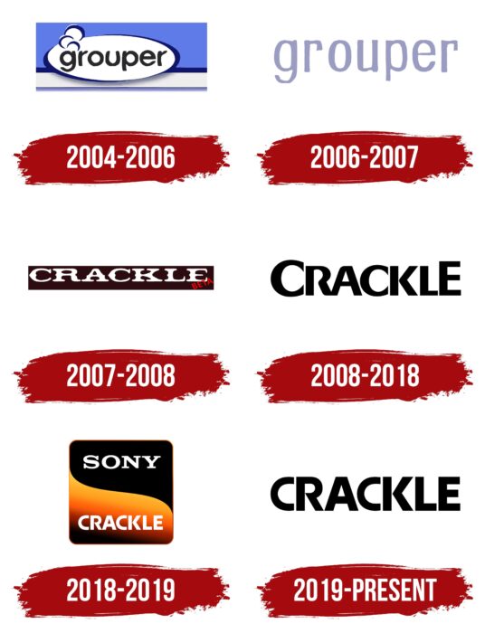
“Sit down like this, the viewing begins,” says the Crackle logo. The logo shows a large selection of films and shows on various topics in several languages. Therefore, the platform will attract viewers’ attention for a long time.
Crackle: Brand overview
| Founded: | 2004 |
| Founder: | Josh Felser, Dave Samuel, Mike Sitrin, Aviv Eyal |
| Headquarters: | Culver City, California, United States |
| Website: | crackle.com |
Meaning and History
At first, it was an independent firm called Grouper. It existed only on the Internet, as it was a simple online video viewing service. After two years in that format, it was taken over by Sony Pictures, which turned it into a multiplatform entertainment service with a personal network and renamed it Crackle.
The main focus was to present TV shows, films, and shows from Sony’s portfolio and produce and distribute unique content of its design. The site then had streaming services on some TVs, players, and set-top boxes (2011). Gradually the company grew and added more apps – for example, for Android and iOS. Much has been made to collaborate with Xbox Live, BlackBerry, Apple TV, and many other services.
In early 2018, the platform was named Sony Crackle. However, a year later, its controlling stake was bought by Chicken Soup for the Soul and immediately returned to the previous name. Now, this service involves programming in several genres: they include mostly sci-fi, action, horror, drama, crime, and comedy. And for the time of its existence, the video site has changed its name and its logos several times. It has six of them in total.
What is Crackle?
Crackle is a streaming video service featuring movies and TV shows of various genres. The platform originated in 2004 when it was launched by four developers – Josh Felser, Dave Samuel, Mike Sitrin, and Aviv Eyal. It moved to Sony Pictures two years later and later became owned by Chicken Soup for the Soul Entertainment. The service is headquartered in Culver City, California, USA.
2004 – 2006
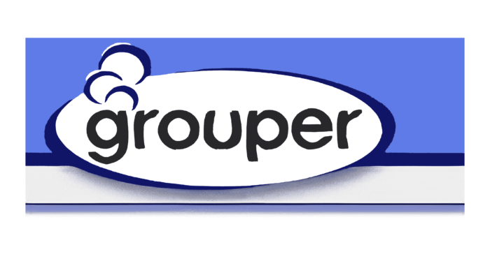
The design of the debut logo was focused on geometry, so it looked like a horizontal rectangle divided by color into several zones. The lower part was a wide gray-blue line, while the middle part was a thin dark blue line. The top zone was a large blue stripe and took up 2/3 of the background space. On top was an oval figure with the then service name in the center. It had a white background and a dark blue border around the edges. The frame was of uneven thickness with an extension to the right and left. On the side were three bracket-like curls of mini clouds of steam that went upward. The inscription was typed in a half-bent grotesque lower register with smooth roundings at the corners.
2006 – 2007
After Sony Pictures took over grouper, the logo underwent a major redesign. First, the new owner added a minimalist look to it and removed all the unnecessary elements, in his opinion, concentrating on the name. Secondly, he changed the font, making it more serious and stylish. In the end, the only word left on the emblem was the name of the service on a white background. It retained only two of the features linked to the previous version – the lower case and rounded corners. Everything else is a thing of the past. The letters were repainted gray and stretched upward.
2007 – 2008
After being renamed Crackle, the multiplatform naturally changed its logo. It then had a rectangular black background with white lettering in the middle. The new name was typed in an Old English style font – with spiky letters, large serifs, and irregular lines. In the middle of each leg were bumpy protrusions, typical of western or even silent movie-style headpieces.
2008 – 2018
Two accented letters appeared in the logo lettering during this period, the first “C” and the last “E.” They were much larger than the others, although all went to upper case. The name was rendered in bold characters with wide feet of uniform thickness. The “R” was unclosed; its right side did not close with the left vertical element. As a result, the space inside the letter was like a keyhole, which I wanted to take my eye to inquire: what’s going on inside? The “R” was connected to the “A,” so they looked like an exception among the other characters, placed separately from each other. And the other letters were geometrically proportional, consisting of angles and flat lines, whereas the “R” and “A” had roundings.
2018 – 2019
After the video content platform was renamed, there was a change in its visual identity. It was major. The developers completely redesigned the logo, using the old writing style. They balanced all the letters in the word “Crackle” by removing the rounding of the “R” and “A” and aligning the “C” and “E” in height. So the text was straight, with bold letters of equal size. But it was still grotesque. The inscription was at the bottom. The second part of the name consisted of the word “Sony” in a large serif font, the style the company usually uses. Both inscriptions were painted white and were placed on different backgrounds, black and yellow, combined in a square with rounded corners and a gradient.
2019 – today
The current logo is essentially a continuation of the 2008-2018 version but in a 2018-2019 design. It’s just that the authors combined the two styles: they took the general characteristic of the first version and the private details from the second. The result is single black lettering on a white background, with all the letters having the same size and identical structure. Everything is the same: the width of the feet, the straight lines, the sharp angles, and the lack of serifs.
Font and Colors
Crackle’s modification of the streaming service logo is a movement from minimalism to minimalism. Complex shapes and multi-component elements appeared in between, but they gradually disappeared. The reason for this is the desire for simplicity in the service’s identity so that visually the service is not perceived as overly complex and attracts as many visitors as possible. The color scheme also remained simple.
The search for marketing logo design resulted in the streaming service frequently changing its text style. In particular, it used several types of typefaces that had only one thing in common: no serifs. Otherwise, they were different: monumental and bold, thin and Old English, translucent and rounded. The color palette, on the other hand, was stable. It consisted only of double combinations. In the early versions, it was a blue-and-white palette; in the later ones, a black-and-white range.
Crackle color codes
| Black | Hex color: | #000000 |
|---|---|---|
| RGB: | 0 0 0 | |
| CMYK: | 0 0 0 100 | |
| Pantone: | PMS Process Black C |

