The emblem of the social internet service Pinterest fully reflects the format of a free photo hosting service. The visualization of the Pinterest logo is aimed at a young audience and is characterized by its simplicity and effectiveness, emphasizing the name and focus of the brand.
Pinterest: Brand overview
Pinterest is an online platform for meeting, communicating, and finding like-minded people in the format of free photo hosting. It allows users to add their own images and create collections from them by “pinning” them to so-called “boards.” Despite its relatively narrow focus, the internet service attracts attention with its unusual design and user-friendly functionality.
Meaning and History
The debut logo of Pinterest appeared in 2010 when the experimental version of the site was launched – first closed and then accessible only by invitation. As far as is known, Ben Silbermann personally invited the first five thousand users. The project itself was launched a few months earlier, in December 2009.
From the first days, the developers strived to make the brand’s style attractive to gain the trust of visitors. After all, a “green,” unknown service had to speak for itself. Great hopes were placed on the logo as part of the visual identity of the brand. Designers portrayed the “Pinterest” inscription in an unusual perspective: fashionable and fresh, with a clear orientation towards a young audience.
However, the online platform did not develop as quickly as its creators would have liked. In terms of unique visits, it significantly lagged behind the competing Instagram, and the difference was impressive. Success came to it in 2011: the number of users began to grow exponentially. Thus, the Pinterest emblem became famous. Millions of people around the world saw it, recognized it, and began to discuss it.
What is Pinterest?
Pinterest is an American internet service with photo hosting and social networking features. It allows users to add images, place them on so-called “boards,” organize them into collections by themes or directions, and share them with other users. The platform was founded by Ben Silbermann and was launched in 2010, headquartered in San Francisco, California.
2010 – 2011
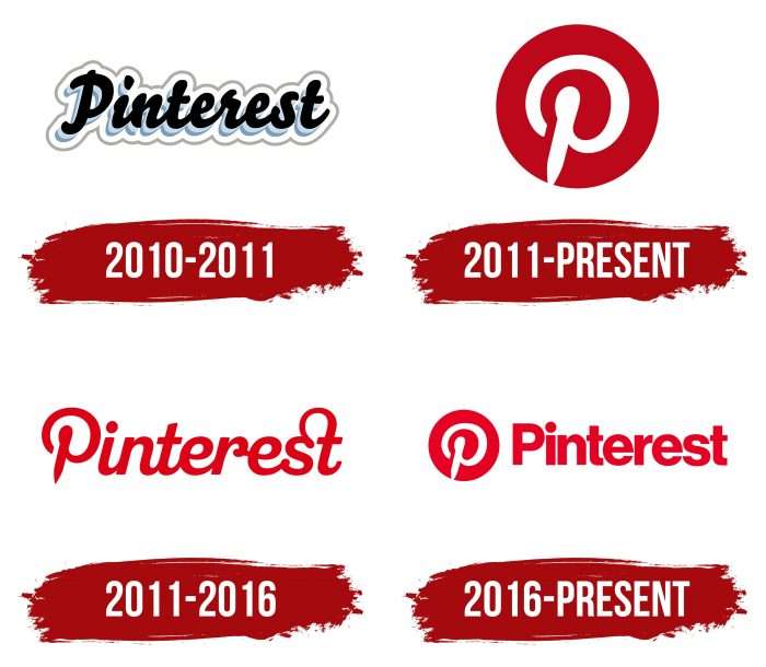
The first version of the logo was created using the Bello Script font. It mimics a handwritten inscription made in a calligraphic style. The primary color is black; the word has a ghostly light blue shadow and a wide white border with a gray outline. The emblem looks presentable but somewhat chaotic due to the mixing of several different elements.
2011 – today
After the launch of the iPhone app, Pinterest began to gain momentum. Around the same time, it introduced a new logo, simpler and more businesslike than the previous one. Designers tried to maintain the original style: they depicted a stylized letter “P” inside a red circle. This logo remains relevant to this day.
2011 – 2016
In 2011, the service updated its trademark. Now, it is noticeably different from the first logo, although developers Juan Carlos Pagan and Michael Deal tried to maintain the overall stylistic direction. The font still mimics handwriting but looks different than before.
The shape of the letters changed (especially “P,” “r,” and “s”), and the connecting lines between the characters changed. For example, a long rounded strip extends to the right from the letter “s,” arching high, then sharply descending and merging with the vertical stroke of “t.” The primary color is dark red; the secondary is white.
2016 – today
In 2016, the social network unhesitatingly abandoned its logo of the previous five years. Perhaps because the redesign was not too global, it only affected the font and combined the service’s name with its infamous round icon.
The grotesque font gives the inscription a business-like appearance. The developers brought all the letters to a uniform shape so that they look strict and harmonious. Most likely, this was an attempt to present Pinterest as a replacement for Instagram, Facebook, or Twitter for large corporations rather than as an entertainment platform for the youth.
Pinterest: Interesting Facts
Pinterest is a website where you can find many ideas for recipes, decorating your home, and fashion tips. Since it started, Pinterest has become a big deal online.
- How It Started: Ben Silbermann, Paul Sciarra, and Evan Sharp made Pinterest and opened it in March 2010. At first, you needed an invite to join. Silbermann even talked to the first 5,000 people to sign up, giving out his phone number and meeting some of them.
- The Name: Pinterest’s name comes from combining “pin” and “interest.” It’s a place to save pictures and videos you like on boards about different topics.
- Growing Fast: Pinterest became popular quickly, with 10,000 users in nine months, even without much advertising. It looked nice and had a new idea, which many women initially liked.
- Scrolling Forever: Pinterest was one of the first websites to allow users to scroll down to see more content without clicking on a new page.
- Lots of Women Use It: For a long time, more women than men have used Pinterest, which is why you’ll find a lot about fashion, decorating, and cooking.
- Becoming a Big Company: Pinterest became a public company in April 2019, a big step that showed it had grown from a small startup.
- Searching with Pictures: Pinterest lets you search for things by photographing something. This “Lens” feature helps you find similar pictures or products on Pinterest.
- More Info in Pins: In 2013, Pinterest made “Rich Pins,” which have more details than regular pins. These can be about products, recipes, or articles, making it easier to get useful info quickly.
- Worldwide: Pinterest isn’t just in the United States; it’s used worldwide in many languages. It tries to ensure it has stuff that people from different places will like.
- Shopping on Pinterest: Pinterest has made it easier to shop from the site with special pins that let you buy stuff or visit online stores. This makes it a good place for companies to find customers.
Pinterest has changed from a simple place to save pictures to a big website where people can discover new things and even shop, making it important in social media and online shopping.
Font and Colors
The round logo of the social network led to legal disputes. As it turned out, it almost completely replicates the icon of Path, the primary red color, the shape of the white letter “P,” and even the proportions of the elements match. The difference is only that the Path icon is a square with rounded corners, and Pinterest’s is simply round. Because of this, people often get confused and do not understand where each application is located.
Chronologically, Path has much more right to this symbol. It had already been using it when Pinterest was about to register its red circle with the letter “P.” Therefore, in 2012, the competing social network approached the United States Patent and Trademark Office with a request to deny Pinterest the registration of the new logo. Judging by the fact that it was accepted, the patent organization ignored the objection.
If earlier the inscriptions on the emblem were done manually, now the font has acquired a new look. Designers chose the strict Neue Haas Grotesk, slightly adapting it to the style of the online platform.
The palette reflects the brand colors of Pinterest – red and white. Shades have changed several times during the modernization of the sign.
Pinterests color codes
| Cadmium Red | Hex color: | #e60023 |
|---|---|---|
| RGB: | 230 0 35 | |
| CMYK: | 0 100 85 10 | |
| Pantone: | PMS Bright Red C |
FAQ
What is hidden in the Pinterest logo?
Several meanings are hidden in the Pinterest logo. Firstly, it reflects the letter P, which denotes the name of the resource. Secondly, the pin emphasizes the ability to attach an image to a board. Together, they convey the nature of the service’s activities, as its name consists of the words Pin and Interest.
What does the Pinterest logo represent?
The logo of this online service consists of a special sign. It looks like a twisted “spring” with a tip and represents a pin. To the right of the red and white circle is the name of the photo hosting service, executed in a simple font – flat, without serifs, and with small roundings.
