The originally executed Amazon logo provided recognition and individuality in the competitive environment of online marketplaces. The graphic composition symbolized convenient and safe trading, reminiscent of a friendly smile, demonstrating friendliness and a wide range of services.
Amazon: Brand overview
Amazon is the largest online marketplace in the USA and is a company of the same name. Amazon’s history began in 1994 when Jeff Bezos left his position at a Wall Street investment firm and moved to Seattle to start an online business. Originally, Bezos planned to name the company “Cadabra.” Still, after his lawyer mispronounced it as “Cadaver” (corpse), he chose “Amazon” instead, inspired by the world’s largest river and reflecting his ambition to create the largest retailer on the planet.
The company was officially founded on July 5, 1994, and Amazon.com launched a year later on July 16, 1995. Initially, the site sold only books, selecting this market because of its high demand and the ability to offer a vast inventory that traditional bookstores couldn’t match.
In its first month, the site received orders from all 50 states in the U.S. and 45 countries worldwide. By September 1995, it sold books worth $20,000 per week, demonstrating early success.
1997, the company raised $54 million with its initial public offering (IPO) on NASDAQ. That same year, the product range expanded to include movies and CDs.
Amazon began its global expansion in 1998 by acquiring the online retailers Bookpages in the UK and Telebook in Germany, which formed the basis for Amazon.co.uk and Amazon.de.
In 1999, Bezos was named Time magazine’s “Person of the Year,” highlighting the growing impact of online shopping. That year, the company expanded its product categories to include toys, electronics, and home goods.
The year 2000 saw the launch of a marketplace that allowed third-party sellers to list and sell products on the platform. This move significantly increased the variety of products available to customers.
2002, the company introduced its cloud computing services, providing technology solutions to other companies. Initially intended as an internal tool, these services eventually became one of the company’s primary revenue sources.
A subscription service offering free two-day shipping and other benefits was launched in 2005. This greatly increased customer loyalty and purchase frequency.
The Kindle, an e-book reader introduced in 2007, revolutionized how people read books. The device quickly became popular, solidifying the company’s dominance in the e-book market.
In 2010, a new venture was established, allowing the production of original content and enabling competition with other streaming services and traditional media companies.
In 2014, the acquisition of Twitch, a popular video game streaming platform, for $970 million strengthened the company’s position in the gaming industry.
The Echo, a smart speaker featuring the Alexa voice assistant, was released in 2015 and quickly became a leading product in the growing smart home market.
The largest acquisition to date occurred in 2017, when the Whole Foods grocery chain was purchased for $13.7 billion, significantly expanding the company’s presence in offline retail and grocery shopping.
In 2018, the company became the second U.S. publicly traded entity, after Apple, to reach a $1 trillion market valuation.
Project Kuiper was announced in 2019. An ambitious plan is to develop a satellite network to provide high-speed internet worldwide.
In 2021, a major shift occurred when Jeff Bezos stepped down as CEO, handing the role to Andy Jassy, the former head of AWS.
By 2022–2023, the company had further diversified into various industries, including robotics, artificial intelligence, and healthcare (following the acquisition of One Medical). The $8.45 billion acquisition of MGM Studios also strengthened its position in the entertainment industry.
Throughout its history, the company has faced criticism over working conditions, its impact on small businesses, and its market dominance. Despite these challenges, it has continued to grow and innovate, evolving from a small online bookstore into a global technology giant, influencing many aspects of modern life.
Meaning and History
In its early years, Amazon positioned itself as the largest online bookstore, a focus reflected in its debut logo. Over time, the small online bookstore transformed into a global leader in e-commerce, expanding its range to include many products. The company’s logo evolved alongside the brand, reflecting the commitment to providing access to diverse goods and services, connecting buyers and sellers on a global platform characterized by convenience and reliability.
What is Amazon?
Amazon is best known as an online store where you can buy goods in 34 categories. In addition, it is a manufacturer of consumer electronics, a provider of PaaS and IaaS services, owner of a film studio and publishing division.
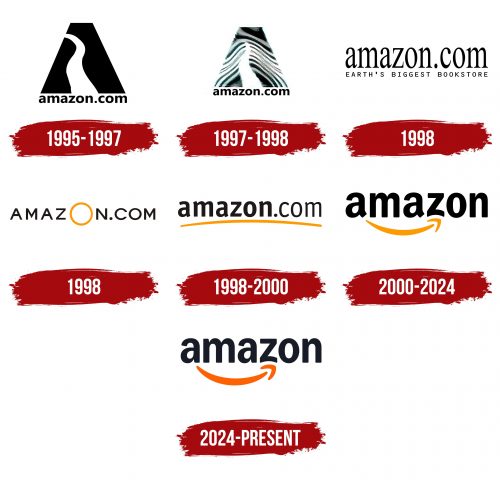
1995 – 1997
At the beginning of its second year, Amazon introduced its first personalized logo, marking an important step in its visual identity. This emblem featured a black triangle with a diagonal peak. A white line ran through the center of the triangle, symbolizing a path being forged. This design element divides the triangle and creates an abstract image resembling the capital letter “A,” referencing the company’s name. Below the triangle, the company’s domain name was displayed in lowercase letters, all the same size.
The symbolism of this logo is multilayered. The black triangle with a diagonal peak represents stability and forward movement, reflecting the company’s ambition to reach new heights despite challenges. The white line, reminiscent of a road, symbolizes the path the company is paving in online commerce. This path is associated with progress, innovation, and market leadership.
The font used for the domain “amazon.com” beneath the triangle plays a significant role. Lowercase letters symbolize accessibility and simplicity, emphasizing the company’s goal of making online shopping as easy as possible for its customers. The uniformity of the font and the absence of capital letters create a sense of cohesion and unity, which is important for a company just beginning its market expansion.
The emblem’s minimalist color scheme reflects the company’s early business approach—focused on substance rather than outward show. Black symbolizes strength and authority, while the white line cutting through the triangle represents the path’s clarity of purpose and transparency.
1997 – 1998
Two years later, the logo underwent some changes. For example, the winding road is now moved to the middle, and thin lines are depicted around it. This symbolizes small paths and roads merging with it. This is a subconscious message: all roads lead to Amazon. The logo’s color palette is a combination of black and white.
1998
This time is notable for the appearance of several versions of the company’s emblem on the trading platform, each of which was tested.
The logo featured the text “amazon.com” in lowercase letters. The font was characterized by narrow, elongated letters, giving the emblem elegance and lightness. The font conveyed a sense of speed and dynamism, which was important for a rapidly growing company and expanding its operations.
Below the main text was the slogan “EARTH’S BIGGEST BOOKSTORE.” This statement immediately reflected Amazon’s ambitions: the company aimed to become the largest platform for selling books globally, and this slogan emphasized those intentions. Using uppercase letters in the slogan added weight and significance, highlighting the company’s confidence in its future success.
The colors were strictly black and white, aligning with the trends of the time and underscoring the company’s serious approach to its business. The black color symbolized reliability and professionalism, while the absence of bright colors made the logo simple and memorable.
The second emblem represents squat symbols of the same word (the store’s URL) but with an enlarged letter “O” made in a yellow circle.
1998 – 2000
1998, the Amazon logo was updated, making it more recognizable and closer to its modern form. This logo was an important step in the company’s visual identity, solidifying key elements still associated with the brand today.
The visual mark featured the internet address of the shopping portal, “amazon.com.” The word “Amazon” was bolded, emphasizing the company’s name and making it the focal point. In contrast, the word “com” was rendered in a lighter tone, maintaining balance and highlighting the main name without overwhelming the overall design.
A thin golden line ran beneath the text, adding elegance to the emblem and symbolizing the company’s commitment to excellence and quality. This line suggested the company’s aspiration to be the “gold standard” in online commerce, offering its customers only the best products and services.
The font was simple and confident, reflecting the spirit of the time—the late 1990s was a period of rapid internet growth and the rise of e-commerce. As one of the leading companies in this sector, Amazon aimed to create an image that conveyed its dynamic development and market leadership.
2000 – 2024
With the onset of the millennium, the administration reworked the assortment and conducted a rebranding. The domain “com” disappeared from the logo, and the letters of the remaining word received maximum emphasis—the designers made them black and wide. The golden line is now inverted and leads from the letter “a” to “z,” as indicated by an arrow. Externally, the graphic design is made like a joyful, welcoming smile.
2024 – today
The new Amazon logo reflects the company’s evolution, aiming to stay relevant and innovative while maintaining its recognizable elements.
The font has undergone noticeable changes as well. The letter “a” has become more rounded and refined, adding a sense of modernity and friendliness. In the old version, the “a” had a sharper, more curled “tail,” which has now been shortened to create a more restrained and harmonious overall appearance for the logo. The letter “m” has also been adjusted—it is now slightly wider and more substantial, adding stability and visual balance to the text.
One of the emblem’s key elements that has also been modified is the famous arrow smile. It stretches from the letter “a” to the letter “z,” symbolizing the wide range of products available on the platform—from A to Z. This arrow has become noticeably thicker in the new version, giving it more visual weight and significance. Additionally, its color has been updated to a more saturated and vibrant orange, which draws attention and makes the logo even more memorable.
This arrow represents a customer’s journey, from searching for a product to making a successful purchase. Moreover, the smile expresses the positive emotions the company strives to deliver to its customers—satisfaction from successful purchases and quality service.
These changes reflect the company’s commitment to meeting modern market demands and user expectations. The new visual mark symbolizes this growth as the company continues to expand and evolve. It has become more dynamic and friendly, aligning with the company’s current strategy of being the largest marketplace, where every customer feels valued and respected.
Amazon: Interesting Facts
Amazon was started in 1994 by Jeff Bezos and first sold books online from a garage. Now, it’s the biggest online store in the world.
- Starting Small: Amazon’s first sale was a book called “Fluid Concepts and Creative Analogies: Computer Models of the Fundamental Mechanisms of Thought” from Jeff Bezos’ garage.
- Selling Everything: What began as just books now includes everything from tech gadgets and clothes to food and car parts. Amazon sells a huge variety of items.
- Cloud Computing with AWS: In 2006, Amazon started AWS, a service that lets people and companies use Amazon’s computers for their websites and apps. This part of Amazon makes a lot of money and helps other businesses grow.
- E-Books and Kindle: Amazon made the Kindle in 2007, changing how people read by letting them download books instead of buying physical copies. The Kindle Store now has millions of digital books.
- Prime Membership: In 2005, Amazon Prime gave customers quick, free shipping for a yearly fee. Prime also includes movies, music, and special deals, making customers want to keep shopping at Amazon.
- Big Warehouses: Amazon has many large warehouses that use robots and AI to send packages quickly, helping Amazon deliver things quickly.
- Shopping Without Lines: Amazon also has physical stores called Amazon Go, where you can shop without waiting to pay. The store knows what you take and charges you automatically.
- Helping the Planet: Amazon wants to reduce its environmental harm and plans to not add to carbon emissions by 2040. It’s investing in clean energy and electric trucks.
- Making Movies and Shows: Amazon Studios, started in 2010, produces movies and TV shows like Manchester by the Sea and The Marvelous Mrs. Maisel, which shows Amazon’s impact on entertainment.
- Worldwide Shopping: Amazon works in many countries, letting people buy and sell things globally.
Amazon has grown a lot, always looking for new ways to do things and making shopping easier and faster for people everywhere.
Font and Colors
After the redesign in 2000, the Amazon brand name became more conceptual. If the orange line previously underlined the brand name, it now resembles an arrow and leads from the letter “a” to “z.” This speaks of the versatility and scale of the internet resource. Such an emblem indicates that one can find everything on the online trading platform, literally “from A to Z.”
The latest logo interpretation has a deep symbolic meaning; it is more than just a sign. It is a whole philosophy based on Bezos’s conceptual view. To emphasize the company’s original position, the company used a solid font in which all letters are the same size, which speaks of equal opportunities for each buyer.
FAQ
What does the Amazon logo mean?
The arrow on the Amazon logo resembles a welcoming smile and indicates that the company provides a full range of goods and services—literally from A to Z. The rounded lowercase letters look friendly.
What is hidden in the Amazon logo?
The arrow connecting the letters “a” and “z” in the word “Amazon,” hints at the complete coverage of goods in the online store and the wide scope of the company’s activities – as they say, from “A” to “Z.”
Is the Amazon logo a trademark?
Yes, Amazon has registered its logo as a trademark.
What is the Amazon logo?
Amazon’s logo includes a word mark (company name) and a graphic symbol (orange arrow).

