


![]() MGM Logo PNG
MGM Logo PNG
Tension, surprise, and vivid emotions are captured in the film studio. The MGM logo shows a leader in its field. Pictures Metro-Goldwyn-Mayer was awarded the highest awards in cinema. The sign promises that all viewers will be interested.
MGM began in 1924 with Marcus Loew, who needed stronger films for his Loew’s theater chain. After buying Metro Pictures in 1919, he added Goldwyn Pictures for $5 million and Louis B. Mayer’s studio for $75,000. On April 17, 1924, the merger created Metro-Goldwyn-Mayer.
Louis B. Mayer managed the studio and its stars, while 24-year-old Irving Thalberg led production. In 1925, Ben-Hur helped MGM earn $4.7 million in its first full year. The roaring lion logo with “Ars Gratia Artis” originated with Goldwyn Pictures and was updated for MGM in 1924 by Howard Dietz, who modeled the lion on Columbia University’s mascot.
In the 1930s and 1940s, MGM became one of Hollywood’s dominant studios, with Greta Garbo, Clark Gable, Judy Garland, Katharine Hepburn, Spencer Tracy, Elizabeth Taylor, and Gene Kelly under contract. While Warner Bros. leaned into social drama and Paramount carried a European tone, MGM built its image around musicals, spectacle, and polished studio glamour. The Broadway Melody won Best Picture in 1929, and in 1939, Gone with the Wind and The Wizard of Oz won Best Picture.
Decline followed in the 1950s as television grew and the old contract system weakened. Kirk Kerkorian bought MGM in 1969 and later added United Artists. The studio passed through Ted Turner, Giancarlo Parretti, Crédit Lyonnais, Sony, Comcast, and other investors, then filed for Chapter 11 bankruptcy in 2010 with over $4 billion in debt. Skyfall helped stabilize the studio in 2012. On March 17, 2022, Amazon completed its $8.45 billion purchase, gaining more than 4,000 films and 17,000 hours of television content.
Meaning and History
![]()
Only Goldwyn Pictures Corporation had a distinctive symbol of the three companies that became part of Metro-Goldwyn-Mayer. It was the one that served as the basis for the modern studio’s logo. The original version was created in 1916. It contained a lion’s head placed in a ring of film diafilm. The loose edges of the tape dangled down the sides. On the left was the word “TRADE,” and on the right was “MARK.” At the top of the circle was the inscription “ARS GRATIA ARTIS.” As the author, design, and advertising expert Howard Dietz admitted, this profound Latin phrase was a favorite of a linguistics professor he knew.
The image of the animal was inspired by a drawing on the cover of Columbia’s student magazine, the names of the university’s sports teams, and their song “Roar, Lion, Roar.” The mask below may have been added because Goldwyn’s first lion came from an African state. It is a tribute to his origins. The pattern of fern-like leaves surrounding the mask played the same role.
The antique trademark Goldwyn, established in 1924, was acquired by MGM. It gradually evolved but retained its original structure. Even now, you can see one version of the lion in a ring of film in the opening credits of the films. But this is not the same animal that appeared on the screen in the late 1910s. The television studio has changed almost ten lions over its century-long history. The most famous are Tanner, who appeared in the golden era of MGM, and the long-lived Leo with a short mane. Screensavers featuring different lions were used simultaneously, making it difficult to determine the logos’ chronology.
1924 – 1960
![]()
The text sign displayed the studio’s name in two fonts. An elegant antiqua with short serifs was chosen for “Metro” and “Mayer,” and a cursive grotesque for “Goldwyn.”
1924 – 1984
![]()
There was a version in which the inscription “Metro-Goldwyn-Mayer” was placed on a scroll with two torches around the edges. At the top was a statue of a lion lying on a pedestal under an arch with the motto “ARS GRATIA ARTIS.” At the bottom, in a convex figure, was the word “PICTURE.” This emblem was shown very rarely. The last time it appeared was in the film Nothing Lasts Forever.
1939
![]()
The menacing, silent lion on the logo was reminiscent of Jackie, who worked for MGM from 1928 to 1956 and acted in hundreds of films. The animal’s head was inside a ring made from film tape. The tape had a characteristic double-sided perforation and contained the familiar phrase “ARS GRATIA ARTIS. At the bottom were two branches of either a fern or a laurel.
1964 – 1966
![]()
The head of the roaring lion was inside a black ring with the same black ribbons around the edges. The Latin utterance and plant ornamentation have disappeared.
1966 – 1982
![]()
In 1965, MGM approached the Lippincott agency to update its image. The collaboration resulted in a new printed logo known as The Stylized Lion. This version debuted in the Grand Prix film and remained current until 1982. The designers depicted a snarling lion’s head within a circle and employed a negative-space effect, in which the surrounding black area defined white lines and outlines. At the bottom was the acronym “MGM,” written in the grotesque Helvetica font.
1982 – 1986
![]()
In 1981, the studio acquired United Artists, changing its name to MGM/UA Entertainment Company. At the same time, the logo returned with a real lion inside a ring of film diafilm. An African mask appeared at the bottom of the circular frame, and the phrase “ARS GRATIA ARTIS” was in the upper half. Beneath the picture was a two-level inscription. The first line was occupied by the abbreviation “MGM / UA,” which was set in a serif font. Just below, between the two horizontal lines, was the word combination “Entertainment Co.” written in a grotesque style.
1984 – 1985
![]()
The lower text was removed, and the motto disappeared, replacing the full company name: “METRO-GOLDWYN-MAYER / UNITED ARTISTS.” The words “ENTERTAINMENT CO.” have been placed on an additional ribbon added at the bottom. The ring without the perforations looked like a heraldic scroll rather than a film.
1986 – 1987
![]()
In early 1986, the company changed its name and updated its logo. It was back to the 1982 version, but with different letters, no “UA.” Thelion’s detailing decreased slightly.
1986 – 1992
![]()
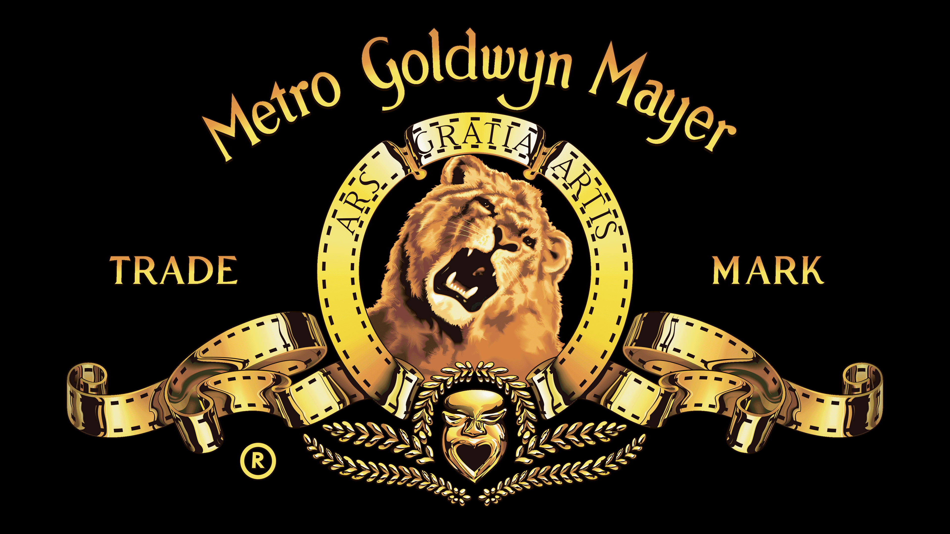
After only a few months as MGM Entertainment Company, the studio rebranded itself again as Metro-Goldwyn-Mayer. Its new graphic symbol resembled the emblem used by Goldwyn Pictures Corporation; only the edges of the tapes were perforated. Leaves formed an ornament around the mask. A ring with a lion’s head was between the words “TRADE” and “MARK,” and an arch-shaped company name was written on top.
1992 – 2021
![]()
The designers made the lines thinner to clarify the image. The words “TRADE MARK” and the registered trademark mark were enlarged.
2011 – 2021
![]()
The “R” symbol in the circle has disappeared. At the bottom, the large black abbreviation “MGM” has been added.
2021 – today
![]()
The studio first unveiled its new logo on March 8, posting it on its YouTube channel. In mid-August, it debuted with the movie Respect. This time, the live snarling lion was replaced by an animated character. The company didn’t simplify the design; on the contrary, it enhanced the image by adding gold and a 3D effect through the gradient. At the same time, all the details and elements correspond to the original.
Font and Colors
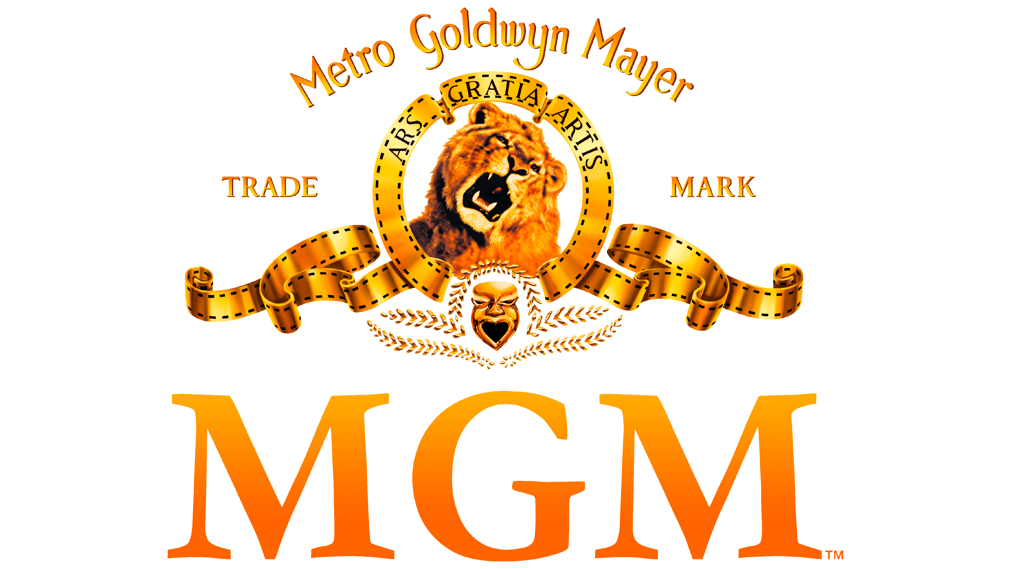
The computer graphics visualized the real lion Leo, MGM’s seventh. He has a short mane because he was still a teenager at the time of the first shooting. Leo is depicted on all the studio’s emblems after 1982. The static drawings depict his growl, recorded in 1957 for a movie splash screen. The company decided to update the design and replace the real lion with a fake one. The perforated bar remained not only as a tribute to history but also as a testament to the art of film.
The current logo features at least four different fonts. The letters in the phrase “Metro Goldwyn Mayer” have similar roundings and the same shape. Still, the second word uses a typeface reminiscent of ITC’s Hadfield, while the first and second use something remotely similar to Göran Söderström’s Heroine. Other serif typefaces were chosen for the words “TRADE MARK” and “ARS GRATIA ARTIS.” The gradient gold color corresponds to the Art Deco style that MGM originally adhered to.