


![]() Batman Logo PNG
Batman Logo PNG
The Batman logo has become an iconic symbol worldwide. Its bold, colorful design reflects the character’s dark, mysterious nature, capturing the essence of Gotham City’s vigilante. The logo has evolved over the years, but it has always retained its core elements, symbolizing justice, fearlessness, and the enduring legacy of the Dark Knight.
Batman first appeared in May 1939 in Detective Comics No. 27, created by Bill Finger and Bob Kane for DC Comics, influenced by the success of Superman’s stories. Early versions of the character were darker and even used firearms, but the tone soon shifted toward detective-driven narratives.
In 1940, the hero received a standalone comic series, and the introduction of Robin broadened the audience. During the 1940s, key elements of the mythology took shape, including Joker, Catwoman, the Batcave, and the Batmobile.
In the 1950s, stories moved toward a lighter, science-fiction tone, partly in response to criticism of comics. The 1960s TV series with Adam West introduced a campier style and boosted its popularity.
The 1970s brought a return to darker themes under Denny O’Neil. In the 1980s, Frank Miller’s The Dark Knight Returns (1986) and Year One (1987) redefined the character, while the 1988 storyline A Death in the Family killed Jason Todd.
Tim Burton’s 1989 film reinforced the character’s presence in popular culture. In the 1990s, Batman: The Animated Series achieved critical acclaim alongside major comic book arcs like Knightfall.
In the 2000s, Christopher Nolan’s trilogy, starting with Batman Begins in 2005, offered a grounded interpretation. In 2011, DC Comics relaunched its universe with New 52.
During the 2010s, the character remained active across media, including the Arkham video games. Ben Affleck appeared in Batman v Superman in 2016, and in 2022, a new film with Robert Pattinson focused on a younger, investigative version of the character.
Meaning and History
![]()
In most versions, the Batman emblem is a silhouette of a black bat with widely spread wings. This image has been repeated in more than 30 variations, in which designers combined various wings with a wide cape. Moreover, the logo has two parallel directions: one for comics and one for movies.
Generally, the emblem has an incredibly turbulent past. The current version, created by Catherine Laver (“Calm the Ham”), is inspired by comic themes. Moreover, its evolution has progressed steadily from simple to multipart forms.
What is Batman?
Writer Bill Finger and illustrator Bob Kane created this legendary superhero for DC Comics. It is the alter ego of billionaire Bruce Wayne, a vigilante who uses technology, intelligence, and martial arts to fight crime in Gotham City. Unlike many other superheroes, Batman has no supernatural powers; instead, he relies on his physical prowess, sharp mind, and advanced gadgets. The character is known for his dark persona, tragic backstory, and a rogue’s gallery of iconic villains.
1939
![]()
When Batman appeared in Detective Comics #27, his chest emblem looked like a pair of spread wings with five points. There were no heads or ears. This version has the shortest history and was released in just one issue.
1939 – 1941
![]()
In the 28th issue, a superhero with an updated emblem appeared. Ears and a small head were added, and the side tips of the wings became longer. Moreover, designers improvised a “cloak” with not five but seven protrusions.
1941 – 1944
![]()
The Batman symbol underwent a whole series of changes. DC artists constantly changed it during the first years, adding interesting design formats. In 1941, they stylized the bat wings, making them angular. The head was slightly removed, leaving only its top visible. The lower points of the wings were reduced to five and significantly sharpened by lengthening them.
1944 – 1946
![]()
The bat figure gradually increased during this period, and the number of points in the wings changed from five to nine.
1946 – 1950
![]()
From 1946, the wings lost their angularity. A distinct head with elongated ears appeared on the logo. The number of “rays” was reduced to five, bringing this version closer to the modern one.
1950 – 1956
![]()
The bat in the Batman emblem grew larger and gained a rounded wing tip.
1956 – 1958
![]()
This period is characterized by the emblem returning to one of the earliest modifications, compact and triangular.
1958 – 1960
![]()
Two years later, the superhero received a radically changed emblem. It depicted a slender bat with long, pointed wing tips and a large head.
1960 – 1964
![]()
This time is characterized by a three-dimensional design, reflected in the 1960 version, to which the emblem returned.
1964 – 1966
![]()
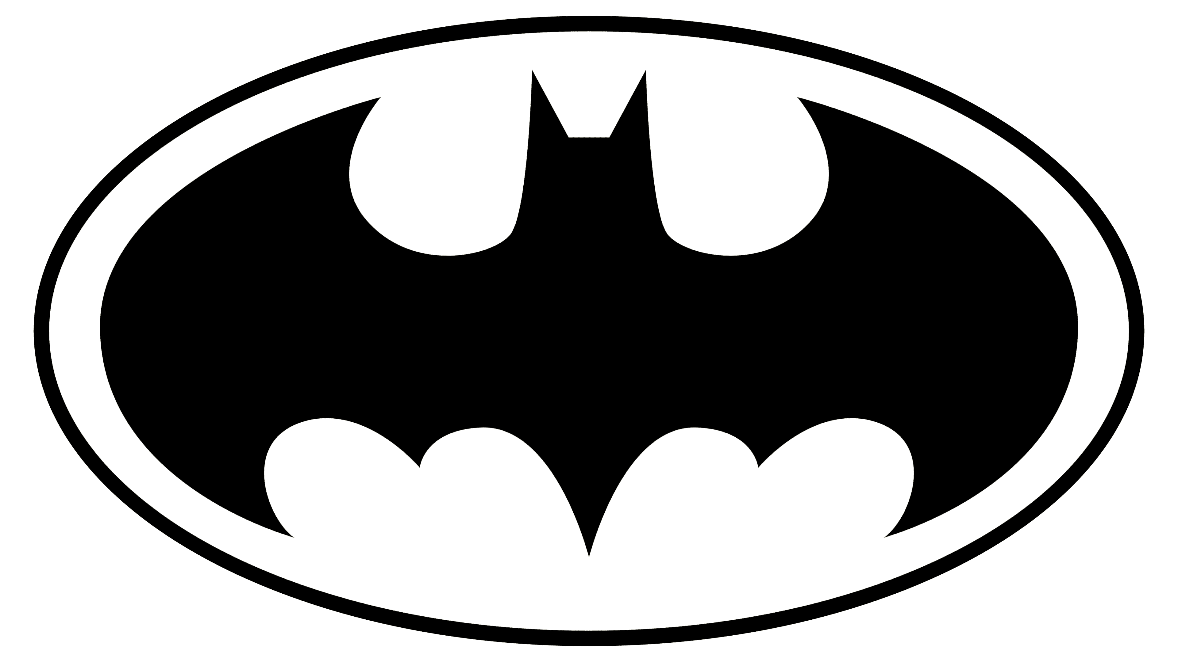
In Detective Comics’ issue 327, artist Carmine Infantino hardly changed the image. She only added width and angularity to the wings and shortened the ears. Her main contribution was the saturated yellow oval, which housed the improvised image. This version later became iconic. The reason for using the ellipse is very practical: finding a background on which the logo would be more easily perceived as a trademark was necessary.
1966 – 2000
![]()
In 1966, Batman’s emblem was changed: the wings became larger, filling the oval. This logo is still used today, not just in comics but also in other areas.
2000 – 2011
![]()
With the onset of the new millennium, designers introduced a reworked version. It acquired clarity, proportionality, and harmony. The yellow ellipse was removed.
2011 – 2016
![]()
Batman debuted with this emblem in the first issue of Detective Comics Vol. 2 after the DC Universe. An elongated central part and the absence of upper points distinguish it.
2016 – 2018
![]()
In the rebirth, the superhero did not return to the old emblem but reworked one of the early modifications. Therefore, the image has no head, only pointed triangular ears and narrow wings outlined in orange.
2018 – 2022
![]()
Batman’s wings are widely spread in this version, resembling a cloak fluttering in the wind. The bat’s image is visible in the general features, thanks to the five-pointed tips at the bottom: one in the center (long) and two on each side (short). The clawed top of the improvised wings almost covers the mask’s head. As a result, high-standing ears are visible. The dark color gives the character a sinister air, hiding him from prying eyes.
2022 – today
![]()
Symbol evolution in the movies
![]()
1943
![]()
1949
![]()
1966 – 1968
![]()
1967
![]()
1977
![]()
1989
![]()
1992
![]()
1992 – 1995
![]()
1995
![]()
1997
![]()
1997 – 2006
![]()
1998
![]()
1999 – 2001
![]()
2000 – 2002
![]()
2004 – 2005
![]()
2004 – 2008
![]()
2005
![]()
2005 – 2012
![]()
2008 – 2011
![]()
2009 – today
![]()
2016 – 2017
![]()
2016 – 2017
![]()
2016
![]()
2017
![]()
2017 – 2019
![]()
2021
![]()
Font and Colors
The logo symbolizes Bruce Wayne. In his childhood, he experienced a tragedy: his parents were killed before his eyes, so the boy swore to dedicate his life to fighting criminals. Hence, his unwavering resilience: when the hero faces difficulties, he is reborn, becoming stronger. Thus, the bat embodies the eternal resistance to evil and the aspiration for the triumph of justice. The emblem also symbolizes an ordinary person’s ability to find strength and hope even in the most difficult times. The emblem has never changed radically, remaining within the harmonious symbiosis of man and bat.
Batman’s logo does not have a label because it is a graphic, not text. Therefore, the main focus is on the image. It carries the key information. The color palette harmoniously emphasizes this through a monochromatic combination of black (the bat, the superhero’s cloak) and white (the background).