


![]() Doctor Who Logo PNG
Doctor Who Logo PNG
The Doctor Who logo is designed in a futuristic, grotesque style. It reflects the atmosphere of travel through time and space, and the image resembles the Time Vortex, a symbol of infinity and the mysteries underlying the science fiction series.
Doctor Who began in 1963 as a BBC experiment to fill a Saturday evening slot with science fiction that could blend education and entertainment. The concept was developed by Sydney Newman, together with Waris Hussein and Verity Lambert.
The first episode aired on November 23, 1963, with William Hartnell as the Doctor, a time traveler from Gallifrey using the TARDIS, disguised as a British police box. The show shifted quickly from an educational format into a broader adventure series.
In 1966, Hartnell’s declining health led to the introduction of regeneration, allowing the Doctor to change appearance. Patrick Troughton became the next lead, establishing a structure that sustained the series for decades.
During the 1960s and 1970s, key antagonists like the Daleks and Cybermen appeared. Under Jon Pertwee, the show moved to color and began featuring UNIT stories. Tom Baker, who played the role from 1974 to 1981, became one of the longest-running and most recognizable Doctors.
The 1980s saw the introduction of Peter Davison, Colin Baker, and Sylvester McCoy, but declining ratings led the BBC to cancel the show in 1989. A 1996 TV film starring Paul McGann attempted a revival without launching a full series.
The franchise returned in 2005 under Russell T Davies. Christopher Eccleston led the reboot, followed by David Tennant. In 2010, Matt Smith took over as Steven Moffat expanded narrative complexity.
The 50th anniversary in 2013 was marked by “The Day of the Doctor.” Peter Capaldi arrived in 2014, followed by Jodie Whittaker in 2017, who became the first woman in the role. In 2022, Davies returned, and Ncuti Gatwa was announced, aligning with the 60th-anniversary plans for 2023.
Meaning and History
![]()
There have been over 10 versions of the Doctor Who logo; fonts, styles, and palettes regularly change with the release of new episodes. All graphic and verbal signs are the property of the BBC.
What is Doctor Who?
It is one of the longest-running and most recognizable British TV series, airing on the BBC since 1963. The science fiction show is known for its dynamic characters, impressive visual effects, and intriguing plot twists. The main character is an extraterrestrial traveler who journeys through space and time using the time machine, the TARDIS, to save the world from villains.
1963 – 1967
![]()
The series Doctor Who is impossible to imagine without its striking, even futuristic opening sequence. However, when it all began in 1963 with the First Doctor played by William Hartnell, viewers saw something very different. Bernard Lodge created an unusual howlround effect in which a television camera captured its own image from a monitor screen, producing an endless loop of distortion. Interestingly, it emerged entirely by accident thanks to Norman Taylor, the BBC’s technical director. In this form, the opening sequence remained in use from the first episodes, An Unearthly Child through The Moonbase. When the series turned 50, this opening was refreshed and adapted for high definition. At the same time, a BBC logo appeared next to the DOCTOR WHO title.
The title, arranged on two levels, looks striking due to its contrasting word sizes and typefaces. The top word, DOCTOR, is smaller, stretched horizontally, and slightly rounded. It is set in a sans-serif typeface reminiscent of Eurostile Bold and Microgramma.
The lower line is dominated by the word WHO. The huge, heavy letters of a monospaced typeface are close to the industrial style of Impact. The vertically elongated word fills the space, emphasizing the scale and importance of the series’ main character.
From an initial television experiment grew one of the most recognizable opening sequences in British television, and the DOCTOR WHO title, with its layout and unusual typography, became a hallmark of an entire era.
1967 – 1970
![]()
When Patrick Troughton became the new face of the Doctor in March 1967, the visual identity of Doctor Who underwent an important update. Bernard Lodge’s original opening, known to viewers for the howlround effect, was augmented. The addition was the Doctor’s own face appearing in the titles. The practice of keeping the main character on-screen until the end of the series persisted. After the 2005 revival, it was set aside for a time and returned only in 2012, with actor Matt Smith as the face.
Along with the updated titles, the logo also changed. Viewers now saw the DOCTOR WHO title in black letters split across two lines. The typeface is classic and serifed, reminiscent of Times New Roman Bold or a Transitional Serif, but heavier.
To create a subtle sense of depth, a soft black shadow was placed around the letters. Shifted slightly downward, it visually lifted the title off the background.
With this opening sequence, the series aired from the episode The Macra Terror through The War Games.
1970 – 1973
![]()
With Jon Pertwee’s arrival, Doctor Who entered the era of color, and the updated opening became a symbol of the new era. In January 1970, Bernard Lodge retained the famous howlround effect, added color, and created an entirely new logo that emphasized the change in lead actor. In this form, viewers first saw the opening in the episode Spearhead from Space, and it remained unchanged through The Green Death.
The updated logo appeared massive, with letters set in a bold, heavy typeface. The composition kept the familiar two-level structure. The smaller word DOCTOR on top and the large WHO below. The letters are black, and the typeface is dense and monolithic, reminiscent of ITC Avant Garde Gothic or a strengthened version of Futura Black.
The letterforms were carefully adapted. The letter D has a diagonally cut front edge; the C has slightly shortened terminals; the T takes on a hammer-like shape; the O is rendered as a round form resembling a donut; and the letter N features a smooth, arched connecting stroke.
Thanks to these details, the logo feels distinctive and highlights the series’s unique style, associated with the arrival of the Third Doctor and the transition to color television.
1973 – 1980
![]()
When the episodes The Time Warrior and Planet of the Spiders premiered in December 1973, Doctor Who greeted viewers with an entirely new opening sequence, once again created by Bernard Lodge. This time, he used the innovative slit scan technique. It involved a camera mounted on a rig filming streams of light repeatedly refracted through polyethylene. The light passed through special slits cut into black card, forming a mesmerizing effect of travel through a time tunnel. A similar technique had first appeared in the landmark film 2001: A Space Odyssey, and now viewers could see it in their favorite series as well.
At the same time, an original series logo debuted. The DOCTOR WHO title was set within a vertically stretched diamond, its gradient shifting smoothly from deep blue at the edges to a softer tone in the center. The title itself was arranged on two levels. The top word, DOCTOR, was curved along an arc and placed within a matching curved frame. The letters are gray with a thin black outline and closely resemble the Eurostile Bold typeface. The lower word “WHO” is much larger, with letters that appear three-dimensional thanks to shadows.
The interior of the diamond was filled with Art Deco-inspired elements. These were stylized arches and curved shapes resembling fans. They created an additional architectural rhythm and gave the logo greater depth.
After Tom Baker replaced Jon Pertwee in December 1974, the opening sequence underwent minor changes. The slit scan technique began to be applied to the image of the TARDIS, the Doctor’s legendary time machine. In this form, the opening remained in use until the 1980 episode The Horns of Nimon, and the logo became a defining mark of an entire era of the series, associated with the third and fourth actors in the lead role.
1980 – 1984
![]()
When Sid Sutton introduced a new opening sequence for Doctor Who in 1980, viewers saw a logo inspired by neon signage; instead of the now-familiar time tunnel, the titles shifted the focus to outer space. Along with the visuals, the musical theme was also updated, composed by Peter Howell. This style was used from the episode “Leisure Hive” through “The Caves of Androzani”.
The logo lettering appears as a single structure made of transparent tubes connected in sequence. Each character flows into the next, and even the transition between the words DOCTOR and WHO is executed in the same way, using a tube shaped like an inverted trapezoid. The contours of the letters are accentuated with short strokes of varying lengths, creating a glow and an electric effect.
The word DOCTOR occupies the top line, while the lower line, WHO, is larger and heavier. Despite the lack of color, as the logo is presented in black and white, the design suggests preparation for neon illumination and evokes the signage of that era.
In this way, Sutton and Howell reinvented the series’s image, leaving behind the earlier tunnel experiments and offering viewers a space-themed aesthetic of the early 1980s.
1984 – 1986
![]()
When the Sixth Doctor, played by Colin Baker, first appeared on screen, it became clear that the series needed a logo reflecting a new stage. The updated opening harmonized with the main character’s bright, extravagant costume. The previous strict black-and-white style was replaced by a colorful, neon-pink title that appeared as if lit from within.
The letters are drawn with soft, rounded sans-serif lines. A double outline creates the effect of a glowing tube, echoing the style of mid-1980s advertising signage. Light highlights, smoothly shifting from rich purple to a gentle lilac, run along the outer edge.
Colin Baker began his run on the series with the episode The Twin Dilemma, when viewers first saw the updated logo. After some time, the series took an eighteen-month break, then returned with music by Dominic Glynn and a large-scale storyline titled The Trial of a Time Lord, spanning the entire twenty-third season. The logo remained the series’s hallmark until the episode “The Ultimate Foe”.
1986 – 1989
![]()
When the Seventh Doctor first appeared on screen, the series received a fresh opening sequence by Oliver Elmes, created on a computer for the first time. The music was composed by Keff McCulloch, and viewers once again saw the TARDIS time machine in the opening sequence for the first time since the Tom Baker era. The updated logo also became part of the changes, marking the beginning of the Sylvester McCoy era in episodes from Time and the Rani through Survival, and later in the special episode Dimensions in Time.
The title consists of two completely different parts. The top word, Doctor, is set in a light, slanted typeface with a handwritten character. The letters are soft and flowing, as if written by hand in a single stroke. The lower part of the logo, the word WHO, by contrast, is massive, dimensional, and rendered in strict letterforms.
The word “Doctor” seems to float lightly above the solid foundation of WHO, emphasizing the balance and contrast that defined the entire McCoy era. The series stepped into a new phase with digital graphics and a clear division of styles.
1996
![]()
When the feature-length television film Doctor Who was released in 1996, the series returned to a logo that had first appeared during Jon Pertwee’s era. An interesting coincidence is that Jon Pertwee himself passed away in the same year the film and the updated logo were released. The new design was based on familiar forms, though the letters D, C, T, R, and W were slightly adjusted, and the spacing between letters was increased. With the help of computer graphics, the title gained brightness, depth, and gloss that were not possible in the 1970s version.
The logo features the word DOCTOR on top and WHO below. The typeface was developed specifically for the series, but stylistically it is also close to futuristic fonts such as Bank Gothic or Eurostile, with an emphasis on strict forms. The color is a rich blue that smoothly shifts from darker tones at the edges to lighter ones in the center. Each letter appears glass-like, reflecting subtle highlights and glints, creating the illusion of a glow and a sense of transparent depth.
This logo was the last before the series’ revival in 2005. It remained the main symbol of classic Doctor Who and was used on merchandise, media materials, and products even after the new series began, to distinguish between the two eras. Only in 2018 was the logo replaced with a new unified version for all releases, finally concluding its twenty-two-year history. The first to adopt the new branding were Doctor Who Magazine, the regular audio dramas from Big Finish Productions, and the Blu-ray release of Season 12 starring Tom Baker.
2005 – 2006
![]()
When Doctor Who returned to screens in the spring of 2005, viewers saw a completely new logo for the first time in many years. It was introduced in the fall of 2004, with the full launch taking place on March 26 the following year, in the episode “Rose”. This symbol accompanied viewers throughout the first two seasons of the revived show, the only season with the Ninth Doctor and the first with the Tenth, from Rose to Doomsday. Notably, this version of the logo was used exclusively within the series itself and did not appear on official merchandise or souvenirs, including some regional reissues of classic episodes.
At the center of the emblem are the capital letters DOCTOR WHO, set in a thin, vertically elongated sans serif typeface closely related to Gill Sans Narrow. The text is placed inside an oval shape with pointed ends, resembling a spacecraft or an elongated ellipse.
The interior of the shape features a complex gradient of warm golden tones, shifting from rich orange and yellow to darker, reddish hues at the edges. Light spots, highlights, and textured details create the effect of metal illuminated from within. The ends of the logo are sharp and extended, giving the image a sense of an interstellar capsule or an energy object.
The type is rendered in black. The logo is perceived as a futuristic element connected to themes of space, time travel, and science fiction. Through its vivid colors and metallic texture, the entire composition appears dimensional, dynamic, and energetic.
2006 – 2010
![]()
When the Tenth Doctor, portrayed by David Tennant, appeared on screen, the creators of the series decided to refresh the already familiar logo. At the end of 2006, in the episode The Runaway Bride, viewers saw an updated version. The typeface itself did not change, keeping the strict, thin letters reminiscent of a slightly elongated Gill Sans, but the logo’s background adopted a completely different style.
The color inside the oval became brighter, taking on rich golden and orange tones with reddish edges. In the center, rays of light, flashes, and abstract waves intertwine, evoking streams of energy or electrical discharges. Rings appeared along the edges of the shape, like ripples spreading from the center, creating an illusion of pulsation. These halos extend beyond the oval’s boundaries, adding depth and volume to the image.
Although a new logo was introduced in 2010, this version remained in use for the Doctor Who DVD Files series until the final release in 2014. It became a symbol of an entire era of the series, closely tied to Tennant’s period and remaining relevant for several years even after its official replacement.
2010 – 2012
![]()
When Doctor Who passed into the hands of Steven Moffat and Matt Smith appeared on screen as the Eleventh Doctor, viewers were shown a completely different logo. Red Bee Media developed the design and first presented it in the fall of 2009, with its official debut on April 3, 2010, in the episode The Eleventh Hour. Instead of plain text, a mark appeared, dividing the series title with a DW symbol styled as the TARDIS time machine. The title became an object that combined text and a symbolic element.
On the left, the word DOCTOR is set in a large, forceful type, with WHO on the right. Between them, at the center, is a vertical symbol made from the letters D and W, visually repeating the shape of the blue police box. The upper part resembles a roof with a small lamp, and the vertical lines contain slits associated with the TARDIS doors.
The typeface is straight and heavy, with rounded, tightly set uppercase letters, giving the entire structure a sense of compactness and strength. The DW symbol was also used separately in promotional materials and print publications. In the opening titles, it transformed into the TARDIS and flew into a spatial vortex, emphasizing the theme of time travel.
Starting in 2011, the logo was slightly modified. A small BBC mark appeared in the lower corner. This opening sequence accompanied viewers throughout the episode “The Angels Take Manhattan.” With the introduction of the new logo, the series emphasized a refreshed identity while maintaining a connection to its iconic imagery.
2012 – 2018
![]()
With the release of the seventh season of Doctor Who, the series abandoned the visual reference to the TARDIS. The familiar image from previous seasons disappeared, leaving only the restrained DOCTOR WHO wordmark. This change applied to episodes from Asylum of the Daleks through Twice Upon a Time.
Instead of a complex construction, the logo adopted simplicity and severity. The letters are set in uppercase, vertically elongated, and rendered in a powerful, heavy typeface. Some letters feature individual characteristics, setting the logo apart from many other versions. Above the wordmark is the BBC logo. It consisted of three white letters set in black rectangles, in a modified grotesque typeface close to Gill Sans.
With the disappearance of the DW icon, the design became more compact. The focus shifted to the name itself, highlighting the brand’s strength.
2018 – 2022
![]()
On February 20, 2018, the BBC unveiled a new Doctor Who logo, marking the end of the era of familiar previous visuals. The LittleHawk studio, which created the updated emblem, concluded a long history of versions dating back to 1996. That was when the classic version was replaced by a modernized one, and in 2010, it was replaced again by the version used until this update.
The new symbol was first presented at the BBC Worldwide Showcase and officially debuted in October of the same year, in the second episode, which featured Jodie Whittaker as the Thirteenth Doctor. The episode titled The Ghost Monument introduced viewers to an updated opening sequence filled with effects reminiscent of the show’s earliest installments. The only difference was the absence of the Doctor’s face, which had appeared in the titles of early seasons. Instead of familiar imagery, the creators introduced slanted metallic letters that enhanced the overall atmosphere of a science-fiction journey.
The DOCTOR WHO wordmark uses a unique version of the Gotham family, a geometric sans serif refined specifically for the series. A distinctive feature is the angular cuts and thin horizontal lines that set the letters D, H, and O apart. In the official promo video, the studio clearly shows how these distortions symbolize the TARDIS’s flight path, the main character’s ship.
The logo itself looks light and stylish. Above the title sits a simple and restrained BBC symbol. The lettering below is set in vertically elongated uppercase characters in a light golden color, with transitions from soft yellow to warm orange. The gradient glow with subtle translucent effects makes the emblem feel dimensional and appealing, reinforcing the show’s fantastical image.
After the BBC’s major rebrand in October 2021, the series received a new mark using the Reith typeface, which became the broadcaster’s official font. In this form, the title began to be used starting with the premiere of Season 13 Flux. However, the version created by LittleHawk did not disappear entirely. In a limited format, it is still printed on the boxes of The Collection Blu-ray releases.
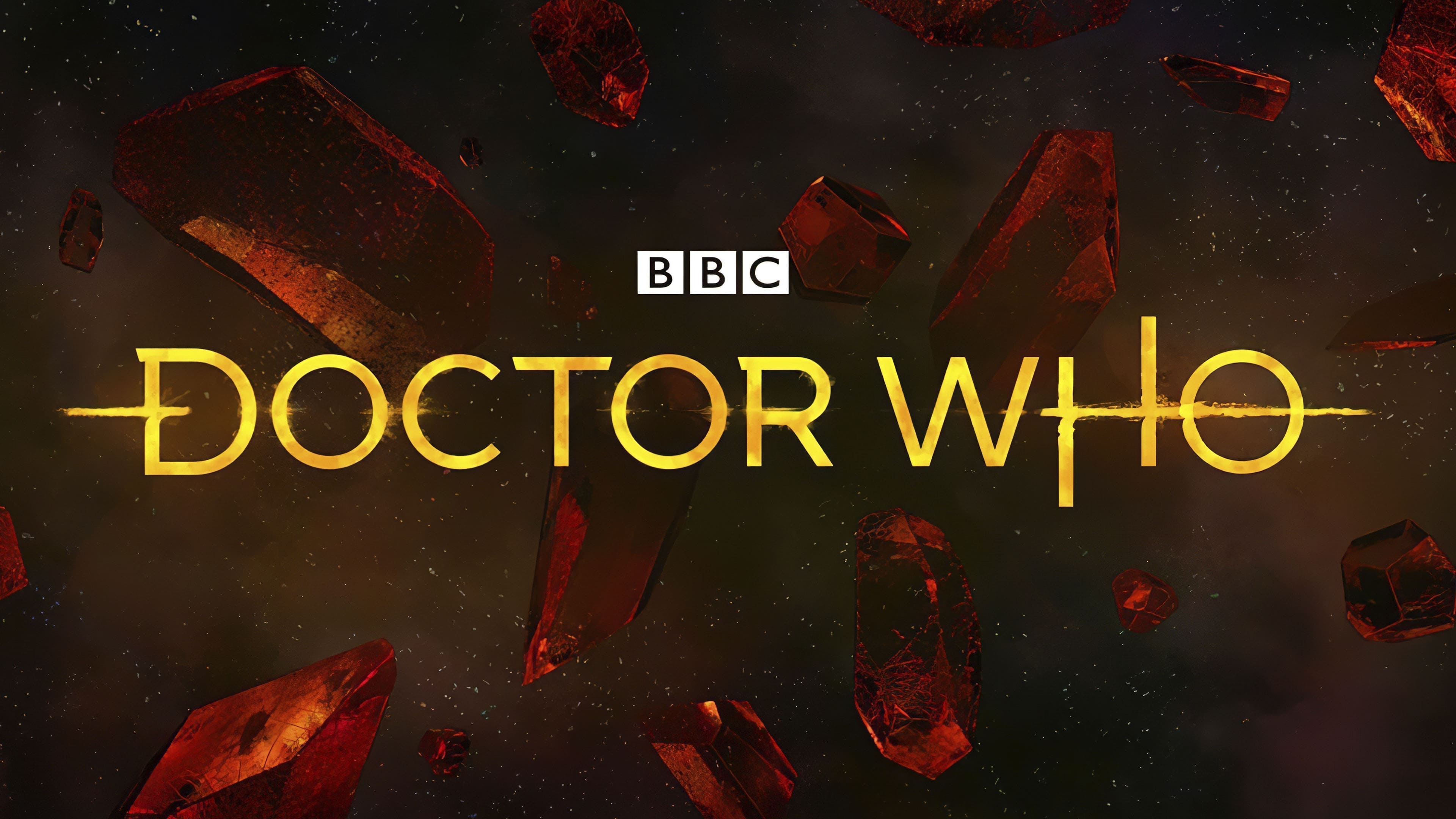
2022 – today
![]()
The updated Doctor Who logo, created by Wolff Olins, brings viewers back to the classic 1970s logo, refreshing the familiar diamond silhouette that the BBC presented in the fall of 2022. This visual became a symbol of a new phase in the show’s development and confirmed international collaboration with Disney+.
The mark consists of two main parts arranged one above the other and united to form a stylized shield. At the top is the word DOCTOR set along a curved arc, using an adapted version of the Futura typeface with smooth, rounded lines and a metallic effect that gives the lettering a cool silver sheen. The second element is the word WHO. It is placed below and rendered in a deep blue typeface with decorative elements in retro-futuristic and Art Deco styles. This word is surrounded by a soft golden glow that emphasizes the letters’ volume and creates the impression of inner illumination.
The logo’s color palette includes shades of blue that reference the characters’ fantastical journeys through space and time, while golden yellow accents reinforce the series’s status as a cultural phenomenon. The dark blue background of the shield, with a metallic sheen and wave-like symmetrical elements, adds to the overall atmosphere of mystery and exploration of the unknown.
The new logo is named after the film The Star Beast. The symbol’s first public appearance was on October 25, 2022, with its official debut exactly one year later, on November 25, 2023.
This update rethinks its iconic details in a new execution. The blue hue, neon glow, and metallic elements convey the atmosphere of a show that has captivated viewers for decades, maintaining a connection across generations of fans.
Font and Colors
The frequent logo redesign reflects a creative approach to the TV project, as each season requires a creative poster. Changes included the font, background, and line count. Until 2005, the title was arranged in two rows, then in one. A horizontal font with thin characters and elongated strokes crosses “D” and “O” in the middle. The background is neutral white, with no designer additions.
The variety of fonts is impressive, with many introduced since 1963. In general, serif fonts are rare. The exception is from 1967 to 1970, when the letters were supplemented with small strokes at the ends.
The logo’s color is also diverse. During this period, its background shifted from neutral white to a colorful space. But more often, monochrome prevailed: a combination of two colors. Thus, all shades of blue, beige, black, pink, green, and gray have been used in the emblem.