


![]() Universal Logo PNG
Universal Logo PNG
The studio broadcasts to the entire planet, says the Universal logo. Her films and programs are loved and known in all corners of the globe. The emblem conveys the scale, the large amount of work performed, and the team’s professionalism.
Universal Pictures began with Carl Laemmle, a German-Jewish immigrant who came to Chicago in 1884 and worked for years as a clerk and bookkeeper. In 1906, he opened a nickelodeon on Milwaukee Avenue, then challenged the Edison Trust, the patent cartel controlling cameras, projectors, and film licensing.
In 1909, Laemmle founded the Independent Motion Picture Company and, by promoting her publicly, turned Florence Lawrence into one of cinema’s first named stars. On April 30, 1912, he merged IMP with five other independents to create Universal Film Manufacturing Company. In 1915, he opened Universal City Studios on 230 acres in the San Fernando Valley, building a self-contained film city and letting tourists watch production.
In 1928, Laemmle made his son Carl Jr. head of production. The studio won an Oscar for All Quiet on the Western Front in 1930, then built its horror identity with Dracula, Frankenstein, The Mummy, and The Invisible Man. Cost overruns on Show Boat in 1936 forced the Laemmle family to sell the studio.
Universal later survived through genre films, Deanna Durbin musicals, and MCA’s 1962 takeover under Lew Wasserman. The studio changed Hollywood in 1975 with Steven Spielberg’s Jaws, the first film to pass $100 million and the model for the summer blockbuster. E.T. followed in 1982, Back to the Future in 1985, and Jurassic Park in 1993. Ownership later passed through Matsushita, Seagram, Vivendi, NBCUniversal, and Comcast, while Warner Bros. remained its long-running rival.
Meaning and history
![]()
The new century has brought discoveries. One of them was related to cinema. The invention of the apparatus for recording motion pictures shocked the world and set it on an unprecedented course. Enterprising people immediately set out to take advantage of cameras and projectors. So, after a long search, the modern Universal Studios, headed by Carl Laemmle, appeared. She produced and distributed her films at the beginning of the 20th century (in 1909). For the first time, the organization used actors in advertising, an innovation in the field of cinema.
The film studio’s official registration took place in 1912, following the merger of several specialized companies. In the end, Laemmle bought them out and focused seriously on filmmaking. The firm moved all its film sets to Hollywood, where it took up work. Thus began the great era of cinema. To emphasize its global significance to humanity, the artists used the globe as the emblem’s key element. It is present on all 12 logos.
1912 – 1913
![]()
For a short time, the American film studio used a logo resembling a seal or the back of a coin. This conclusion was prompted by its design. In the center was a globe with meridians and parallels, and a cinematographic tape was on it. On it was a monogram composed of the first letters of the company name, “UF,” with serifs. They were surrounded by the full version of “Universal Films.” The text was written in large, uppercase letters.
1913 – 1914
![]()
The debut emblem depicts the planet Earth with a wide ring encircling it. Presumably, this is an orbit. The upper half contains the word “Universal Films” in a small serif typeface. The letters are painted black. “U” and “L” are much larger than the rest of the symbols, and “V” is represented in the form of a horseshoe, which is why the adjacent “I” and “R” have side valleys.
1914 – 1919
![]()
This is the only logo without a real globe; it’s sketchy. The contours have an elongated, rounded shape that repeats the globe’s outlines, with an inscription in the middle. The banner has the word “Universal,” and at the top and bottom, “Moving” and “Pictures.” The color palette is black and white.
1919 – 1923
![]()
Since 1919, each new version of the logo has featured a globe and a ribbon encircling it, with an inscription. In this version, the globe is black, and the words “Universal” and “Films” are white at the top and bottom.
1923 – 1931
![]()
The designers have given the logo a more modern look. Firstly, they made it lighter by drawing the continents’ contours on a white background, and secondly, they removed the circular ribbon (orbit). Instead, the artists used free lettering, which is not framed. This is the name of the film studio in massive font. A thin black line surrounds each letter, casting a shadow that makes the text appear volumetric and convex.
1931 – 1936
![]()
After the redesign, the logo became flat and two-dimensional. He received the appearance of a classic rondel, the central part occupied by the globe. A wide white ring with a sans-serif lettering runs along the entire circular perimeter. “Universal” and “Pictures” are separated by a set of miniature strokes. A solid black line surrounds the edge.
1936 – 1947
![]()
The planet is wrapped in a wide black ribbon with the film studio’s name in white. The wordmark is in uppercase and typed in a simple sans-serif typeface. The letters are bold and the same height. This time, the planet is in a diagonal orbit: its right side is higher than its left. The globe depicts two continents, South America and North America, painted black.
1947 – 1960
![]()
In 1947, the identity of the American film company changed: the ribbon disappeared from the logo, and in its place, the calligraphic inscription “Universal International” appeared. The words were placed in parallel and occupied two lines unaligned on either edge. As a result, the bottom part looked longer than the top. The name was written in thin lines that outlined the white letters. Near each of them was a black shadow. She added volume to the glyphs. The exact outlines of the continents have been removed from the globe. Their place was taken by randomly located dots and spots of various sizes.
1960 – 1963
![]()
The logo has received a professional design: the globe has become detailed, and the inscription is italicized. Modest ones have replaced the original symbols: they are hand-drawn in calligraphic handwriting, with each letter neatly drawn and not exceeding the size of its neighbors. At the same time, the developers left the bottom and side shadows on them so that the movie company’s name still looks three-dimensional. Another change concerns the arrangement of words, since they now take not one but two lines against the globe’s background.
1963
![]()
For some period, the emblem was not ribbon-like but a two-line inscription. The upper word was made much larger than the lower one to emphasize the film company’s versatility and planetary scale. Another significant meaning of this option is that the phrase “Universal International” has been replaced by “Universal Pictures.” The designers left the font the same.
1963 – 1990
![]()
This is a laconic and stylish sign. It shows a schematic 2D globe. Five meridians and one parallel are drawn on a flat circle. They are made with thin black lines. The globe is in a depression formed on a black square. There are no inscriptions.
1990 – 1996
![]()
The number of parallels and meridians has increased, and the continents have received clear contours. The name of the film studio has been shortened to a single word: “Universal.” It overlaps the globe and goes beyond it to the right and left. It has small serifs in the form of needle-like protrusions. The phrase “AN MCA COMPANY” has been added at the bottom.
1996 – 2012
![]()
The developers have removed all unnecessary details, retaining only the schematic outline of a circle, on which the images of two continents, North and South America, are drawn in black. The lettering also became minimalist: the word “Universal” remained while everything else was removed.
2012 – today
![]()
The modern version of the logo is based on the previous version. The fixes are minimal:
- The map has been enlarged.
- Europe has been added.
- Serifs have been removed.
- The inscription is curved.
If you look closely at the name, you will immediately see that this is the same typeface as the previous logo, but only chopped.
2021 – today
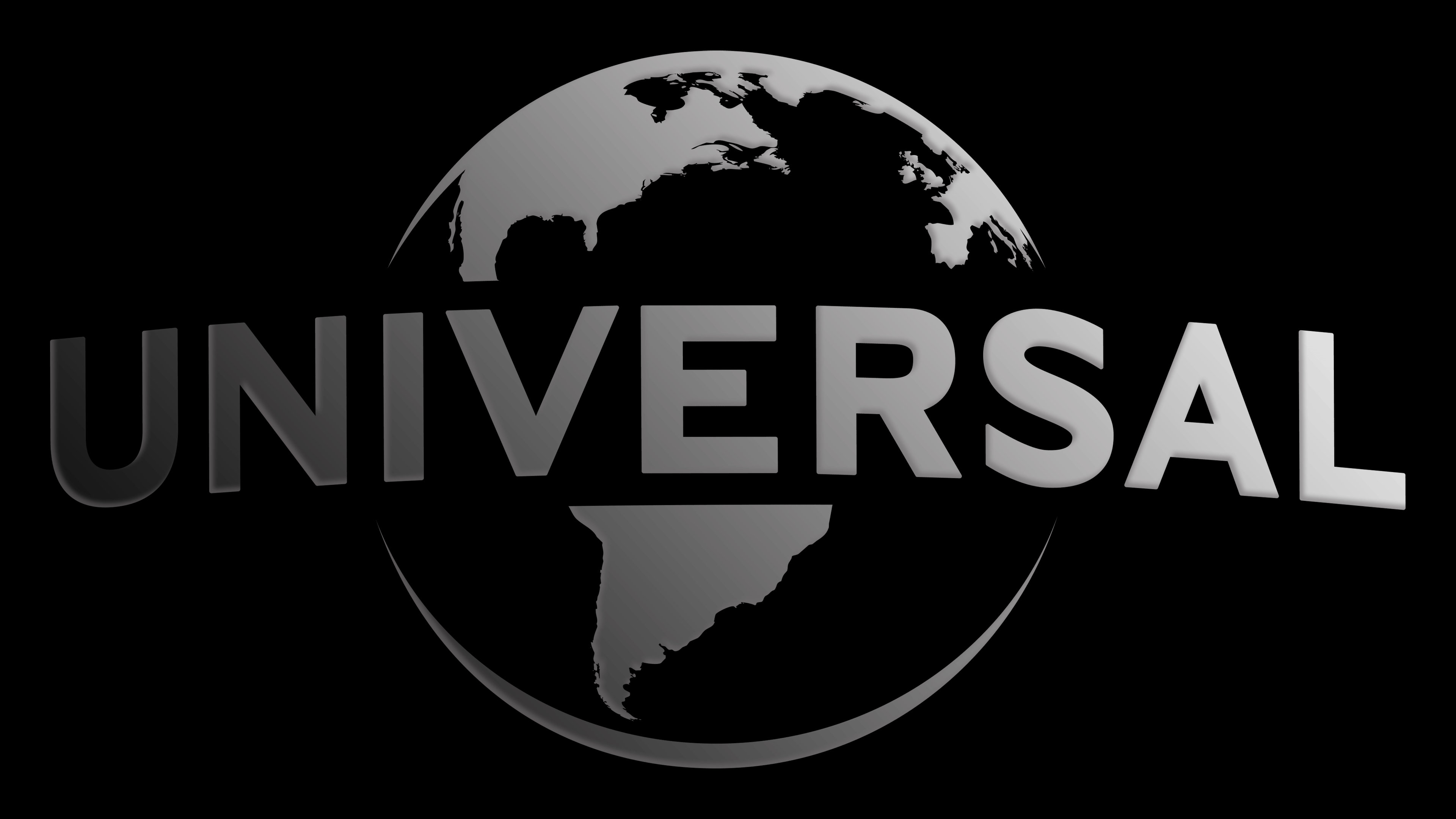
![]()
The updated Universal logo is a refreshed version of the iconic symbol that has long represented one of the world’s largest film studios. While the changes to the emblem may seem subtle at first glance, they carry deep symbolism and reflect the company’s modern state.
The font remains nearly identical to the 2012 version, with slight adjustments that give it a fresher, more contemporary appearance. The letters are slightly closer together, creating a sense of unity and solidity. These changes are so subtle that the average viewer might not notice even when comparing the two versions. This subtlety underscores the company’s strength and resilience in the film industry. The font is rendered in black, symbolizing the brand’s reliability, stability, and seriousness.
The most noticeable change is the representation of the continents on Earth, the logo’s central element. The continents have become more detailed and realistic, reflecting the company’s commitment to staying up to date with technology and updating its visual style to meet modern audiences’ expectations. These changes symbolize the company’s global reach and influence, highlighting its ability to adapt and remain relevant worldwide.
The color palette has remained classically restrained, emphasizing the brand’s timelessness and stability.
Although the changes may appear minor initially, they make the logo more modern, reflecting the current state of one of the world’s most influential film studios.
Font and Colors

The film’s identity is tied to Universal and is directly related to the name. This word has several basic meanings in English: “universal” and “universe.” Both are conveyed in the logo. This is an independent world of creative fantasies and dreams, without which humanity cannot exist on Earth.
To signify the independence of their MCU, the management chose a custom version of the Universal Serif font for the emblem. Its author is designer Khiam Mincey. The latter uses the same sans-serif typeface. The color of the logos depends on their placement and purpose. For example, in movie splash screens, the emblems are mostly navy blue with gold lettering. And in their usual form, they are black and white.
![]()