


![]() Netflix Logo PNG
Netflix Logo PNG
The modern, bright, and original Netflix logo is both visually appealing and highly recognizable. The visual sign and text module symbolize a passion for the entertainment on offer and reflect the brand’s key features.
Netflix was founded in 1997 in Scotts Valley by Reed Hastings and Marc Randolph, former colleagues at Pure Atria. The idea was to move film rental online rather than rely on physical stores.
In April 1998, the company launched a DVD-by-mail service. At the time, DVDs were still new, while Blockbuster relied on VHS and retail locations. In 1999, Netflix introduced a subscription model without late fees, attracting users and reaching 300,000 subscribers by 2000.
During the dot-com bubble, Netflix struggled and offered to sell itself to Blockbuster for $50 million, but the deal was rejected. In 2002, the company went public on NASDAQ, and by the end of the year, its subscriber base passed one million.
In 2007, Netflix launched streaming, allowing users to watch content online. While Blockbuster filed for bankruptcy in 2010, Netflix expanded internationally, entering Canada and later Europe and Latin America.
A major shift came in 2013 with the launch of original content. “House of Cards” and “Orange Is the New Black” introduced full-season releases and changed viewing habits. Later projects like “Narcos” and “Stranger Things” confirmed global demand.
By 2017, Netflix exceeded 100 million subscribers, facing competition from Amazon Prime Video and Disney+. In 2022, the company reported its first subscriber decline and introduced an ad-supported plan while limiting password sharing.
Meaning and History
![]()
The company acquired the trademark with the inscription “Netflix” in 1997, but it did not last long. In 2000, designers shifted their approach, incorporating bright colors and creating symmetrical inscriptions. This was a transitional stage to the modern logo.
What is Netflix?
Netflix is an American media company based in Los Gatos (California), which operates a video service of the same name. The company was founded in 1997, but it began producing and distributing original content through its streaming platform in 2011. In 2022, the company expanded its specialization to include video games. The company’s founders are Marc Randolph and Reed Hastings.
1997 – 2000
![]()
The debut logo is characterized by some “disarray.” Visually, it is divided into several fragments. Even the letters in the word “Netflix” are arranged in groups: the uppercase “N” and “F” are larger than the lowercase “E,” “T,” “L,” “I,” and “X,” which are also written in uppercase. This is specifically done to distinguish the parts Net and Flix.
Another symbolic element is the film strip. It is outlined around the first half of the word and dissolves into a white background. The black-purple gradient gives the drawing dynamism. The custom-designed font enlivens the logo with thin, elongated lines and sharp serifs.
2000 – 2001
![]()
The Netflix logo from 2000 significantly differs from other year variants. The letters in it are curved, worm-like, and chopped. They lack traditional components, so they are perceived more as graphic design than as alphabet elements. The letters “N” and “F” have rounded corners instead of angles. Interestingly, the inscription combines lowercase and uppercase letters, and instead of a dot, the letter “i” is replaced with a television screen. The background for the white text is a black oval, framed by wide yellow brackets on the right and left.
2001 – 2014
![]()
In 2000, the company adopted a new logo, changing the inscription style. The word “Netflix” now forms a low arc. Designers borrowed this technique from vintage CinemaScope. Black outlines and shadows surround the white sans-serif letters. Thanks to this contrasting color combination, they stand out clearly against the red background.
2014 – today
![]()
In June 2014, the owners of the streaming service conducted a global rebranding. This process involved the design studio Gretel from New York. Specialists developed a new brand name and redesigned the website interface. In the updated logo, there are no dark shadows that are used to weigh down the visual perception. There is only the company name, highlighted in red: Netflix. The inscription is made with a non-standard font. It is based on Gotham Book and Gotham Bold.
Font and Colors
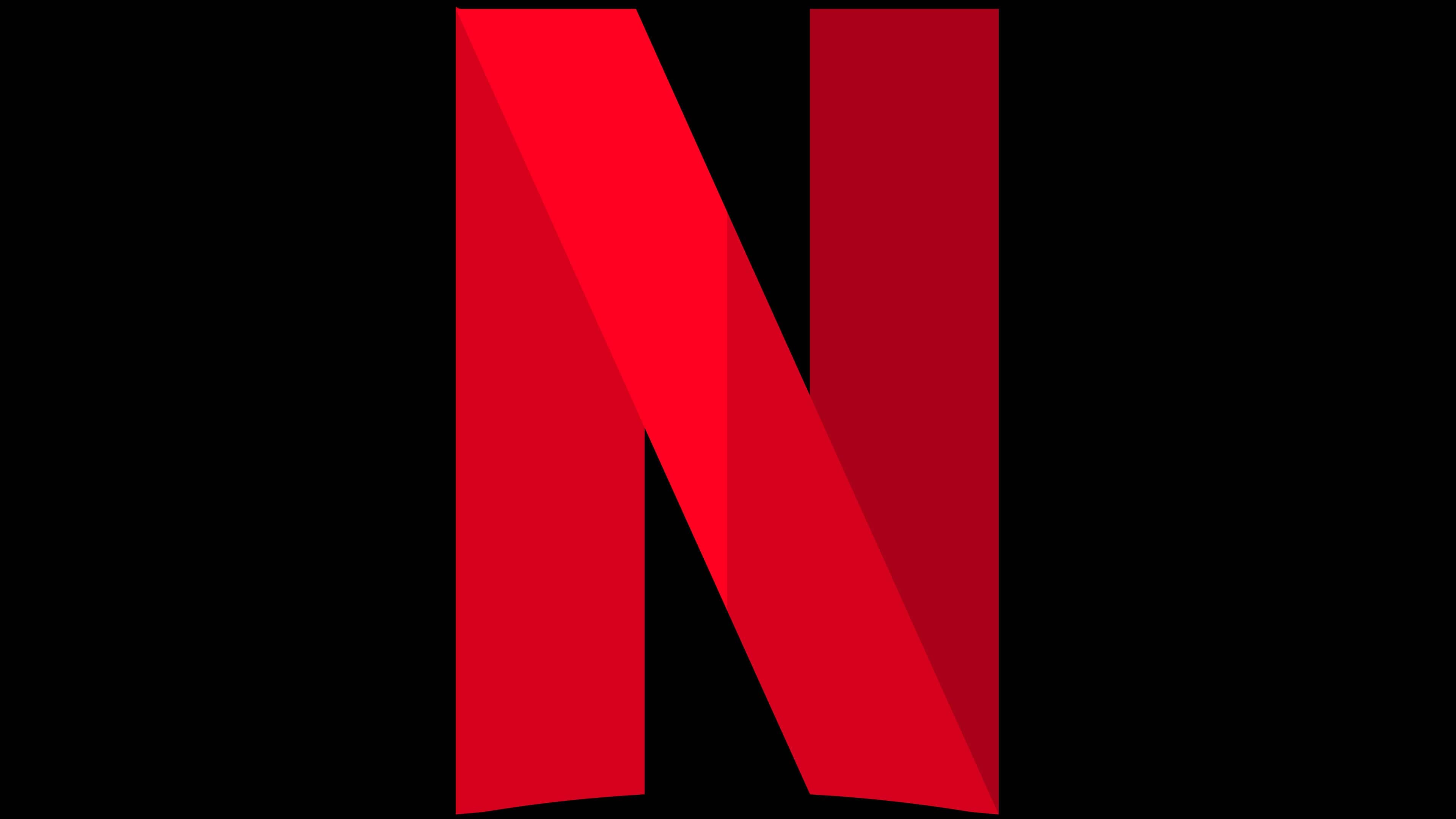
In June 2016, another element of the brand’s graphic visualization appeared in the shape of the letter “N.” The letter consists of several wide lines formed by different shades of red.
Representatives of the service explained that this emblem is used alongside the main corporate symbol. It is intended for mobile applications, social networks, and websites, and rarely appears in teasers and press materials. In the latter, the full-size version of the logo is more common.
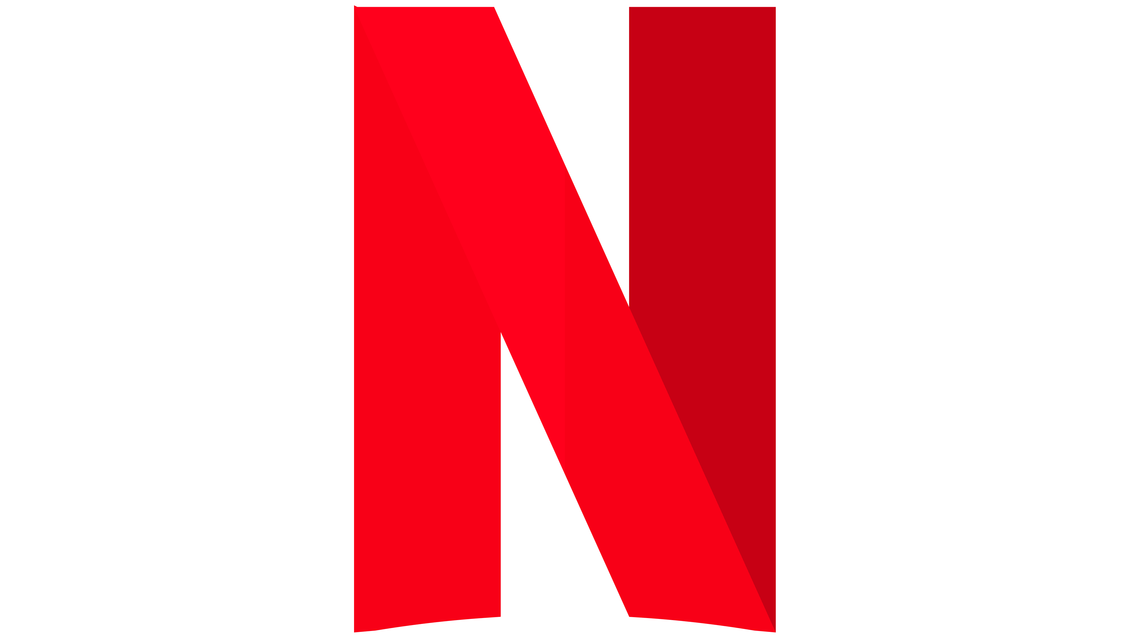
Both the letter “N” and the word “Netflix” have the same palette. The overwhelming majority of inscriptions are made in the shade of Netflix Red. But if they are used as watermarks, white is permissible instead of red. The preferred background is black. In rare cases, other options may be possible, such as white and light, non-contrast shades. According to the brand’s concept, the main red-black color scheme should emphasize the premium-class cinematography.