


![]() Stranger Things Logo PNG
Stranger Things Logo PNG
The Stranger Things logo resembles a rock band cover. It appears mystical due to the chosen font and colors. This is no coincidence, as the series is set in the science fiction, horror, and thriller genres. Additionally, the project name suggests using a corresponding “mysterious” logo.
The history of Stranger Things started with repeated rejections. Matt Duffer and Ross Duffer, inspired by Steven Spielberg, John Carpenter, and Stephen King, developed a story about kids in a 1980s town facing supernatural events. Before that, they worked on Wayward Pines in 2015.
Around 15 studios rejected the script, mainly because of its focus on child characters. Netflix approved the project in 2015 after earlier originals like House of Cards and Orange Is the New Black. The first season cost about $6 million per episode.
The series premiered on July 15, 2016, with all eight episodes released at once. The fictional town of Hawkins, Indiana, along with bikes, arcades, and cassette players, shaped its setting. The logo used is ITC Benguiat, tied to Stephen King book covers. The early title Montauk was later replaced.
The first season drew record viewership and earned 18 Emmy nominations, while Millie Bobby Brown gained global attention. Season two followed in 2017, and season three in 2019 reached 40.7 million households in four days, competing with Disney+ and HBO Max.
Season four in 2022 raised budgets to $30 million per episode and exceeded 1 billion viewing hours in 28 days. The use of “Running Up That Hill” by Kate Bush returned the track to the top of the UK charts. The fifth season was announced as the final, and production resumed in early 2026 after strike delays.
Meaning and History
![]()
The series’s first season premiered on Netflix in 2016. The scriptwriters were the Duffer Brothers, Matt and Ross. The plot centers on life in a provincial town in the 1980s.
The peaceful, measured life of the residents was disrupted by the mysterious disappearance of a 12-year-old boy, after which various mystical events began in the town. The local sheriff, investigating the boy’s disappearance, accidentally uncovers one strange secret. We won’t continue recounting the plot. The series is available to watch online, and four seasons have already been released. But the story of its logo is very interesting.
What is Stranger Things?
Stranger Things is a sci-fi-horror series created by the Duffer Brothers and produced by Netflix; the first season premiered in 2016. The second, third, and fourth seasons were released in 2017, 2019, and 2022, respectively. Work on the final (fifth) season began in 2022.
2016 – today
![]()
2016
![]()
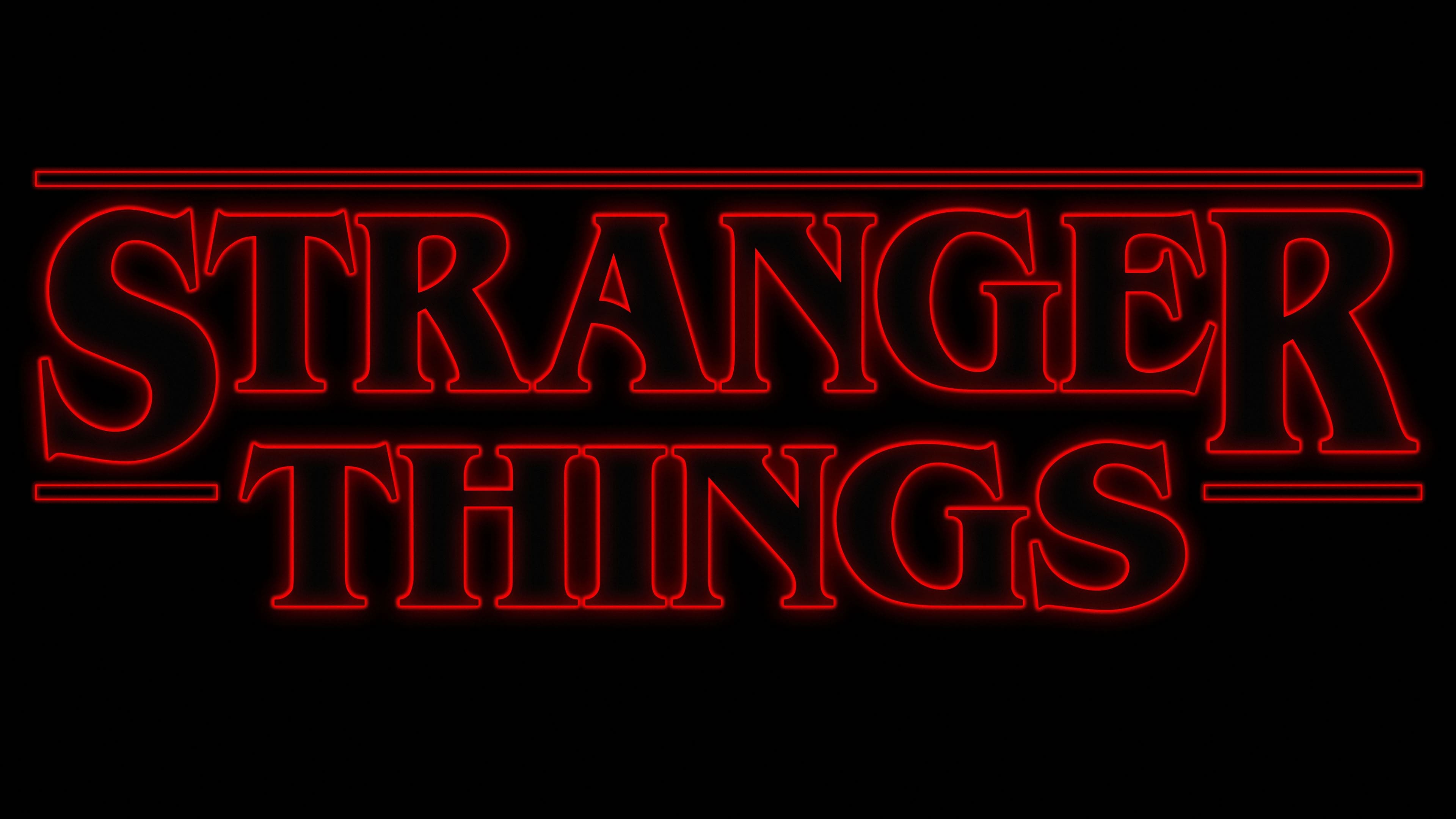
The logo of the first season of the sci-fi series is based on a text phrase. Graphics are excluded because the focus is solely on the title, which emphasizes the strangeness of the events. To convey a ghostly, horror-inspired atmosphere and the 1980s style, the creators chose the ITC Benguiat font. The words are arranged in two tiers: the upper “Stranger” and the lower “Things.” The first part of the phrase is highlighted with a double line. The letters themselves are contour: hollow inside and solid outside, edged by a solid line. The letters “S” and “R” are significantly larger than the other characters.
2017
![]()
The second season was first marked with the corresponding number “2”. It was done fully colored and placed behind the “semi-transparent” name of the series. The mystical atmosphere is underscored by a red mist that envelops the phrase “Stranger Things.”
2019
![]()
With the release of the third season, a new logo appeared. To emphasize the sinister plot, designers recolored the words in black, leaving a red frame. The number 3 is a gradient: raspberry with dark edges. The writing style remained the same: ITC Benguiat with serifs and capitalization, emphasizing the first and last letters of the word “Stranger.” Moreover, this year, the logo’s lines became solid.
2022
![]()
The fourth season did not bring radical changes, but the figure now came to the forefront, with the series’ name serving as its backdrop. The mysticism of the events is emphasized by gray letters with a thin red border.
2025
![]()
Font and Colors
The series’ creators, the Duffer brothers, and the creative design company Imaginary Forces, led by art director Jacob Boghosian, created the logo.
As the film’s plot is set in the 80s, Boghosian began studying the era’s pop culture and the work of iconic writers and directors, including Stephen King, George Lucas, Steven Spielberg, and John Carpenter. He collected posters for their films, album covers, books, and advertising brochures, and generated 20 variants of the series title.
After long discussions, the producers settled on ITC Benguiat, a font with precise contours. It was used on posters and on the series’ opening and title clips.
The ITC Benguiat font was created in 1977 by typographer Ed Benguiat, based on a modern handwriting style, a very decorative, beautiful, readable, and original serif font. That same year, it was patented and named after its inventor, although he opposed it.
According to Netflix representative Michelle Dougherty, this font, like no other, conveys the atmosphere of that time, combining the design of Stephen King’s works, the adaptation of “Aliens,” and the popular culture of the 1980s.
Adjustments to the ITC Benguiat font included refining the initial letters “S” and “T,” which now extend to the left, and changing the serifs’ shape. Some other letters also received minor changes. Designers developed the layout: a bar above the upper word, along the sides, and in the free spaces below it.
Some experts considered the title’s word order a bit elongated and recommended making the words more compact, but Netflix’s owners considered it very successful, and the question was closed.

The color palette changed for each season. Initially, they were red text on a white background; later, they turned black. In the last season, the letters were removed, leaving only the contour, making the inscription resemble the neon signs of 80s stores and hotels.
The Stranger Things logo is a bright example of successful teamwork in design, where the ideas of many people produce an impeccable result, with nothing to add or remove; everything is in its place.