


![]() Spider-Man Logo PNG
Spider-Man Logo PNG
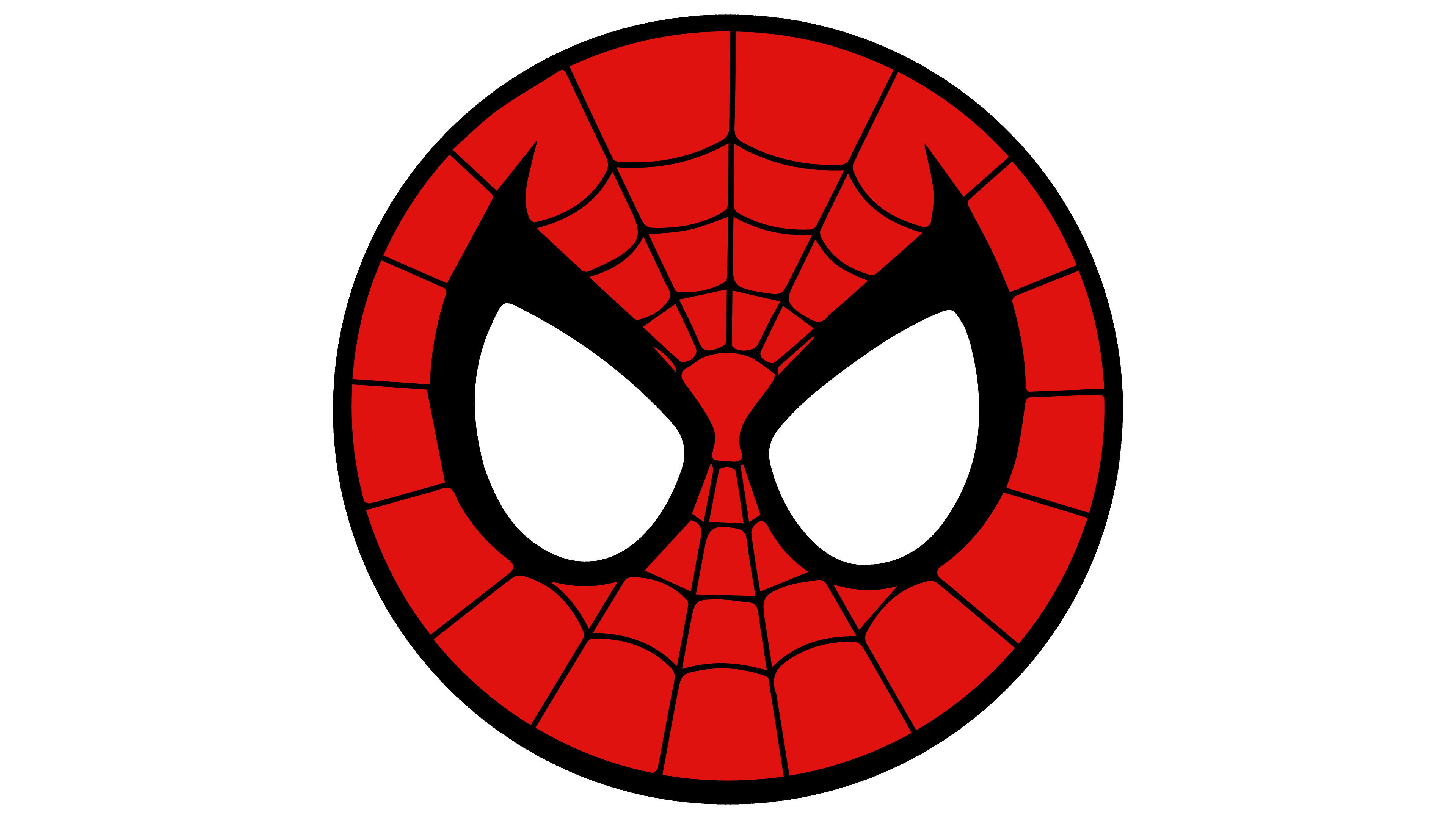
The Spider-Man logo looks down on the viewer from above, as the franchise’s hero rarely stands on the ground. The symbols read the white web that allows him to fly, and his superpowers give him special strength.
In early 1962, Marvel editor Stan Lee received approval from publisher Martin Goodman to create a new character for the final issue of Amazing Fantasy. Lee proposed a teenage superhero with everyday problems. Initial work by Jack Kirby did not align with the concept, so artist Steve Ditko took over the design.
In August 1962, Amazing Fantasy #15 introduced Peter Parker, a student bitten by a radioactive spider. The story centered on a moral failure that led to his uncle’s death, framing responsibility as tied to power. Strong sales led to the launch of The Amazing Spider-Man in March 1963.
From 1963 to 1966, Lee and Ditko developed the series, creating villains such as Doctor Octopus, Green Goblin, and Electro. Ditko left in 1966 after creative disagreements. Lee continued writing until issue 100, after which new authors took over.
During the 1970s and 1980s, the character expanded into television and film. A live-action project aired on CBS in 1977. In 1990, artist Todd McFarlane drew Spider-Man #1, which became one of the best-selling comics.
In 1999, Sony Pictures acquired film rights through Columbia Pictures. The 2002 film directed by Sam Raimi earned $821 million worldwide, followed by a 2004 sequel that received an Academy Award. A third film in 2007 led to a 2012 reboot.
In 2015, Sony partnered with Marvel Studios to integrate the character into the MCU. Competing DC Comics franchises developed parallel universes. In 2018, an animated film featuring Miles Morales won an Academy Award. In 2021, a new release reached about $1.9 billion globally.
Meaning and History
![]()
The superhero Spider-Man and the Spider-Man media franchise logos are very different. On the one hand, it is a character from a fictional world whose costume features a spider image. On the other hand, the universe itself is represented not only by comic books but also by feature films, cartoons, television series, video games, and even theater productions.
What is Spiderman?
Spider-Man is a legendary superhero who appeared on the pages of American Marvel Comics. He was created by writer Stan Lee and artist Steve Ditko. He first appeared in 1962 in the August 1962 issue of Amazing Fantasy magazine. Since then, it has appeared in comic books, movies, TV shows, video games, novels, and other media. Behind the red mask with white eyes is orphaned teenager Peter Parker.
1963 – 1979
![]()
The covers of the first Spider-Man comic books bore the series title, a bright yellow, orange outline that curved slightly upward. The artwork was designed by the artists who drew the adventure story, with Marvel Comics’ approval.
1979 – 1985
![]()
In 1979, the developers changed the inscription’s style. The letters became white, circled with wide red-orange contours, and the comic’s title was placed as an arch. An unusual visual element was a light gradient, which gave it a childish look.
1985 – 1990
![]()
In 1985, another change was made to the logo. For the next five years, a variant with slanted SPIDER-MAN lettering was used. Specially chosen proportions gave the impression that the words were falling forward. At the same time, the view from above created a feeling of heaviness, impressiveness, and solidity. The letters were orange, with wide yellow edges. In the foreground, directly opposite the letter “M,” the artists depicted a spider hanging on a web.
1990 – 1994
![]()
1994 – 2005
![]()
The comic book began to gain popularity, and Marvel Films Animation decided to adapt it into an animated series. In 1994, the audience first saw Spider-Man: The Animated Series. Then his emblem was presented: a ragged inscription “SPIDER-MAN,” set in an individual serif font. The lower parts of the letters were sharply angled, jarring, and disproportionately long.
In the basic version, the phrase was highlighted in white, and the outlines in black and dark red. But there was another variant with yellow lettering and an orange outline. It was complemented by a drawing of a superhero in a costume.
2005 – today
![]()
The logo, which is still used today, was introduced in 2005. Compared to previous versions, it looks more modern because the designers paid attention to symmetry and line clarity, which had not been observed before. At the same time, the inscription cannot be called flat: its first and last letters protrude downward, forming a kind of arch. Sometimes, the name of the media franchise is complemented by the name of the Marvel brand.
Font and Colors
The character Spider-Man wears a costume with a spider on his chest. This is the famous superhero logo, which, if changed, would be only slightly. The artists experimented with their color and size without breaking the overall concept. At first, it was black, but in 1984, it was made white. In 1988, the dark version returned. It was used until 1994, when another designer drew a red spider. In 2013, a sign appeared on the costume depicting a large insect with disproportionately long legs. Its author and designer is Humberto Ramos.