


![]() Attack on Titan Logo PNG
Attack on Titan Logo PNG
When you look at the Attack on Titan logo, images of metal crunching, destruction, and devastated cities come into view. The human world is on the verge of extinction. The logo recreates the apocalyptic world and invites the user into the game.
Attack on Titan began with Hajime Isayama, born in 1986 in Hita, Oita Prefecture, a town surrounded by mountains. That closed-in geography later shaped the manga’s giant walls. After studying manga design at Kyushu Designer Gakuen, Isayama moved to Tokyo and worked at an internet café, where an aggressive customer who grabbed him by the collar helped inspire the fear behind the Titans.
In 2006, he drew a 65-page draft of Attack on Titan. Shueisha’s Weekly Shōnen Jump asked him to change the style and story, but he refused and took the work to Kodansha. The draft won a Fine Work prize at the Magazine Grand Prix. In 2008, another manga, Heart Break One, earned him recognition from Weekly Shōnen Magazine.
Attack on Titan began serialization on September 9, 2009, in the first issue of Kodansha’s Bessatsu Shōnen Magazine. The first volume arrived in March 2010. Sales grew steadily, and in 2011 the series won the Kodansha Manga Award in the shōnen category. Kodansha USA released the first English volume in June 2012.
The real breakthrough came in April 2013, when Wit Studio launched the anime adaptation. By the end of 2013, the manga had sold 15.9 million copies in Japan, and several U.S. volumes reached the New York Times bestseller list. In 2014, it briefly passed One Piece in Japanese sales. Later seasons arrived in 2017 and 2018-2019, with MAPPA handling the final season from 2020. The manga ended on April 9, 2021, with chapter 139. By November 2023, total circulation had reached 140 million copies.
Meaning and History
![]()
The manga’s events take place in a universe where humans live in gated cities surrounded by triple walls to protect them from the cannibalistic giants known as the Titans. The action centers around a young man named Eren Yeager, who has vowed to destroy the humanoid giants for killing his city and his mother. The editors of Kodansha released regular chapters of the comic.
In addition, an animated series spanning four seasons aired a little later. Three of them were produced by Wit Studios. The first one was released in 2013 and included 25 episodes. The second was launched in 2017 and included 12 episodes. The third was split into two parts: 12 episodes appeared in 2018 and 10 in 2019. MAPPA is now working on the fourth season. In 2020, 16 episodes have already been released. The rest are scheduled for release in 2022. According to the idea, these will be the final episodes.
The literary work is inspired by Japanese culture; as the author admitted, its key theme is each person’s inner feelings, which he presents in a fascinating and entertaining form. Throughout the plot, centered on Eren Yeager, the protagonist, and his friends, they make many discoveries for themselves and the world. For example, it turns out that they live on an isolated island where their people have long been banished for crimes committed against other people. The further you go, the more mysterious the manga becomes. The mystery’s energy is reflected in the emblems.
2009 – today
![]()
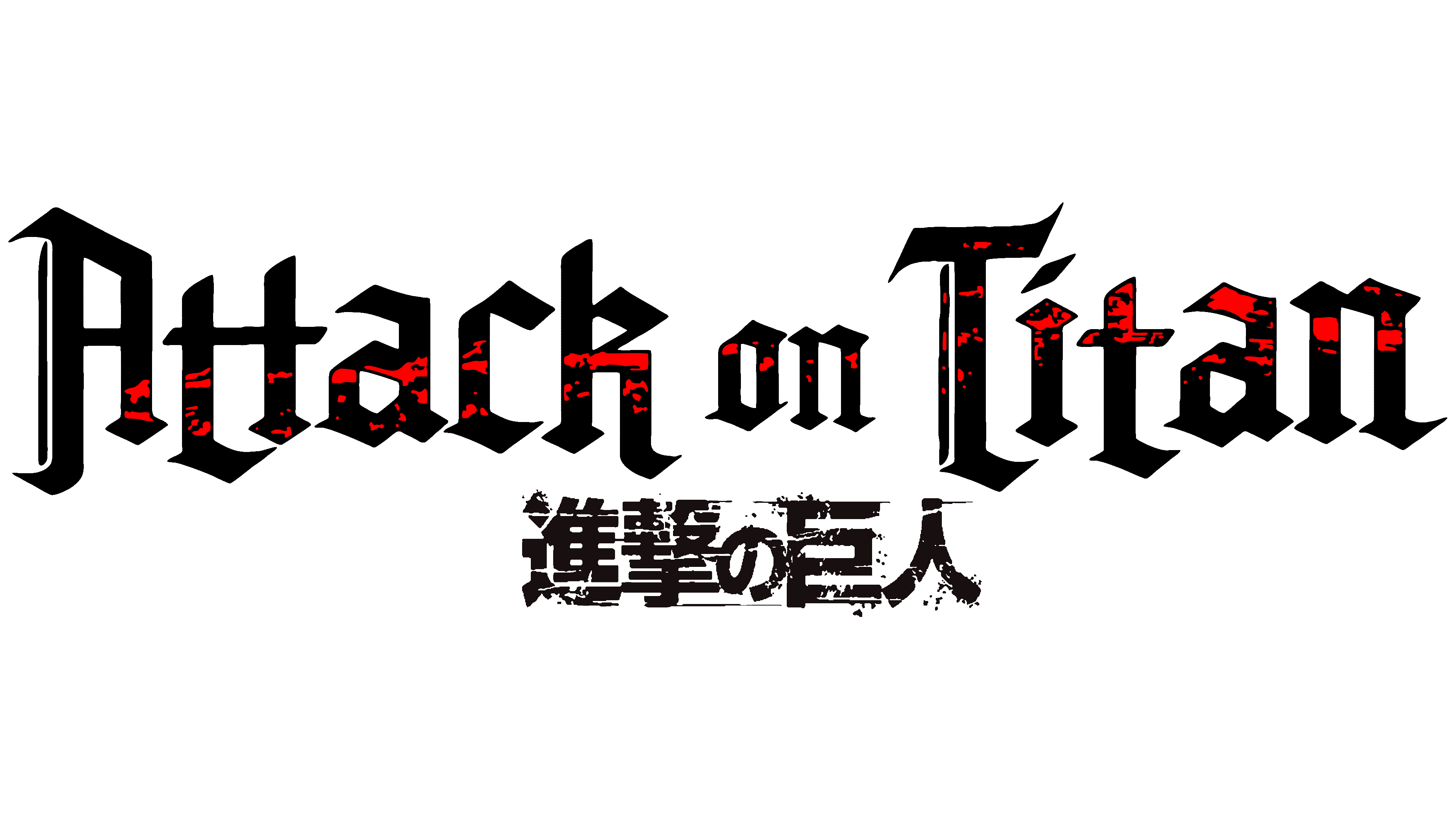
The main element of the emblem was the manga’s name. At first, it was depicted in a Japanese style, using hieroglyphics. They have the structure of a destroyed stone wall and resemble flying-off pieces of masonry from a once-powerful fortress. A wide range of gray colors was used: ash, graphite, silver, and metallic. There are violet flecks in certain places, and throughout the symbols, elongated lines appear. The English title of the comic is located under them in small font. It is written in white Old English lowercase letters and is set on a red-orange-yellow background as a long strip with narrow ends.
2014 – today
![]()
In 2014, an English-language version of the logo was created, featuring an original redesign of the letters rendered in a gray-purple palette. Instead of the previous bright accents, the designers chose muted tones and a smooth texture with softly blurred shadows. Sharp contours gave the inscription a harsher, darker tone.
The manga title is set in a typeface inspired by ancient Germanic styles, where elongated forms and abrupt shifts in stroke thickness create an atmosphere of tension and gloom. Instead of classic serifs, the letters feature prominent thickenings that emphasize the weight and seriousness of the storyline.
Beneath the English title are the Japanese characters 「進撃の巨人」 (Shingeki no Kyojin), written in a small, rough-edged font that matches the overall theme. The characters are marked with dark red stains resembling battle traces. A metallic texture adds a warlike, dramatic feel to the logo.
A faint yet cold glow around the inscription heightens unease and tension, underscoring the brutal, unrelenting nature of the “Attack on Titan” narrative.
Font and Colors
In addition to the text logos, the Attack on Titan manga has a graphic icon. It is associated with the characters, representing two wing feathers resembling knife blades. There are nine of them on each side. The feathers have a segmental structure, consisting of three segments, except for the lower ones, which have only two segments each. The right wing is white contoured, and the left is blue and solidly molded. They partially overlap and are enclosed within a gray pentagonal shield with a white border, designed to resemble a window.
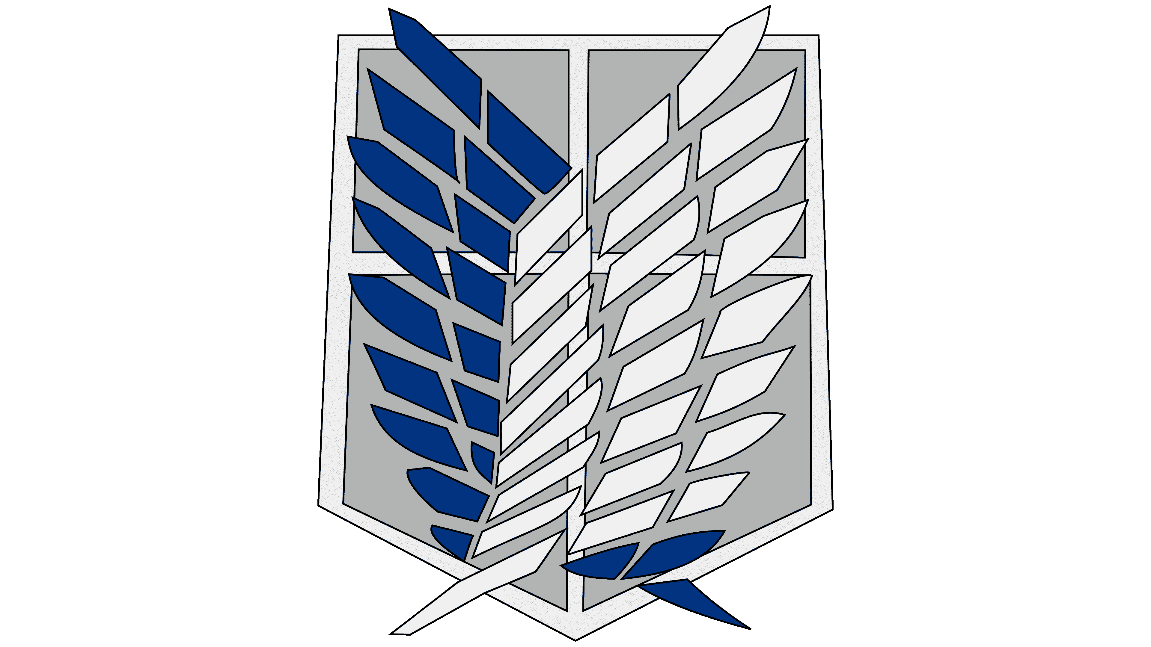
The developers chose the Linotext font for the emblem, designed by Morris Fuller Benton. The logo’s color scheme is restrained and gray-based, dominated by ash, metallic, graphite, pewter, platinum, and zirconium. The first version also features purple, orange, yellow, and red colors.