The Whole Foods logo shows that when entering the network stores, the buyer is immersed in the theme of ecology, clean, natural, and safe food. The brand’s products undergo special control; therefore, they are ideal for preparing family meals.
Whole Foods: Brand overview
| Founded: | September 20, 1980 |
| Founder: | John Mackey, Renee Hardy-Lawson, Mark Skiles, Craig Weller |
| Headquarters: | Austin, Texas, U.S. |
| Website: | wholefoodsmarket.com |
Meaning and History
It all started with Renee Hardy-Lawson and John Mackey, who borrowed 45 thousand dollars from friends and relatives. They opened a SaferWay store in their city selling vegetarian and organic products. This happened in 1978. They did not yet have warehouses, and the trading area was limited, so the goods had to be stored at home. When the entrepreneurs were asked to move out of the apartment because they organized a warehouse there, they lived in a store.
After two years, aspiring businessmen got up and entered into cooperation with Craig Weller and Mark Skiles, which had their trading enterprise to sell meat and meat products. As a result, SaferWay and Clarksville Natural Grocery merged to form the basis for the Whole Foods Market. A year later, the store was hit hard by floods. The inventory and equipment fell into disrepair: the total damage amounted to 400 thousand dollars, and the supermarket was not insured. Clients, staff, and neighbors helped the owners to cope with the critical situation. Investments made by investors, suppliers, and lenders allowed them to recover fully. As a result, less than a month later, the eco-supermarket opened its doors to customers again.
The store then began to expand to include competitors in the domestic market. Gradually he moved on to international expansion. In 2017, Amazon announced the purchase of Whole Foods Market. In 2018, the retail chain decided to expand the area again, for which it acquired the empty buildings of the former Sears and Kmart stores. But, despite constant renewal and transitions, the commercial structure has retained its original identity: it has only two logos.
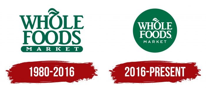
1980 – 2016
The grocery store’s debut logo appeared as soon as it opened. The logo consisted of a name in uppercase bold characters. The letters had distinct serifs in the form of short strokes. Some of them were even (for “W” and “H”), others were diagonal with sharp edges (for other signs). The labels were divided into three levels: in the top row was the word “Whole,” in the middle – “Foods,” in the bottom – “Market.” In the first, the “O” was supplemented with a wavy element that resembled the stalk and leaf of a vegetable or fruit. In the second – “OO” were originally connected, although all other letters stood apart. In the third, an elongated rectangle with rounded sides served as the background.
2016 – today
After changing the image, the grocery and trading network corrected the logo. The designers transferred the labels to one plane and united them with a common circle with a green fill. And they made the letters themselves in white font. The sheet got more distinct outlines. No other changes followed.
Whole Foods: Interesting Facts
Whole Foods Market started in 1980 in Austin, Texas. It was founded by John Mackey, Renee Lawson Hardy, Craig Weller, and Mark Skiles. It has grown from a small grocery store into an international chain famous for its organic and natural foods.
- How It Started: Originally called SaferWay, it mocked Safeway to highlight its healthier food options. After merging with another natural food store two years later, it became Whole Foods Market.
- A First of Its Kind: The first Whole Foods was unique in the U.S., selling only natural and organic foods. This move set new standards for groceries everywhere.
- Overcoming Disaster: In 1981, a flood heavily damaged the original store. The community helped clean up and rebuild, showing strong support for Whole Foods.
- Growing Big: Whole Foods didn’t grow independently. It bought other natural food chains, like Bread & Circus and Wild Oats Markets, which helped it spread across the country and in the UK.
- Eco-Friendly Leader: In 2008, Whole Foods stopped using plastic bags at checkouts, reducing plastic waste. It’s known for caring about the environment.
- Strict on Quality: Their products don’t contain artificial preservatives, colors, flavors, sweeteners, or hydrogenated fats. They also focus on non-GMO and sustainable seafood.
- Caring for Animals: They have a rating system for meat that shows how animals were raised, encouraging better treatment of animals.
- Joining Amazon: In 2017, Amazon bought Whole Foods for $13.7 billion. This big move brought Whole Foods into online shopping and delivery.
- More Than Groceries: Whole Foods also sells health and beauty products, supplements, and household goods that meet its high standards. Some stores offer health classes and events.
- Trying to Be Accessible: They tried to reach more people with 365 by Whole Foods Market, a lower-priced store format launched in 2015. Though they stopped expanding this format, it showed their effort to be more accessible.
Whole Foods has greatly influenced how people think about and buy organic and natural foods. It’s a key player in making organic foods popular and continues to push the grocery industry toward quality and sustainability.
Font and Colors
Whole Foods Market used streamlined shapes and flowing lines for the logo in keeping with the concept of sustainability and naturalness. There are no frankly sharp corners or “cubism” in it. Even the corners in the in-letter gaps have been smoothed out.
The first two words are written in an elegant, bold typeface reminiscent of Brighton Com Bold. The only difference is in the letter “F,” the horizontal line of which has a vertical serif. The third word from the name of the supermarket chain uses a clean, clean sans-serif typeface reminiscent of Lawyer Gothic.
The green and white palette of the logo corresponds to the principle of the naturalness of the products that the store sells. White means purity and absence of impurities. Green is a sign of freshness, environmental friendliness, and naturalness.
Whole Foods color codes
| Dark Spring Green | Hex color: | #007042 |
|---|---|---|
| RGB: | 0 112 66 | |
| CMYK: | 100 0 41 56 | |
| Pantone: | PMS 7726 C |
