The Twitch logo seems to have stepped out of the screen and approached the viewer at arm’s length. The emblem indicates that the service is filled with realistic films and shows that address the issues and interests of its users.
Twitch: Brand overview
| Founded: | June 6, 2011 |
| Founder: | Justin Kan, Emmett Shear, Michael Seibel, Kyle Vogt, Kevin Lin |
| Website: | twitch.tv |
Meaning and History
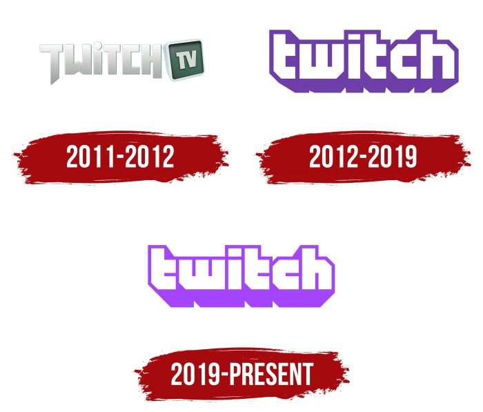
Initially, the service was launched as a platform for the “Justin.tv” channel, so it immediately had an emblem consisting of the “TwitchTV” inscription. Then, its status changed, along with its logo’s appearance. Over the years, the internet resource has had three logos.
What is Twitch?
Twitch is an American streaming channel focused on live broadcasts of real events. These can include demonstrations of the drawing process, video games, esports competitions, and much more. They can be watched live or recorded. The streaming service was launched in 2011 and is owned by Amazon.com’s subsidiary, Twitch Interactive.
2011 – 2012
The debut version features a light grey “Twitch” inscription. It’s in a mixed format: most characters are in uppercase, while “i” is in lowercase. The first letter in the word has an elongated leg, making it seem larger than the others. A similar approach is applied to the letter “H,” but its leg is slightly shorter than that of “T.”
To the right of the inscription is a “TV” icon located inside a round square depicting a television screen. The color of the display is dark grey.
2012 – 2019
In 2012, the service changed its name by removing the part related to television. Now, it is oriented towards collaborative processes occurring in real-time, with the ability not only to watch but also to participate. The company NX World developed the updated logo.
The emblem depicts the company’s name as a combination of text and graphics. These are large geometric symbols forming the word “twitch.” It is made of white lowercase letters with purple shadows. The letters “T,” “w,” and “c” have a slanted lower left edge, and the letter “h” has a right upper corner. The unusual shadow outline signifies a “glitch,” a duplication of the image, creating a unique 3D effect.
2019 – today
The modern format of the logo is the same as the previous one. The difference lies in the change of color to light purple and the narrowing of the gaps between the letters. The updated variation was presented on September 26, 2019. It was jointly developed by the Collins studio and the web service’s design department.
The logo creators emphasize that they aimed to create a unique font. Additionally, they wanted to add emotions to the graphics and change the style to a more friendly one, inviting users to join a new world and become a part of it.
Twitch: Interesting Facts
Twitch started in June 2011, focusing on video games. It quickly got popular, so much so that Amazon bought it for about $970 million in 2014.
- How It Started: Twitch was the first part of Justin.tv but became its own thing because people liked watching and sharing video game content.
- Amazon’s Buy: Amazon’s purchase of Twitch showed how big live streaming was becoming, especially for games.
- Lots of Users: Millions of people use Twitch daily to watch or share their gaming, music, or chat. The number increased even more when people were stuck at home during the pandemic.
- Esports: Twitch is big on esports, showing live tournaments for games like “League of Legends.” These tournaments are huge, with many fans watching and big money for the winners.
- TwitchCon: Twitch hosts a big event every year where fans, streamers, and people from the gaming world meet, share news, and hang out.
- Cool Features: Twitch lets viewers and streamers interact in fun ways, like chatting, using special points, and supporting streamers with Bits, a virtual cheer.
- More Than Games: Twitch isn’t just for gaming anymore. You can find all sorts of things on the channel, such as art, music, and people talking about their day.
- Helping Out: Streamers also use Twitch to raise charity money, showing how gaming communities can help others.
- Twitch Plays: This neat event was called “Twitch Plays Pokémon,” where everyone helped play Pokémon together through chat. It was a big deal and showed how Twitch lets viewers be part of the action.
- Worldwide: Twitch is available in many languages and places, making it a global spot for streaming lovers.
Twitch has grown from a gaming site to a big community where people share various interests. It’s a key part of how people watch and interact with games and each other online.
Font and Colors
Throughout its history, the brand service has been built around the name “Twitch.” According to company representatives, their icon is associated with the word “Glitch,” which conveys the state of malfunction. Therefore, in 2012, small separate icons symbolizing a glitch appeared. These are squares with a cut-off in the right corner, two rectangular “cuts,” and a wide shadow.
The name is made in a font reminiscent of Dimitri, with distinctive angles and the letter “t” missing half of its top bar. The brand palette consists of purple (Hex: #6441A4, PMS: 2665C), black, and white colors.
Twitch color codes
| Purple | Hex color: | #9146ff |
|---|---|---|
| RGB: | 145 70 255 | |
| CMYK: | 43 73 0 0 | |
| Pantone: | PMS 266 C |


