Ansaldo STS: Brand overview
Ansaldo STS traces its rich history back to 1853 when Italian industrialist Giovanni Ansaldo founded Gio. Ansaldo & C. Starting out as a machinery manufacturer, the company gradually developed into a major producer of naval artillery, locomotives, steel, ships, and other heavy machinery.
Over time, Ansaldo has used strategic acquisitions and mergers to expand its presence in the industry, becoming a multi-faceted conglomerate. The creation of the Finmeccanica Group in 1993 was an important turning point. The newly formed company brought together numerous Italian defense and transportation companies, including Ansaldo.
In 2001, Ansaldo’s signaling and transportation solutions business was spun off as Ansaldo Signal. This division did not remain independent for long: in 2006, it merged with the Spanish transportation conglomerate STS to form Ansaldo STS.
Ansaldo STS has carved out a niche for itself by specializing in the development and operation of signaling, monitoring, and control systems for railroads and mass transit networks. The company expanded its services on a global level, building train control systems and managing infrastructure solutions in security and ticketing.
However, in 2015, Ansaldo STS lost its status as an independent operating unit, fully integrating into parent company Hitachi Rail Italy, now known as Hitachi Rail. Despite this organizational change, the legacy of Ansaldo STS has been preserved, and its engineering excellence continues to evolve under the Hitachi Rail umbrella.
Meaning and History
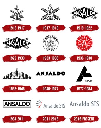
1912 – 1917
1917 – 1919
1919 – 1922
1922 – 1933
1933 – 1936
1936 – 1938
1938 – 1946
1946 – 1977
1977 – 1984
1984 – 2011
2011 – 2016
2016 – today
The simple Ansaldo STS logo inspires confidence, which is important since the company works with technology. There is a sense of goodwill in this design as the logo does not have complex shapes or deep meaning. It is easily understood by customers. The logo consists only of the company name written in a thin sans-serif font. The gray letters are elegant, neat, and even. The only corner is at the first letter “A,” which has a sharp tip. The rest of the letters are lowercase.
The single sharp tip on the first letter “A” serves as a small accent mark. It attracts attention without being conspicuous. The gray color as if says: “We are serious, but not too serious.” It’s simple, but you still want to know more about what this company does.


