The iOS logo is strictly business-oriented. Color, shape, content – everything in it speaks of belonging to a serious sphere, which is represented by innovative technologies. A harmonious balance makes the emblem recognizable and gives users the necessary mindset, confirming the reliability of the digital product.
iOS: Brand overview
| Founded: | June 29, 2007 |
| Founder: | Apple Inc. |
| Headquarters: | United States |
| Website: | apple.com |
Meaning and History
The implementation of Steve Jobs’ grandiose idea began in 2005 with the planning of the iPhone. The visual identity of the operating system was considered in parallel so that the manufacturer could launch everything at once – the mobile device, the operating platform, and the logo. And so it happened. They were all presented together in January 2007 at the Macworld Conference & Expo. The logo was initially intended to be business-oriented and minimalist to signify the seriousness of the OS.
What is iOS?
iOS is the second most popular operating system designed for use on digital devices. It runs mobile gadgets created by Apple. And the software itself is its personal product, launched in 2007. It is compatible with the iPhone, iPod Touch, and iPad and is updated annually.
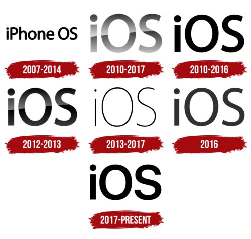
2007 – 2014
The textual iOS logo contains a single line with the inscription “iPhone OS.” That’s what this software was called until 2014. A sans-serif, lowercase font was chosen for the logo. The letters are semi-bold, smooth, and rounded. The only exception is the long segment “i,” which looks like a vertical rectangle. The lines of the other glyphs are smooth. This concise sign meets the expectations of users focused on a simple but functional operating system.
2010 – 2017
This logo accompanied versions 4-6. After renaming the OS, the owner decided to change its visual identity. Naturally, a new name appeared – in a short form but in a similar design. That is, it still lacks graphical elements. There is only text. It is precisely the business approach that made the emblem well recognizable.
The font is simple and monochrome. It is two-dimensional, without frills. Moreover, the inscription “iOS” looks as if all the letters in it are uppercase, whereas, in fact, only the “OS” fragment is set in large glyphs. And “i” is lowercase, although the designers depicted it larger than it actually is. In height, this symbol is almost on par with capital letters.
2010 – 2016
This era’s logo, related to the 4-5 operating system versions, is marked by its simplicity. However, designers added some sophistication to it through reflections, shadows, and gradients, making it appear three-dimensional. The inscription is painted in two shades of silver, giving it a metallic impression. This livens it up and adds inner energy. The bold, voluminous lines give the emblem a futuristic and technological look.
2012 – 2013
This logo accompanies version 6 of the OS. It consists of the familiar “iOS” inscription, but not metallic; instead, it’s black. A specular strip diagonally cuts across it – a small reflection adding expressiveness. The letters are slightly further apart, but the new shift is so minimal that it’s visually unnoticeable.
2013 – 2017
An emblem with threadlike letters characterizes versions 7-10. They’re thin, black, elegant, large, and consist of a single line. At the same time, the logo doesn’t appear bulky or clumsy because designers strictly adhere to the law of proportionality. All glyphs are airy, as if written with a ballpoint pen.
2016
Although the iOS logo is subdued, it’s not black but rather dark gray. This small symbol doesn’t feature any shadows, reflections, or gradients. The main element is the text, arranged in a single line. It’s set in a semi-bold, sans-serif typeface.
2017 – today
Bold, black letters make the inscription clear and businesslike. The minimalist logo applies to versions of the operating system from 11 onwards. It maintains a strict design, with not a single unnecessary element – only the software’s name. A small inter-character distance does not affect the inscription’s readability: it’s visible against any background.
iOS 11 (icon) Logo
With the launch of iOS version 11, another emblem emerged – colorful, transitioning from green (at the top) to subdued orange (at the bottom). However, the colors are not bright but pastel. Wide lines, sharp corners, and clean cuts create a sense of steady confidence. The logo still retains its characteristic simplicity and compactness.
iOS 12 (icon) Logo
The full spectrum of the rainbow testifies to the completeness of OS version 12, to which this logo pertains. It’s colorful, with a smooth gradient transition from fiery red to cool blue. The inscription is set in a semi-bold typeface.
iOS 13 (icon) Logo
The next version of the iOS operating system received a colorful emblem predominated by warm shades, including red, orange, yellow, and purple. The glyphs are rounded at the ends and lack sharp corners, making the logo simple yet sophisticated.
Font and Colors
The iOS logo is textual, so the style of the inscription is of great importance. As the visual identity evolved, the developers’ preferences changed but always stayed within general characteristics. Thus, the letters never had serifs, so the emblems were made in sans-serif typefaces Helvetica, Myriad, and San Francisco.
The brand’s palette is monochromatic and usually consists of a classic combination of black and white. Contrary to tradition, there are also vibrant logos painted in red, orange, blue, turquoise, violet, and yellow with a gradient.
iOS color codes
| Black | Hex color: | #000000 |
|---|---|---|
| RGB: | 0 0 0 | |
| CMYK: | 0 0 0 100 | |
| Pantone: | PMS Process Black C |

