


![]() Windows New Logo PNG
Windows New Logo PNG
The emblem represents the window through which the client can look into the world of computers. As the Windows logo indicates, the operating system serves as the link through which the machine understands the user.
Microsoft Windows emerged from Microsoft’s position in the early 1980s, following the release of MS-DOS for the IBM PC in 1981. DOS relied on text commands, limiting usability. In 1983, after exposure to graphical interfaces developed at Xerox PARC and popularized by Apple with Lisa and Macintosh, Microsoft announced Windows as a graphical layer atop DOS.
Windows 1.0 launched on November 20, 1985, at $99, but offered limited functionality and weak performance. Windows 2.0, released in 1987, added overlapping windows, though adoption remained modest. The turning point came in 1990 with Windows 3.0. Improved interface and memory support drove over 10 million sales within two years, establishing GUI computing on IBM-compatible machines. In 1993, Windows NT introduced a new architecture designed by Dave Cutler that separated enterprise systems from DOS-based consumer versions.
On August 24, 1995, Windows 95 launched with the Start button, taskbar, and built-in internet features. About 4 million copies sold in four days, marking mass adoption. Competition with Macintosh System 7 remained, though Windows benefited from broad hardware compatibility. In 2001, Windows XP unified the consumer and NT lines, becoming the longest-used version, with support lasting until 2014.
Windows Vista, released in 2007, faced criticism for its performance and compatibility. Windows 7 in 2009 restored adoption, while Windows 8 in 2012 introduced a touch-focused interface that was later revised. Windows 10 launched in 2015 as a free upgrade model, and Windows 11 followed in 2021 with an updated design and stricter hardware requirements.
Meaning and History
![]()
The #1 operating system’s visual identity has a rich history. Since the launch of the initial logo, 15 different types have been developed. They all share one common feature: a stylized window associated with the product name.
What is Windows?
Windows is the generic term for a group of closed-source operating systems developed by Microsoft. Each family representative is responsible for a specific sector: Windows IoT, Windows Server, and Windows NT. The first version, in the form of a graphical shell, was introduced in 1985.
1985 – 2001
![]()
The debut emblem, presented in 1985 along with the program, resembled a black-and-blue sign composed of graphics and text. It featured a window of four squares of different sizes, separated by thin white lines. The word element included “Microsoft Windows” in a serif typeface.
1990 – 2001
![]()
Along with OS 3.0, an updated emblem was introduced, featuring a monochrome design with a realistic window and inscription. This option was designed in color with gradient shades.
1992 – 2001
![]()
In 1992, the so-called era of the corporate flag started. The first badge looked like a fluttering cloth. On the left were four multicolored squares surrounded by a wide black outline. These were not just impromptu “glasses” but the main products of the parent company: Bing, Windows, Xbox, and Office. The inscription was located on the right side.
1993 – 2001
![]()
The emblem of this period completely echoed the previous version. It was the first representative of the corporate flag era, which lasted until the beginning of the next millennium. Its differences are the abundance and brightness of color. The logo was divided into two parts: graphic and text, and the changes made concerned only the appearance of the abbreviation “NT” next to the inscription “Microsoft Windows.”
1994 – 2001
![]()
After the redesign, a large, colored flag appeared, slightly offset and angled, making it seem to balance on a sharp edge. The opposite side, which consists of many small rectangles, is directed upwards. The developers also enlarged the word “Windows,” making it narrow and elongated. They put the second part of the phrase (“Microsoft”) on the left. Simultaneously, the designers reduced it, placed it vertically, and added pronounced serifs to the font.
1995 – 2001
![]()
Windows 95 Logo
With the release of Windows 95, the emblem also changed: the release year was added.
1996 – 2004
![]()
A year later, another update to the program was introduced in parallel with the previous one. At the end of the phrase “Microsoft Windows,” the developers indicated its next version, “NT.”
1998 – 2006
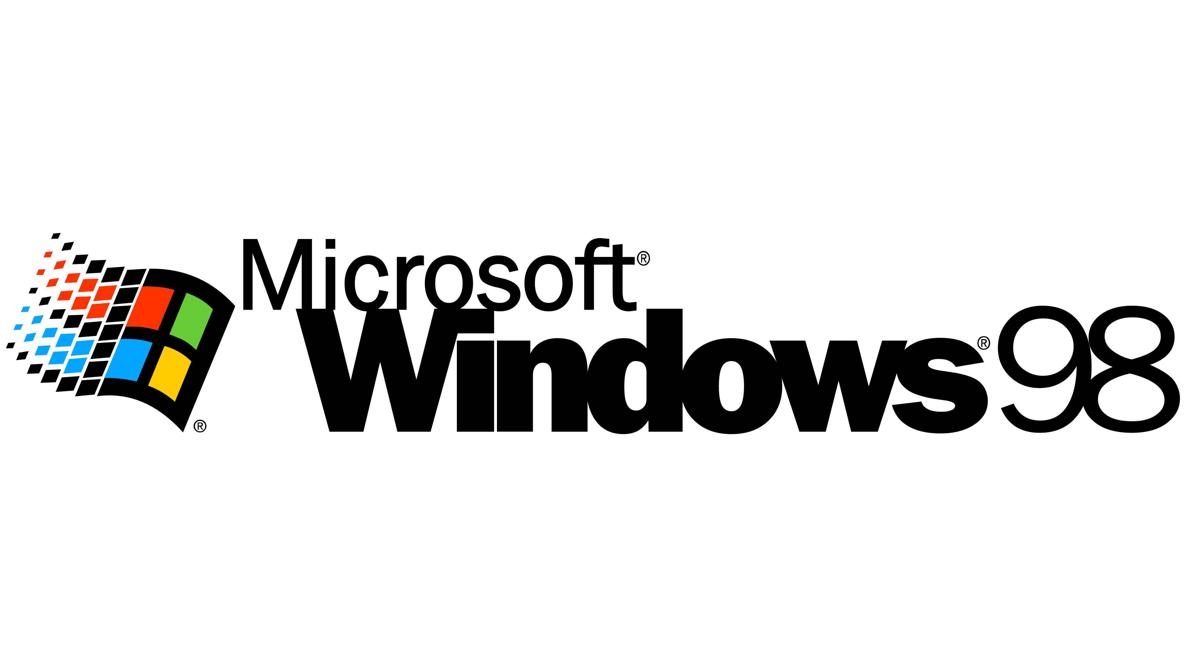
In 1998, the corporation launched one of its most legendary developments, marking the release with a logo update.
2000 – 2006
![]()
During this period, two versions of the operating system appeared. The first is “ME.” To highlight its innovation, the designers have updated the logo. They reshaped the windows, moved them to the center, layered one on top of the other, and lowered the text.
2000 – 2010
![]()
The second OS was named after the year of its release. Its logo also underwent some adjustments to distinguish it from previous ones. The windows were arranged in a row, with a slight gap between them. The inscription remained at the bottom, replacing the version name.
2001 – 2014
![]()
Windows XP Logo
With the advent of XP, the branding was redesigned. A single window, shaped like a waving flag with multicolored elements, was used. The operating system’s name was increased, while the number of companies was reduced. The version designation was made red and placed at the end of the text.
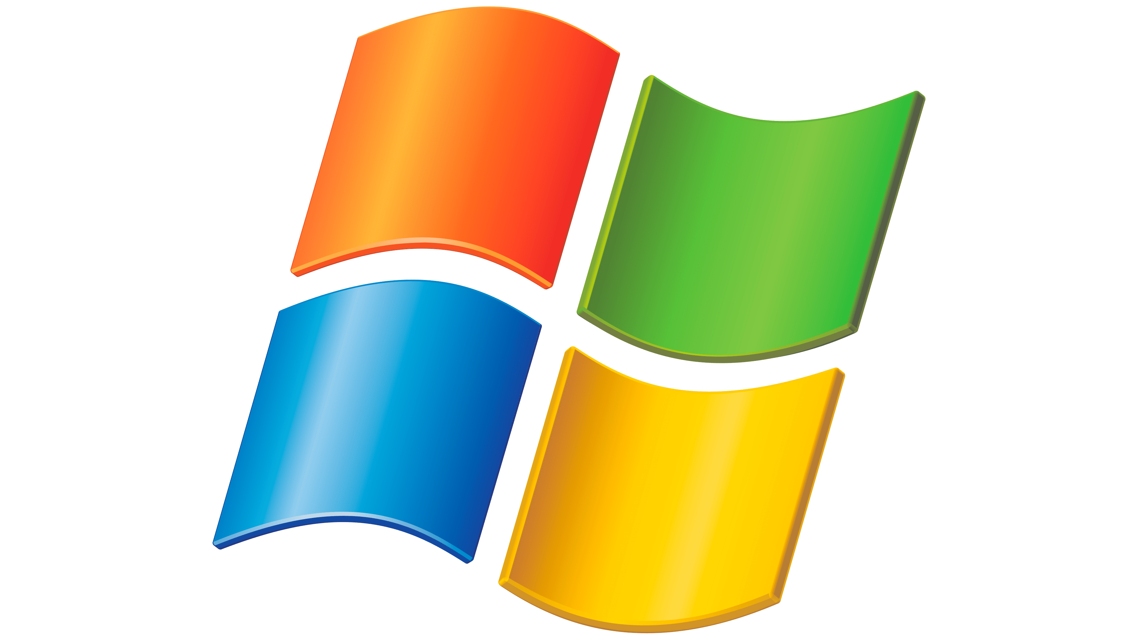
2006 – 2017
![]()
Vista’s release was significant because the OS received a new icon: the classic flag in a dark blue circle.
2009 – 2020
![]()
Windows 7 Logo
The release of Windows 7 marked 2009. As a result, the circle disappeared from the logo, and the flag window became larger.
2012 – 2016
![]()
The 2012 version was centered around the name of the next operating system, the eighth in a row. The designers created the corporate symbol as a rectangular, uniform shape. Moving to the beginning, the inscription “Windows’8” turned an intense black. This time, it set the stage for a completely different symbolism.
2013 – today
![]()
When Windows was updated to version 8.1, the logo was changed. It became flat (two-dimensional) and simple, yet it looked very modern. The emblem depicted a rotated rectangle of four identical smaller figures. Thin white lines separated them. To the right of the icon was an inscription, neat, thin, chopped. Almost all letters were in lowercase, except for the first “W.”
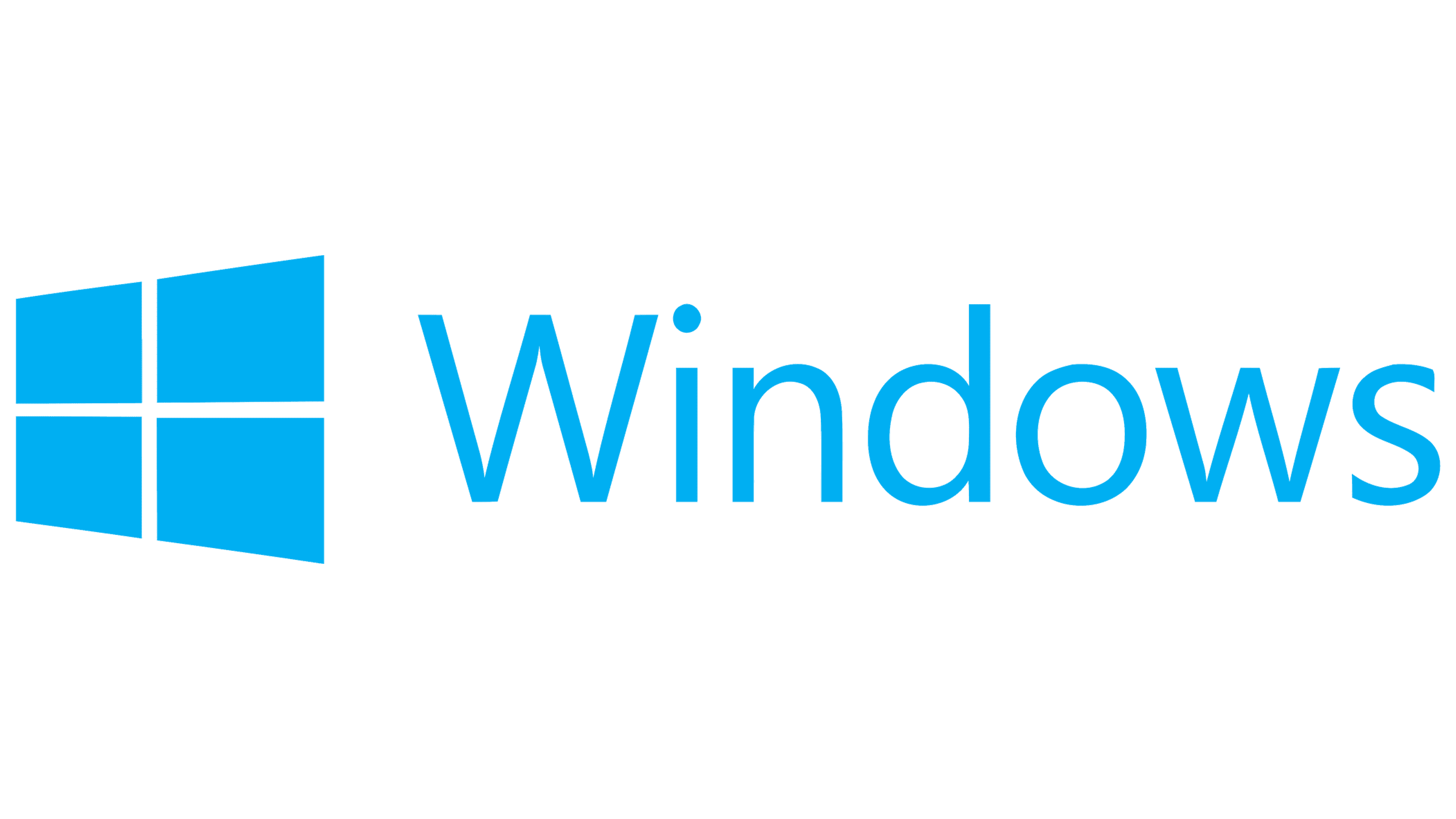
2015 – today
![]()
Windows 10 Logo
With the arrival of Windows 10, the developers made a slight tweak to the logo. They changed the system number and the sky-blue color to blue, and shifted the letters slightly, reducing the inter-character distance.
2020 – today
![]()
The designers added an “X” to the current version and painted each rectangle a specific shade of blue. The result is a gradient color transition from pale blue to rich cobalt.
From the beginning, Windows’ visual identity consisted of three basic components: the window icon, the operating system name, and the corporation name. Based on their shape and location, the logo’s evolution comprises four stages: the first, from 1985 to 1998; the second, from 2000; the third, from 2001 to 2009; and the fourth, from 2012 to the present. The modern variation is strictly geometric and monochrome, featuring a half-turn window whose squares resemble glass.
The writing style has changed with the logo redesign. But the letters, regardless of width, were always smooth, even sans serif. One of the most recent typefaces is Myriad Pro.
The Windows palette has several bright colors: red, yellow, green, and blue. The background is white, and black is also used for edging.
2021 – today
![]()
Windows 11 Logo
The logo was launched in the summer of 2021, ahead of schedule. It officially debuted alongside the release of the updated platform, echoing the old emblems in their structure, style, and font. But some adjustments did take place. The Segoe UI Bold typeface is used here, so the letters look much more distinct than before. They are perfectly flat, strict, and chopped. Another transformation affected the corporate “window,” the icon to the left of the inscription. The designers aligned the rectangles and made them squares of the same size. Therefore, the flag’s shape has now disappeared, as the maximum adaptation of graphics and text has been achieved, and the icon visually conveys the program’s name.
Font and Colors
The developers used the Segoe UI Bold typeface to make the letters look wider for the new Windows platform. The color palette is the same as in previous logo versions.