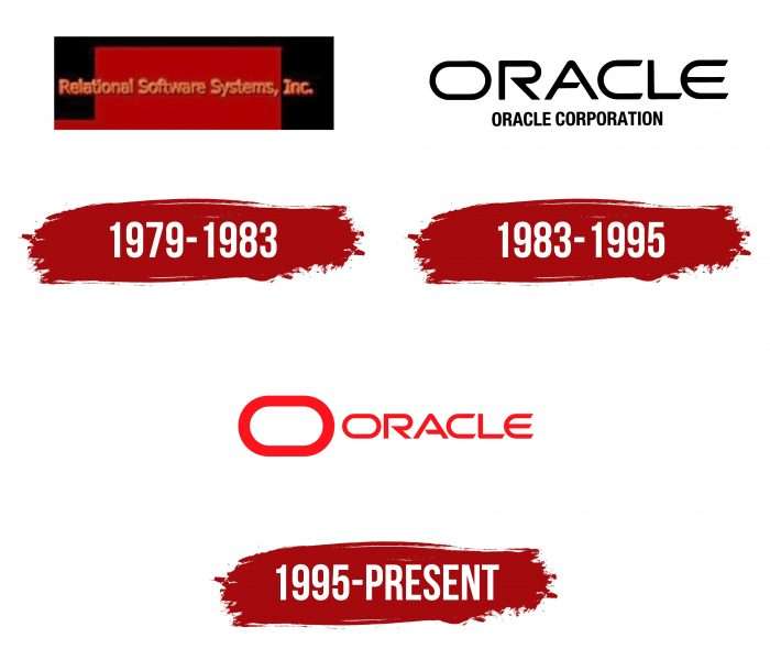
As the Oracle logo shows, the manufacturer has its own unique style that distinguishes it from other technology companies. The products harmoniously combine software perfection and a unique appearance to solve the tasks.
Oracle: Brand overview
| Founded: | June 16, 1977 |
| Founder: | Larry Ellison, Bob Miner, Ed Oates |
| Headquarters: | Austin, Texas, United States |
| Website: | oracle.com |
Meaning and History
The current Oracle logo appeared after the rebranding of 1982. Before that, the organization was known as Software Development Laboratories and was owned by three entrepreneurs who worked on a secret CIA project codenamed Oracle. In mid-1979, the corporation was named Relational Software, and three years later – Oracle, in honor of the commercially successful Oracle v.2 database. At the same time, she had to change the logo to match the new corporate identity.
What is Oracle?
This is the name of an American corporation that is a direct competitor to Microsoft in software development. She specializes in business applications, DBMS, and middleware. Since 2008, the Oracle assortment has included server hardware.
1977 – 1979
In 1977, Oracle made its market debut as Software Development Laboratories, immediately identifying the scope of its professional interests. She started with enterprise software and database technologies, gradually expanding and complicating the list of software products. All subsequent logos speak of the seriousness of its activities.
1979 – 1983
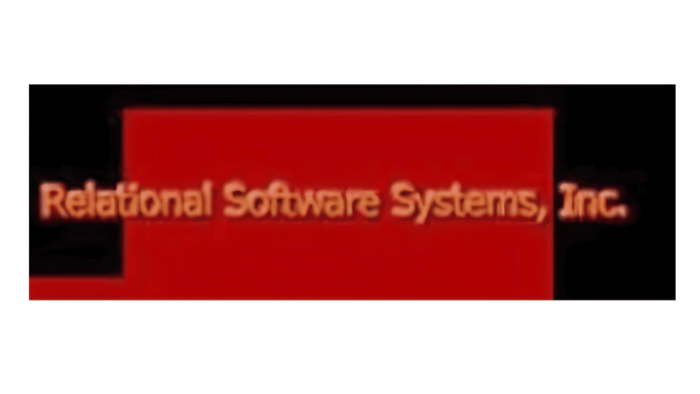
Its minimalism and business approach distinguishes the emblem of this period because its elements resemble a geometric scheme – moreover, progressing upward. A stepped graph is placed against the background of a black rectangle without borders. You can see a narrow red fragment on the left, which turns into a tall and wide rectangle. On top of them is the old name of the company – Relational Software Systems Inc. The phrase is made in beige letters with a slight shade at the bottom. The font is lowercase, except for the first characters – they are uppercase.
1983 – 1995
In 1983, a rebranding took place, after which the company became known as Oracle Systems Corporation. That is, it changed its legal status – it grew into a corporation. At the same time, the company changed the logo – bringing it into line with the new name. But she chose the same style – minimalistic. In this case, it has become even more concise since the management decided to abandon the graphic part and left only the text element. However, the designers have introduced into it branded hand-drawn details: a horizontal “O” in the form of an oval, an “A” with an angle on the crossbar, and an elongated “E” with rounding, which resembles the Ukrainian “Є.” The bottom line is occupied by the words “Systems Corporation.” They contain thin, tall sans serif letters.
1995 – today
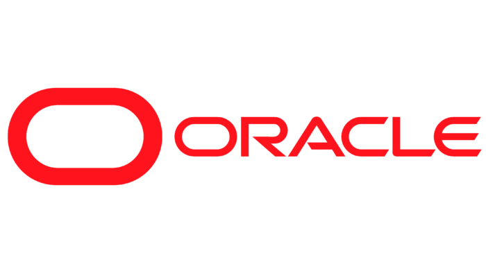
Concerned about the lack of graphics, the software company decided to add it anyway. To do this, she used the first letter of the current name Oracle Corporation. The designers enlarged the sign as much as possible and placed a large oval on the left side. They removed the bottom inscription and repainted the rest of the text in red. The closed geometric shape represents the unity of software, hardware products, and digital services.
Oracle: Interesting Facts
Oracle Corporation is a big company that works with computer programs and the Internet to help businesses.
- Starting Out: Oracle was started in 1977 by three people: Larry Ellison, Bob Miner, and Ed Oates. They made a special computer program that could keep and find data easily, which was new and exciting back then.
- Why “Oracle”?: “Oracle” came from a secret project Larry Ellison worked on before starting the company. It shows that Oracle started by making computer programs for the government.
- Easy Way to Talk to Databases: Oracle was one of the first to use a special language called SQL. This made it easier for people to get information from databases.
- Helping Businesses Run Smoothly: Oracle makes many computer programs that help companies improve their planning, customer relationship management, and supply organization.
- Into the Cloud: Oracle also works with cloud computing, which means using the internet to store data and run programs, making it easier for businesses to operate.
- Growing by Buying Other Companies: Oracle grew by buying over 100 other companies, adding more products, and reaching more customers. Some big names it bought include Sun Microsystems, PeopleSoft, and NetSuite.
- Big Deal with NetSuite: Oracle’s Purchase of NetSuite for $9.3 billion was huge. It showed how serious Oracle is about offering cloud services for business finances and online sales.
- Owning Java: By buying Sun Microsystems, Oracle gained control of Java, a popular programming language. This made Oracle an important name in software development.
- Big Meetings: Oracle holds a big meeting called Oracle OpenWorld every year, where many people come to learn about new Oracle products and ideas.
Oracle started with a new idea for storing data and grew into a big name in business software and internet services. It keeps coming up with new ways to help businesses in a world that’s always changing.
Font and Colors
The designers created two emblems for the company: a white one with red lettering and a white one. They differ only in the “inverted” arrangement of colors – everything else, including proportions and font, is the same. In 2010, the corporation bought Sun Microsystems, and with it acquired the rights to its visual identity and decided to use them.
The original Sun Microsystems logo was created by Professor Vaughan Pratt, who taught at Stanford University. The Oracle designers left only the diamond-shaped ambigram and the word “Sun” from the original version and placed a red rectangle with the words “ORACLE” below them.
The main emblem does not symbolize anything: it is the company’s name, depicted in an unusual font. But the software manufacturer has an icon that is used in the webspace. The icon looks like an oval rectangle with a wide red border. You can tell it is the inverted “O” from the full-size Oracle logo if you look closely.
The corporation prefers a custom typeface that combines rounded and pointed elements. The letters have no serifs: all horizontal lines, including the stroke between the side portions of the “A,” are cut at an angle. This design makes the inscription bright even without additional graphic symbols.
The logo’s palette is quite varied, although the developers adhered to two colors: white and red (Pantone PMS 485). In some cases, the use of an RGB gradient and a black and white monochrome version is allowed depending on the visual context.
FAQ
What does Oracle do?
Oracle is a multinational computer technology corporation that develops and markets database software, technology, cloud-engineered systems, and enterprise software products. The brand provides tools and solutions that help businesses manage, organize, and analyze their data more effectively.
One of Oracle’s main products is its database software, which allows businesses to store and retrieve large amounts of data efficiently. Companies of all sizes use these databases to manage customer information, financial records, and more.
The brand offers cloud computing services, providing businesses with scalable and flexible computing resources. This allows companies to run applications and store data in the cloud, reducing the cost and complexity of managing their IT infrastructure.
Oracle develops enterprise software products like Enterprise Resource Planning (ERP), Customer Relationship Management (CRM), and Supply Chain Management (SCM) systems. These products help businesses streamline operations, improve customer relationships, and manage supply chains more.
What is the color code for Oracle Red?
Oracle Red’s color code is PMS 180C, with the hex code #C74634. In the CMYK color model, it is 3% cyan, 91% magenta, 86% yellow, and 12% black.
Oracle Red is a vibrant shade that represents the brand’s identity. This red creates a strong and recognizable visual presence in all marketing and branding materials. It conveys energy, passion, and strength, aligning with the brand’s values and mission.
What is the logo of Oracle?
The logo features the brand’s name in red letters. The designers created a custom font for the name, combining elongated and compressed lines, roundings, sharp corners, and symmetrical cuts.
This unique font makes the logo recognizable and helps establish a strong visual identity. The vibrant red color, Oracle Red, conveys energy, passion, and strength, matching the brand’s values and mission.
The custom font and red color work together to create a logo that stands out and represents the brand’s identity.
What systems are under Oracle?
Oracle’s portfolio includes various systems designed to meet different needs in data management, cloud computing, and data recovery.
- Oracle Private Cloud Appliance: This system lets businesses quickly set up private cloud environments. It integrates computing, storage, and network resources, offering a flexible and scalable solution for managing private clouds.
- Oracle Zero Data Loss Recovery Appliance: This appliance ensures no data is lost in case of failure. It provides real-time data protection and recovery, making it ideal for businesses needing critical data security.
- Oracle Database Appliance: This system simplifies deployment, maintenance, and support of database environments. It is optimized to run Oracle databases and includes hardware, software, and support in one package.
- Oracle Exadata: This system is built to run Oracle databases with high performance and reliability. It combines hardware and software to create an optimized platform for large-scale and mission-critical applications.
Each product is designed to address specific challenges, ensuring businesses can find the right solution for their unique requirements.
Is Oracle trademarked?
Yes, the company is a registered trademark owned by the corporation of the same name. This trademark protects the brand’s name and logo, ensuring that only the company can use them for its products and services. This legal protection helps maintain the brand’s uniqueness and prevents unauthorized use by others. The trademark covers various aspects of Oracle’s business, including software, hardware, cloud services, and other technology solutions.
Can I use the Oracle logo?
You cannot use the logo without permission from the copyright holders or a specially obtained license. The logo is a registered trademark of the brand, and unauthorized use can lead to legal consequences. The trademark protects the brand’s identity and ensures its name and logo are correctly used.
You must contact the company to request permission or obtain a license to use the logo. This ensures the logo is used according to the brand’s guidelines and legal requirements.
Using the logo without permission can result in legal action, including cease and desist orders, fines, or other penalties. Following the proper procedures is essential to avoid these issues and respect the brand’s intellectual property rights.

