The Microsoft logo demonstrates diversity. The emblem showcases the company’s multitude of products, multifaceted approach to problem-solving, and global user presence. The giant’s products are suitable for both work and everyday life.
Microsoft: Brand overview
| Founded: | April 4, 1975 |
| Founder: | Bill Gates, Paul Allen |
| Headquarters: | Redmond, Washington, U.S. |
| Website: | microsoft.com |
Meaning and History
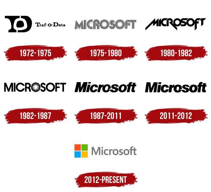
Microsoft has had several logo versions – about seven. Each is associated with certain transformations and reflects its evolution from an obscure firm to a globally renowned digital industry giant.
What is Microsoft?
Microsoft is a multinational technology corporation founded in 1975. It specializes in producing software products (operating systems, office suites, browsers), PCs with touch screens, and Xbox consoles. As of the end of 2022, the company ranked 14th in the Fortune 500 list. It is also one of the world leaders in revenue. Its founders are Bill Gates and Paul Allen.
1972 – 1975
The organization began its activity in 1970 as a company named Traf-O-Data. It dealt with producing computer equipment for traffic lights on Washington roads. During the government period, the enterprise was transformed into a new structure named Microsoft. This occurred on April 4, 1975.
Its emblem initially played with the letters “T,” “O,” and “D,” forming the name. It was a combination of a graphic sign with text. The original symbol, featuring overlapping black “T” and “D” with a white “O,” was positioned to the left of the full company name. The word was written in a combination of uppercase and lowercase letters on a light background.
1975 – 1980
When the company changed its name to Microsoft, it immediately introduced its new logo, which resembles the modern one a little. The letters were lined up and echoed the road theme – as if they were stylized city streets. The uppercase symbols were wide, even, smooth, and of uniform height.
1980 – 1982
In 1980, a logo appeared, remotely echoing the familiar version. It had almost no free space between letters, causing some symbols to merge. Each character had a slanted cut at the top or bottom, and the elongated legs of “M,” “R,” and “F” extended far beyond the word’s boundaries.
1982 – 1987
After only two years, the previous version was updated. The company name was now written in an even, thin, sans-serif font. The graphic accent was on the first letter “O,” positioned at the center. Thin, short strokes surrounded it.
1987 – 2011
In 1987, the recognizable and familiar logo was approved. It consisted of slightly inclined letters written in lowercase, except for the first letter, which is capitalized. The connection between “o” and “s” featured a slanting line, emphasizing movement and dynamism in the word’s “softest” part (where lines are most fluid). Scott Baker created the updated logo.
This logo can still be seen on some portals and old company products. Particularly, it remains relevant on the Windows / Microsoft Update site and Windows Vista, in the Windows XP loading window, on the Windows XP Professional documentation page, etc.
2011 – 2012
With the slogan introduced in 2011, the corporate logo got a new design: developers reduced the letter slant. But this version lasted only a year – until the second half of August 2012.
2012 – today
After a radical redesign, another emblem was introduced. It now consists not only of text but also of graphics. These are four multicolored squares, symbolizing the corporation’s main products – Bing, Windows, Xbox, and Office. However, this approach was not entirely new: a similar variant appeared in the 90s in Windows 95 ads and since 2009 in Microsoft Store symbolism.
But the word “Microsoft” was altered, receiving a new modification. The letters became uniformly thin and gray. The only accent was the alignment between “f” and “t”: they, as before, were connected by horizontal strokes.
Microsoft: Interesting Facts
Bill Gates and Paul Allen started Microsoft on April 4, 1975. It began as a small company making software for personal computers but has grown into one of the biggest and most important tech companies.
- First Product: Microsoft’s first project was making a programming language called BASIC for an early personal computer, the Altair 8800. This was how Microsoft started focusing on making software.
- MS-DOS and IBM: Microsoft’s big moment was making the operating system (OS) for IBM’s first personal computer. Microsoft bought an OS called QDOS, changed it a bit, and named it MS-DOS. This deal made Microsoft very important in the computing world.
- Windows Launch: In 1985, Microsoft released Windows, a new way of interacting with computers using pictures and icons instead of text. Windows became very popular for personal computers.
- Microsoft Office: In 1990, Microsoft made Office, which combined Word, Excel, and PowerPoint. This made it easier for people and businesses to do their work, and Office became widely used.
- Internet Explorer: In 1995, Microsoft started making a web browser called Internet Explorer. This led to a big competition with another browser called Netscape. Microsoft’s incorporation of Internet Explorer into Windows led to a big court case.
- Xbox: Microsoft entered the video game market with the Xbox in 2001. The Xbox and its newer versions have successfully competed with PlayStation and Nintendo.
- Buying LinkedIn: In 2016, Microsoft bought LinkedIn for $26.2 billion. This was one of the biggest buys in tech and added professional networking to Microsoft’s business.
- Bill Gates and Charity: In 2008, Bill Gates left his day job at Microsoft to focus on giving away money to help others through the Bill & Melinda Gates Foundation.
- Windows 95: When Microsoft released Windows 95, it was a big deal and included a huge advertising campaign. Windows 95 helped make Windows the most used computer operating system.
- Cloud Computing: With Satya Nadella as CEO, Microsoft has invested a lot in cloud computing. Its Azure service is a big deal and competes with Amazon’s cloud service. This has helped Microsoft keep growing.
Microsoft has changed greatly from starting as a small software company to becoming a technology leader. Its products change the way we work, play, and talk to each other.
Font and Colors
The current logo emphasizes the global areas in which Microsoft operates. According to the administration, the updated design conveys the transition from classic to progressive interfaces, which takes time. Therefore, it consists of one large square divided into four small ones. The tile design reflects convenience, as most digital products now use this format.
Previously, the emblem had an individual font based on the classic. Only the word positioning changed – straight or slanted. After the redesign, the new version received the Helvetica font from the neo-grotesque category, developed in 1957 by Haas’sche Schriftgiesserei from Switzerland.
Until 2012, the logo’s predominant color was black on a white background. Then, it became multicolored: the letters turned light gray, and the squares became red, green, blue, and yellow.
Microsoft color codes
| Giants Orange | Hex color: | #f25022 |
|---|---|---|
| RGB: | 242 80 34 | |
| CMYK: | 0 67 86 5 | |
| Pantone: | PMS 1655 C |
| Apple Green | Hex color: | #7fba00 |
|---|---|---|
| RGB: | 127 186 0 | |
| CMYK: | 32 0 100 27 | |
| Pantone: | PMS 376 C |
| Vivid Cerulean | Hex color: | #00a4ef |
|---|---|---|
| RGB: | 0 164 239 | |
| CMYK: | 100 31 0 6 | |
| Pantone: | PMS 2995 C |
| Selective Yellow | Hex color: | #ffb900 |
|---|---|---|
| RGB: | 255 185 0 | |
| CMYK: | 0 27 100 0 | |
| Pantone: | PMS 7549 C |
| Nickel | Hex color: | #737373 |
|---|---|---|
| RGB: | 115 115 115 | |
| CMYK: | 0 0 0 55 | |
| Pantone: | PMS 424 C |
