The Microsoft Word logo symbolizes the enhancements and versatility of the text editor, reflected by four blue stripes of the same shade. The simplified design improved the emblem’s perception, adding elegance while maintaining recognizability.
Microsoft Word: Brand overview
| Founded: | October 25, 1983 |
| Founder: | Microsoft |
| Website: | products.office.com |
Meaning and History
The first version of Microsoft Word was created in 1983 by programmer Richard Brodie based on the Bravo editor. At that time, another editor, WordPerfect, was very popular in the U.S. However, Brodie quickly adapted, eliminated all the shortcomings, and two years later released Word 3.01 for Macintosh, followed by an updated version for Windows 3.0 a year later. WordPerfect became obsolete and incompatible with Windows, and Word became the leading editor in the U.S. and worldwide. In addition to the text editor, new versions of Microsoft Word introduced graphic tools, the ability to embed various objects and multilingual support.
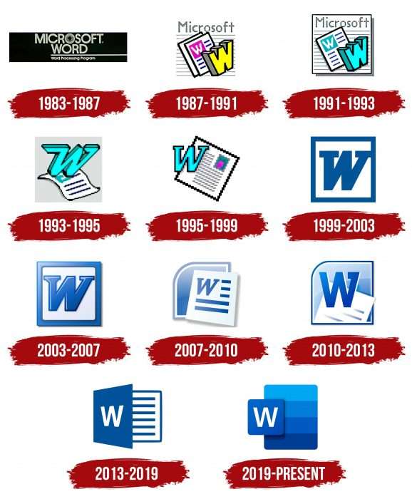
The Microsoft Word logo was created in 1983 and updated every 3-5 years with the release of a new version. Experts consider the current version to be the most successful and representative of the latest version’s capabilities.
What is Microsoft Word?
It is a program specifically designed for working with texts. Its alternative names are WinWord or MS Word. This software is part of the Microsoft Office suite but appeared much earlier – in 1983.
1983 – 1987
The first logo was simple – the editor’s name, MICROSOFT WORD, written on a black plaque in white capital letters, with the central letter depicted as concentric circles. A thin white stripe underlines the word Word, and below it, in small print, is the slogan Word Processing Program.
1987 – 1991
A full-fledged logo was created with the improved versions of Word 3.0 and Word 3.01. The emblem depicted a sheet of paper with small, illegible font tests. Above it, in large letters, Microsoft, are two small sheets positioned at an angle. On the upper sheet is a purple emblem with the letter W. In the foreground is another voluminous letter, W, with a bright yellow facade. The editor introduced several fonts, including 3D effects and the ability to color the background and text.
1991 – 1993
The emblem was slightly changed – it became twice as large. A thin black frame was added to the background square, and the shadow on the right depicted a stack of printed sheets. The name did not change; of the two small sheets, only one remained, with a blue-green square, and the voluminous letter W received a bright azure color.
1993 – 1995
The logo was radically changed, becoming softer. The sheet of paper was depicted horizontally, with a wave, and the letter W moved up and became vertical, slanted, and with large serifs.
1995 – 1999
In 1995, as part of the Office 95 package, the revolutionary Word 7.0 version was released. Along with it, the logo changed – the sheet was positioned at an angle, the large letter W was highlighted in color on the left, and the square with the fill moved to the right. Notably, all lines represent an “image element,” now called pixels. This version was considered the most unsuccessful in depiction.
1999 – 2003
The next radical transformation in design and color. A white and blue color scheme with a gradient was chosen. A white square is enclosed in a blue frame, and a large blue letter W is in the center.
2003 – 2007
Minor changes – the emblem decreased in size, and the plain blue color was replaced with a toned one, transitioning from blue to light blue.
2007 – 2010
Word 2007 switched to the international Open XML standard, and the emblem changed significantly. We returned to the white sheet with stylized text and the letter W. In the background is a blue square with rounded corners.
2010 – 2013
The design slightly changed in terms of moving individual logo elements, although its visual perception remained the same.
2013 – 2019
In 2013, Word changed its functionality and interface, becoming softer and more intuitive, and added many new features. The logo also received a new image – in the form of an open book with text and the letter W on the cover. The color scheme is blue and white.
2019 – today
Users were presented with a new, improved Microsoft Office Word 2019 and a new editor logo. The plaque background consists of 4 wide stripes of different shades of blue, symbolizing the program’s versatility. In front on the left is a small square plaque of blue color with the brand’s white letter W.
As you can see, designers went in reverse: the Microsoft Word logo was simplified and became more elegant in design, while the editor itself became more complex.
Microsoft Word: Interesting Facts
Microsoft Word is a program that allows users to write and change documents. It’s part of Microsoft Office, and lots of people use it.
- It Started in 1983: Word first appeared on October 25, 1983. It was called Multi-Tool Word and worked on Xenix systems. It was cool because it let you see what your document would look like while working on it, showing things like bold or italics on the screen.
- Word for Windows: The first Word came out in 1989. Since then, it has helped more people use Word, making it very popular for writing documents.
- Clippy: In Office 97, Microsoft added Clippy, a little animated paperclip that tried to help you. Some people found it annoying, so it was removed in Office 2007.
- WordArt and Templates: Word was one of the first to let you make fancy text with WordArt and use templates to start a document with a certain look quickly.
- Working Together: Word added ways for people to work on the same document simultaneously. You can also track changes and comments, making it easier to work with others.
- New File Formats: Starting with Word 2007, Microsoft introduced new file formats like .docx, which are better and safer than the old ones.
- Word on Your Phone: Word is available for iOS, Android, and Windows Phones, and it can be used on phones and tablets. Thus, you can work on documents no matter where you are.
- Cloud Services: Word works with Microsoft’s cloud services, like OneDrive and SharePoint. You can save your documents online and get to them from anywhere.
- Accessibility: Word has features to help people with disabilities, like a screen reader and text-to-speech.
- Education: Word is really important in schools. Students and teachers use it to write papers and create educational materials. Microsoft even offers special pricing for schools.
Microsoft Word keeps improving, adding new features to meet users’ needs. It’s a key tool for writing and working together on documents.
Font and Colors
Since 2019, WinWord has had a stylish icon consisting of two parts. In the background is a rounded rectangle with four stripes of different shades. Brought forward is a square without corners, casting a triple shadow. The light seems to come from the left outside the image. Inside the square is a large letter “W” – an abbreviation for “Word”. It can also be interpreted as an inverted capital letter “M” from “Microsoft.”
The only white element on the emblem is the capital letter “W.” It has no serifs and consists of four diagonal stripes of equal length and width. All other parts of the emblem are blue, with several shades present in the palette – from light blue at the top of the rectangle to dark blue at the bottom. The shadows cast by the square are gray.
Microsoft Word color codes
| Spanish Sky Blue | Hex color: | #00a7f1 |
|---|---|---|
| RGB: | 0 167 241 | |
| CMYK: | 100 31 0 95 | |
| Pantone: | PMS 2995 C |
| Ocean Boat Blue | Hex color: | #007dd7 |
|---|---|---|
| RGB: | 0 125 215 | |
| CMYK: | 100 42 0 16 | |
| Pantone: | PMS 285 C |
| Tang Blue | Hex color: | #005ac1 |
|---|---|---|
| RGB: | 0 90 193 | |
| CMYK: | 100 53 0 24 | |
| Pantone: | PMS 2935 C |
| Dark Powder Blue | Hex color: | #003d95 |
|---|---|---|
| RGB: | 63 194 204 | |
| CMYK: | 60 0 23 0 | |
| Pantone: | PMS 661 C |
FAQ
What is the Microsoft Word logo?
The modern WinWord logo consists of two quadrilaterals. In the background is a blue rectangle divided into four horizontal stripes. The shade changes from light (at the top) to dark (at the bottom). In front of it is a blue square with a white letter W.
How to create a design in Microsoft Word?
You need to go to the “Insert” section, click on “Shapes,” and choose the appropriate option. Once the shape is created, a “Drawing Tools” tab will appear where you can change the fill and outlines. To create a design, add a few more objects.
How to create a logo in Word?
To create a logo in the “Word” program, it is recommended to use standard shapes and experiment with color and outline thickness. The WordArt function is suitable for decorating text. You can also insert any images saved on your computer.
Where are the icons in Word 2019?
Icons in Word 2019 are located in the same place as in other program versions – on the “Insert” tab.

